 FA+
FA+
273
Views
Views
4
Favorites
Favorites
Category
All / General Furry Art
Species Vulpine (Other)
Size 1080 x 695
File Size 1 MB
Report this content
More from Eeveev2


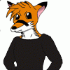
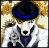
Lately, I've been working on a portfolio for my graphic art final. In short, a presentation of something we enjoy doing when it comes to graphic art. So, of course, I had to do something concerning some of the newer work I've done so far this term.
Any critiques would be helpful in making this work a bit better while I'm renovating some of my older drawings with things I've learned.
Renamon belongs to Toei Animation / Namco Bandai
V2, Rin, and Chase are mine.
Any critiques would be helpful in making this work a bit better while I'm renovating some of my older drawings with things I've learned.
Renamon belongs to Toei Animation / Namco Bandai
V2, Rin, and Chase are mine.
Category All / General Furry Art
Species Vulpine (Other)
Size 1080 x 695px
File Size 1 MB

Well, you might try using same styles between linearts and backgrounds. For example, if you're doing a cellshaded draw, a minimalistic bg or something in that style will fit way more than a colorful blending. Otherwise, it'll look like you just did some cut and paste with a random image of google D: . And really that doesn't look good xD.
Same is with Rena. And you're dead anyway: (NOT SAFE FOR WORK!)http://www.furaffinity.net/view/3542810/

Comments