 FA+
FA+
1327
Views
Views
69
Favorites
Favorites
Category
All / All
Species Lion
Size 1280 x 800
File Size 308.1 kB
Report this content
More from alphaleo14


Manage to dig back up some old artwork which i have forgotten. 2001 and 2009 work. The biggest changes i have was switching from traditional watercolor to digital photoshop. but still remain back the same spirit.
Template: http://www.furaffinity.net/view/3924251
Template: http://www.furaffinity.net/view/3924251
Category All / All
Species Lion
Size 1280 x 800px
File Size 308.1 kB

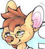


well for me both pics are more like apples and oranges. I can't say your style has improved worsend or stayed the same. don't get me wrong but both pics are awsome ^_^ I love your art but this looks to me more like a change in style more then anything else. I like how you did the feet in second pic to more ferral like. As for the character he looks much older and calmer then do one on the left.
Both pictures tell few interresting things in terms of technique you used. The one on the left is made using tradicional art and second one using digital art (further showing that it's hard to compare the two). I like the attention to background in the first one the scenery looks like I would like to go there one day to have a swim in that lake ^_^ but it looks like you forgot about your tail in that one ^_^
The pic on the right has no background it's just a blurr between different kinds of green and some brown on the bottom. Its a shame because your caracter looks more like copy pasted cut-out then a true living being and the amount of work you must have put into him deserves better.
It's time for facial expressions. Lets start with two cycling characters. I have to say that I like the one on the right more he looks like he is enjoying himself and really loves what he is doing you can see in his eyes that this is his way of life and he loves it. the guy on the right looks... shocked? frightened? he looks like he is about to crash into a wall or a rock or something. I see that you were you going for a "exhausted" but it didn't work out at all.
Now for the two standing Leos ^_^ I see that you went for the defoult for them. They are smiling but their faces don't actually say anything and are just... well... meh and look more like an avatar for FA or mascot for some life-less company then actual characters
ok I think that's enough.


Comments