 FA+
FA+
1424
Views
Views
80
Favorites
Favorites
Category
Artwork (Traditional) / General Furry Art
Species Wolf
Size 780 x 735
File Size 339 kB
Report this content
More from Tremorwolf

")


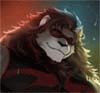
Targis Prime,, Small Little Planet with a Earth like environment and culture way out in the boondox of Space. Its were i had my first "protection" mission after the Core... Was a simple gig really.. Use my new ship to transport a bunch of Green Mercs to this planet and keep the neighboring bullies from killing the peaceful residence of this world. Not so hard.. was a great break for the Fuck up that was the Core.
Was stationed at Umber Park.. just a big old Forrest reserve with lots of wildlife and a small park for the kids. One of my Fellow Mercs took this of me.. God there was nothing to do. He was such a shutter bug.. always taking pictures of the alien life... Least, thats what i thought.. One thing about the Mercs.... They go were the money is when they are organized they way we were...
This pick and me are all that remain of Targis
***Artists Notes***
Been working on this for quite a wail.. wanted to put all my efforts in to show if I have had any real artistic growth. Everything is hand done. EVERYTHING. every stroke of grass, every blot of tree foliage, even the clouds. No damn stock photos blurred into oblivion.. its ALL done by me.. The color job needs work.. the anatomy is improving and the pose is much looser than my other stuff. Im rather happy with how this came out.. Lets hope Part two dose just as well.
Category Artwork (Traditional) / General Furry Art
Species Wolf
Size 780 x 735px
File Size 339 kB


Critique-y dun dun duuuuuuuuuuuun:
First off, I think it is safe to say this is your best work yet. You have been working a long time at it, and I think that is what you may need to do for future works. The time and effort you put into what you do pays off.
Picture +:
I like the anatomy/pose. I do see some slight size issues between the upper arms, the left art (from the viewers perspective) seems a bit smaller then the right arm. The pose is good, not static and dull. Got some highlights where they need to be. The carousel looks amazing. See what references can do? lol. Also love the trees and the variation of the colours
Picture -:
Some of the things I noted above as being good are lacking in some parts of the picture. The picture doesn't 'pop' like it should, because parts of it seem flat. This is because of the lack of color variation. I can slightly see where you were putting in brighter colors on the body for lighting variation, but the uploading to FA may have destroyed that. The perspective on the carousel looks great, you got a good reference for it, but because there is not much shadow/lighting variation, it looks flat. I would recommend reference on metals, cloth, etc, as the body armor, gun, and clothing are to flat. So in final summary on color, variation, variation, variation, because of lighting colors change, becoming brighter or darker. They can also change completely because of what type of light is on them. And one final note, the gun is a little bent, a bend in an initial sketch is fine, but when you go to construct anything that should be perfectly straight, rulers are your best friend.


Comments