 FA+
FA+
13996
Views
Views
1788
Favorites
Favorites
Category
All / All
Species Unspecified / Any
Size 1280 x 625
File Size 1.74 MB
Report this content
★
More from Nomax


Listed in Folders

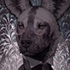
For  kesik, thank you very much!
Everytime i get to draw painted dogs i get to experience the horror i am putting other artists through when they need to draw my character. As it turns out the camouflage works and makes it very easy to get things messy.
______________________________________
If you like to get personalized art feedback, or stuff like PSD files, highres and more, or you want to have a print of my work then here are your options.
Patreon | Prints
 kesik, thank you very much!
 Everytime i get to draw painted dogs i get to experience the horror i am putting other artists through when they need to draw my character. As it turns out the camouflage works and makes it very easy to get things messy.
______________________________________
If you like to get personalized art feedback, or stuff like PSD files, highres and more, or you want to have a print of my work then here are your options.
Patreon | Prints
Category All / All
Species Unspecified / Any
Size 1280 x 625px
File Size 1.74 MB
Listed in Folders


Hah thank you. Yeah they are very close design-wise, so one always has to be careful to bring some differences there. But it's also what i enjoy. Characters just kind of looking like their animal counterpart without anything too fancy. I mean all in all we humans also all look fairly similar if you take away stuff like our clothes and all that. That's kind of what i like to go for in characters as well. Just a more subtle difference rather than extravagant colours and whatnot to differentiate. It's hard to get right but i think can be great fun! Plus of course just fits to my design sesibilities as well and with the way i paint.


Nomax, the love, care and detail you put into your paintings is astonishing. The styling, the texturing and use of lighting gives an incredible lifelike radiance. Meticulous detail to the spear, shield, the necklace and clothing. The beautiful blurring effect of the background so we become focused on these magnificent characters.
OUTSTANDING⭐⭐⭐⭐⭐👍
OUTSTANDING⭐⭐⭐⭐⭐👍


I always adore your work. It's so full of life with the excellent lighting and rich textures used. I'd love to be able to do similar, but I always get caught up in the sharp contrasts - my natural instinct is to smoothen it out! If you had any tips for starting out painting more loose stroked, I'd appreciate it. I want my works to look *painted* with texture, like yours, rather than overlain with texture/grunge that seems to happen.
Really it's about finding a balance there. What do you want to have sharp, what do you want to have smooth. Smoothness pushes things back and makes them more unimportant while sharpness highlights them. So it's always a push and pull you have to think about, which areas are important and which aren't.
I don't think i really have any advice for painting loose as that, as it's not something i really think about while paintings. What i think about is the structure the picture. What areas do i want to highlight or push back, how is the area affected by light and whatever other things might influence it. Then i just lay down what i think those colours and strokes should be.
Like the white hand for example, it's essentially just a base colour, an area that gets hit by light, one area that is influenced by the occlusion shadow and then one by the bounced light from below.


Comments