 FA+
FA+
5885
Views
Views
139
Favorites
Favorites
Category
All / All
Species Unspecified / Any
Size 524 x 1024
File Size 63.3 kB
Report this content
More from onta


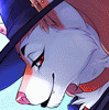
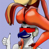
These are some of my pet peeves with clothes. Some of this is style choices but even so.
Category All / All
Species Unspecified / Any
Size 524 x 1024px
File Size 63.3 kB


Learn the power of feathering!
Also, make sure the wrinkles go off the side, etc, and conform to how the clothes fit..tight shirts wrinkle less than looser, but baggy shirts tend to have a few main folds rather than many wrinkles.
Burne Hogarth did a book on clothing wrinkles...you wanna see wrinkles holy fuck that book.
Also, make sure the wrinkles go off the side, etc, and conform to how the clothes fit..tight shirts wrinkle less than looser, but baggy shirts tend to have a few main folds rather than many wrinkles.
Burne Hogarth did a book on clothing wrinkles...you wanna see wrinkles holy fuck that book.


xD It's not a matter of sanity. It's a matter of creating the illusion of depth in a piece of art (at least that's the case being made by the third part.) Little details like that can make a huge difference. As for the additional lines on a shirt, that's more of a, as Onta said, stylistic choice.

Actually, guys? You might have hit on it- I've skimmed your posts, but it's that the sleeve on the bottom of the arm stretches with the arm in the first pic, when on the right, it doesn't, since when you bend your arm like that, your muscles shift and the back of the arm stretches longer, while a shirt would be unable to follow.

It is unfortunate that underwear doesn't exactly highlight, outline, and emphasize one's package as it seems to do in 98% of porn here. The world would be a much more awesome place if there were underwear that did that, but instead, it seems only to . . . compress and flatten or be entirely non-indicative of anatomy, depending on its design.


Some of those are good points. Though when people start off drawing clothes, and experiment with folds and wrinkles in them, sometimes they'll exaggerate and make too many wrinkles and folds as they get the hang of it. I'd rather they do that for a little while than never learn to do wrinkles at all. Though if it hadn't occurred to them already, it'd be a good way to improve.


All fabric follows some basic principles. Baggy clothes tend to have bigger folds. Usually you'll see lots of folds on a shirt with a thin "limp" fabric (I'm not sure what the acutal word for it is, but when a frabric doesn't have the strength of cotton it tends to have more folds around key areas like the waist.)


Usually I would agree, but occasionally I'll be admiring a piece of art and suddenly realize that the pattern on the shirt is flat. And it works.
BUT - and it's a big but (similar to my own butt) - the artist didn't allow that pattern to be the be all and end all of their work. They took that flat pattern and manipulated it and worked with it and PUSHED highlights and shading into it. It works best with simple non-repeating floral patterns. It will never work with stripes or plaids, though, and people who abuse plaids like that need to diaf.
A good example of someone who intentionally uses flat patterns in nearly all their work is Yu Kagei.

I've been guilty of all these things, but I've gotten over most of them.
the seam thing I think has plenty to do with how much blank space you're working with. There are some that I always include, but occasionally minor seams/hems would make things too cluttered, especially if the lines are thick and your image is small. Also, sometimes it's better not to put a line, but indicate a shadow.
But yeah, some of these things are pet peeves of mine. In my own work. If others don't do them, I generally ignore it...unless they're asking for a critique. XD


Comments