
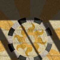
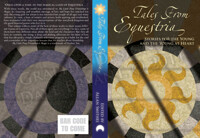
Just to prove I’m not dead: These are thumbnail versions of a collaborative project on which I’m working with the talented MCA Hogarth. Derived from a couple of her books, The Aphorisms of Kherishdar and The Admonishments of Kherishdar—which I also designed and laid out—these designs display words from the language of the Ai-Naidari empire in which the books are set, along with definitions in English of their meanings. They’re available now from her Zazzle store on T-shirts and coffee mugs.
The typeface used for the words themselves is Zapfino, which has been included on every Macintosh computer since OS X began shipping. However, it’s only in the last couple of years that graphic designers have “discovered” it, with predictable results—one sees it everywhere. What most designers apparently fail to realize is just how astonishingly versatile the typeface is: Every capital letter is available in four variations, every lower-case letter is available in three to eight variations (depending on the letter), and there is a host of ampersand variations, ligatures, dingbats, and other characters. Most designers use only the default glyphs that appear during normal typing, without exploring the alternate versions, which is a real pity, given the effectively nearly infinite possibilities of different combinations.
The typeface used for the words themselves is Zapfino, which has been included on every Macintosh computer since OS X began shipping. However, it’s only in the last couple of years that graphic designers have “discovered” it, with predictable results—one sees it everywhere. What most designers apparently fail to realize is just how astonishingly versatile the typeface is: Every capital letter is available in four variations, every lower-case letter is available in three to eight variations (depending on the letter), and there is a host of ampersand variations, ligatures, dingbats, and other characters. Most designers use only the default glyphs that appear during normal typing, without exploring the alternate versions, which is a real pity, given the effectively nearly infinite possibilities of different combinations.
Category Designs / Abstract
Species Unspecified / Any
Size 500 x 321px
File Size 48.7 kB
Listed in Folders
I deliberately shrank it down for several reasons. One was to emphasize the design over the text, since that was my part of the project. Another was to scotch any attempt to make off with the intellectual property, of course. A third was to encourage people to seek out the merchandise—mercenary, perhaps, but the point of the exercise was to create things people would want to buy.
To paraphrase, the Ai-Naidari word means “perspective”, in the sense of seeing oneself in the context of everything else. With more than a hundred thousand languages in the world—and once upon a time a million or more—it’s inevitable that any word one can make up probably has a homophone somewhere.
To paraphrase, the Ai-Naidari word means “perspective”, in the sense of seeing oneself in the context of everything else. With more than a hundred thousand languages in the world—and once upon a time a million or more—it’s inevitable that any word one can make up probably has a homophone somewhere.

 FA+
FA+



Comments