 FA+
FA+
484
Views
Views
10
Favorites
Favorites
Category
Artwork (Digital) / Animal related (non-anthro)
Species Bat
Size 886 x 731
File Size 277.8 kB
Report this content
More from delectable


Just trying to doodle before I go to work this evening. I don't think I'll finish this, it looks so sloppy.
Fat bat chasing a fat moth. I have no idea how to draw moths, apparently!
Fat bat chasing a fat moth. I have no idea how to draw moths, apparently!
Category Artwork (Digital) / Animal related (non-anthro)
Species Bat
Size 886 x 731px
File Size 277.8 kB


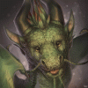


A very nice and cheerful picture, seems like that pear-reclining bat has finally awoken and is hungry again. You have a very rare capacity for the cartoonish and stylized drawing, getting all the proportions just right at the same time as raising the level of expressiveness to the flamboyant level that we have grown to expect and admire in cartoons. It is a great boon if you will capitalize on that style, although it may clash with the more realistic ways of depicting stuff should you venture there. Then again, it seems like you've been drawing for quite a bit before you started uploading your works here, so what I take for an inherent talent may as well be a hard-earned skill that you strove hard to obtain, so I beg pardon there. Of peculiar note is how the sketchy blue lines that the digital inking is superimposed on work as both shading of sorts and action lines that add to the motion of the picture.
Wish you success !
Wish you success !
You are just the sweetest commenter! Thank you.
I'm very encouraged and flattered to hear all of that! I have indeed been drawing for most of my life before beginning this account at FA, I am not sure if my style is a hard-earned skill or just me trying to play around with images that please me. I have never really been instructed on how to draw this or that, everything I do is mostly experimental in that regard (as for realism vs. cartoonish).
And I think you're on to something about the undersketch. I always love sketching much more than finishing pieces, honestly, but my quicker idea-jotting style is usually so sloppy that no one can tell what I've drawn until I line over it like in this picture. But I do think my original sketches retain so much more motion and life somehow, it almost makes me sad to line over them - they become stiff :( I'm still learning how to ink properly I suppose!
Thank you again :)
The treacherous thing about lines is that they don't really exist in reality. All that we are accustomed to perceive as solid lines is usually shade in one way or another. Real life objects don't have contours, either, at least not in a well-lit space, but it'd be extremely difficult to draw without those artificial borders. Seeing how our eyes work, constantly roaming around the focus area, any picture drawn with a lot of sketchy lines can be more believable than even the most accurate solid linework, although smaller count of lines is easier on the eyes. The same can be applied to the drawing process, sketching being more in tune with how we imagine what we want to convey, while inking is used to finalize and solidify the object once it's basic orientation and position has been established. All the comic-book action lines are the same act of solidification, but not of objects themselves, but the impressions that their actions and interactions make. Very curious stuff, that is. Pardon my ramblings, a lot of obvious things there.
I forgot to compliment you on wings, by the way. True, realistically they should be about twice their present size, but it works in your style neatly without any visual discomfort whatsoever. Scale aside, the membrane and digits are all aligned and rendered very nicely, kudos on that. Wings are among the several pieces of anatomy that I'm absolutely mortified by when it comes to drawing them.
I forgot to compliment you on wings, by the way. True, realistically they should be about twice their present size, but it works in your style neatly without any visual discomfort whatsoever. Scale aside, the membrane and digits are all aligned and rendered very nicely, kudos on that. Wings are among the several pieces of anatomy that I'm absolutely mortified by when it comes to drawing them.
That's all very true! It's one of the difficult parts about trying to make someone understand the drawing, too. Since lines don't exist in our everyday sight, unless they're drawn cleanly and purposefully it can be difficult to get a viewer (especially a non-artistic one) to piece together what the lines really mean. Color and shading add more depth and understanding to a lined piece, so a completed image is less of a problem. But sometimes I show my sketches/linework to people and they can't understand them at all. It's all very interesting.
Thank you! I don't believe they're worthy of compliment myself, but I appreciate it all the same. The only reference I had in my mind was from a book I owned as a child, Stellaluna, that had anatomical descriptions of bat wings comparing them to human hands in the back of it. It's been a long while so I could probably stand to look up more reference than that, especially in relation to wing size, heh.
Thank you! I don't believe they're worthy of compliment myself, but I appreciate it all the same. The only reference I had in my mind was from a book I owned as a child, Stellaluna, that had anatomical descriptions of bat wings comparing them to human hands in the back of it. It's been a long while so I could probably stand to look up more reference than that, especially in relation to wing size, heh.

Mmmm, moths!
Love this a lot. To follow up on some of what AstroNommy said, the curve of the wing membrane works much better in the undersketch. Otherwise, the wings look great, and those are the Hard Part about drawing bats.
I love the way the legs are in a running pose, as if he's running madly but can't quite make it off the ground -- which in turn suggests that the fat little moth is a little to nectar-full to gain enough altitude to escape.
Comments