 FA+
FA+
195
Views
Views
2
Favorites
Favorites
Category
Artwork (Traditional) / Portraits
Species Rabbit / Hare
Size 462 x 600
File Size 550.8 kB
Report this content
More from Akorr


Wrong Marvel, comic history and what-not. "Disney's releasing 'The Marvels'"
They can't do that! They don't own-oh, oh that's right. That's right. Fine.
"We'll call them the Shazamily" No >:C
I digress!
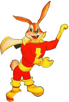
I wanted to play with a metallic sort of effect. As in making something look reflective or metallic So I used this little runny-babbit as a subject. I made a horrible choice in paper. Things didn't work out in the end. However, hey I learned some things and I imagine Hoppy is right up this place's alley, so here he is.
The initial comics Hoppy appeared in are even public domain! Silly-billy-runny-babbit: https://comicbookplus.com/?dlid=30172
They can't do that! They don't own-oh, oh that's right. That's right. Fine.
"We'll call them the Shazamily" No >:C
I digress!
I wanted to play with a metallic sort of effect. As in making something look reflective or metallic So I used this little runny-babbit as a subject. I made a horrible choice in paper. Things didn't work out in the end. However, hey I learned some things and I imagine Hoppy is right up this place's alley, so here he is.
The initial comics Hoppy appeared in are even public domain! Silly-billy-runny-babbit: https://comicbookplus.com/?dlid=30172
Category Artwork (Traditional) / Portraits
Species Rabbit / Hare
Size 462 x 600px
File Size 550.8 kB

I like the way the metal effect has come out on the cloak's trim. :D
I think after seeing in the comic that Hoppy is actually sort of pink furred, I would have liked to see him done in pink here to match the original character. Though this is a very nice rendition regardless, and in a way it feels more natural too.
I think after seeing in the comic that Hoppy is actually sort of pink furred, I would have liked to see him done in pink here to match the original character. Though this is a very nice rendition regardless, and in a way it feels more natural too.
Hoppy's an interesting one, he appears pink in most of the comics. Though in others he's more of a tawny brown, in all fairness not this dark that was a product of my color choices and not thinking ahead ^^' Or I suppose that's how I read it.
http://www.comicbookreligion.com/im.....rvel_Bunny.jpg
https://image.isu.pub/160807235526-.....jpg/page_1.jpg
https://dyn1.heritagestatic.com/lf?.....oduct.chain%5D
Kind of like cartoon will use pale blue in place of greys to keep things on the more saturated side (think Georgette from "Oliver and Company")
I suspect the pink may be from the printing color limitations on the time? As that particular issue linked is from 1942.
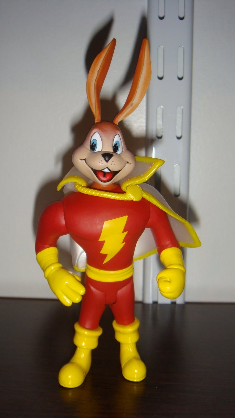
The merch of him is pretty mixed bag too XD:
https://www.hakes.com/Image/MediumR.....79/1/image.jpg
http://www.toysaroundtheclock.com/a.....pytherabbi.jpg
Modern depictions/items for the sake of transparency
http://3.bp.blogspot.com/_c9wxqxqfh.....0/DSC04267.JPG
https://thumbs.worthpoint.com/zoom/.....691a34cddb.jpg
https://lh3.googleusercontent.com/p.....Y7dSDt0lEymtGM (<- How he appears in "Tiny Titans" so probably doesn't "count" much but come on, he's cute)
I was planning on drawing another anthro character from Captain Marvel/Shazam, Tawky Tawny: https://comicvine.gamespot.com/tawk.....wny/4005-6273/
Perhaps pink Hoppy could make an appearance too? It'd be good practice.
I'll admit a large part of why I went with the brown coat is I'm more comfortable with it ^^'
(I want to do a piece with Hoppy, Tawny and Mr.Mind: https://comicvine.gamespot.com/mr-mind/4005-9336/
based on their 1940's designs because they're more fun. DC has been un-funning Shazam lately, how dare they do what they want with their own property. The audacity>:C)
/rambleramble
http://www.comicbookreligion.com/im.....rvel_Bunny.jpg
https://image.isu.pub/160807235526-.....jpg/page_1.jpg
https://dyn1.heritagestatic.com/lf?.....oduct.chain%5D
Kind of like cartoon will use pale blue in place of greys to keep things on the more saturated side (think Georgette from "Oliver and Company")
I suspect the pink may be from the printing color limitations on the time? As that particular issue linked is from 1942.
The merch of him is pretty mixed bag too XD:
https://www.hakes.com/Image/MediumR.....79/1/image.jpg
http://www.toysaroundtheclock.com/a.....pytherabbi.jpg
Modern depictions/items for the sake of transparency
http://3.bp.blogspot.com/_c9wxqxqfh.....0/DSC04267.JPG
https://thumbs.worthpoint.com/zoom/.....691a34cddb.jpg
https://lh3.googleusercontent.com/p.....Y7dSDt0lEymtGM (<- How he appears in "Tiny Titans" so probably doesn't "count" much but come on, he's cute)
I was planning on drawing another anthro character from Captain Marvel/Shazam, Tawky Tawny: https://comicvine.gamespot.com/tawk.....wny/4005-6273/
Perhaps pink Hoppy could make an appearance too? It'd be good practice.
I'll admit a large part of why I went with the brown coat is I'm more comfortable with it ^^'
(I want to do a piece with Hoppy, Tawny and Mr.Mind: https://comicvine.gamespot.com/mr-mind/4005-9336/
based on their 1940's designs because they're more fun. DC has been un-funning Shazam lately, how dare they do what they want with their own property. The audacity>:C)
/rambleramble
That makes some sense. I did notice that it was dated 1942 and wondered about colour print limitations. I had noticed on some of the strips, certain bits that aren't coloured or should possibly be white or whatnot are just the background colour, which is sort of cream/beige. I think the beaver's teeth at one point was a highlight of this for me.
I can't say I was familiar with the character (I also have never read comics very much at all) and while I'm not especially fond of pink as a colour actually, after seeing all the linked images, I think I would still prefer him in pink because it does seem to fit the character, to me. I think your dark brown is more appealing than some of those examples you linked, too.
Also, thanks for pointing out the blue in place of greys thing, I don't think I'd ever noticed it (consciously) and I'll be paying more attention to that in the future.
Yeah, I can't explain that. Normally I'd assume that it was deliberate, using the white of the paper as white. Then it simply yellowed with age (that's why so many sketchbooks and such tout "Acid Free" and "Archival" one's marked as such the pages aren't supposed to yellow with time). But given there are many areas clearly colored white that's clearly not the case.
Could be as simple as the artist missed it (perhaps because at one point it would've been white on white when it comes to the originals/hard copies) to misprints.
I'll admit I read about comics a lot as a kid and teen, but only actually started reading comics themselves in the past year or so. Young Akorr was scared of being judged by family and friends, comics were "boy" things. Mom and "friends" very much wanted little Akorr to be Molly Ringwald in Breakfast Club.
Molly Ringwald Akorr was and is not XD
I definitely recommend skimming through that site, see if anything catches your eye as everything there is public domain therefore free.
So you can poke at (albeit old) comics and such of various types and see if they're something up you're alley without putting a ton of money into it. Especially since it might not be your thing, y'know?
I've gotta finish the background of another project but once I finish that Pink Hoppy is on my to-do, he'll be a good challenge. Or make me regret my decisions, one of the two :P
Yeah I suppose it could be some kind of misprint or error; I think I remember seeing that sort of thing in the past, probably in comics my dad had, not sure if I ever gave it much thought before though.
Interestingly I'd recently been watching some of the commentary for the Animatrix, and what you describe was pretty much remarked on in there; the Western attitude (certainly even recently) towards comics, cartoons and that sort of thing being very much like "that's for children", while in Japan the acceptability of comics/cartoons is much wider, though in the West I think it's becoming more normalised because of people growing up and still having those interests too. And yeah, in my teen years I still watched a fair bit of cartoons and on several occasions I remember aunts and such like making the same sort of comment. To some extent others of my age made the same comments but I guess the proportion that did was much smaller.
I did have a quick look earlier today and actually started thinking that it might be a good source of reference. Already did some sketching using a comic there as reference, was thinking about colouring it later today or tomorrow. Also I noticed that comics do a few composition tricks I never really consider on my own, presumably to make better use of the space available in such small squares. So that kind of thinking while I'm reading might also be helpful for me.
Oh, and a "good challenge" sometimes makes me regret my decisions... So I think there's room for both. :P
Comments