 FA+
FA+
783
Views
Views
23
Favorites
Favorites
Category
All / All
Species Unspecified / Any
Size 1200 x 1200
File Size 211.9 kB
Report this content
More from Saara


")
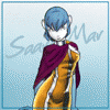
A little while ago "Tim Kangaroo" asked if he could use an old illo of mine for an icon. Actually, he wanted to crop a face out of it. So I said, "sure."
The drawing was based on one of his in the first place. Tim had drawn a couple of skunks having tea under a banner reading "Socieite de Skonques" or something like that. Evidentally, meetings were an opportunity for members to be skunks. I loved the piece, and redid it. The only big change I made was to look up the real French word for "skunk."
Years later, Tim wants to use the face of the "Tim" character as an icon. Other than cropping it, he only dropped a solid pink into the background. That got me thinking. It would only take a little more effort to fully colour the piece. So I did it again -- re-worked Tim's original. This could become a habit.
Category All / All
Species Unspecified / Any
Size 1200 x 1200px
File Size 211.9 kB

Even before reading the description, my first impression was this was definitely something Tim Fay would've done-- Not just the large-rimmed glasses, but that the background colour is typically based on a low-bit GIF colour palate, something that reminds me of his earlier digital imagery. :)
d.m.f.
d.m.f.

Thanks! I was originally going to use a transparent background, but I didn't like the results. I then tried pure magenta, but that was a little too reddish. So I used a pink from the standard palette in Paint Shop Pro (Version 4.x -- which might help explain "retro" look to this particular hue). And the color seemed to suit the "Ma'm'selle."
The only other change I made was to add a dash of black on her tail, to make it stand out a little more.
The only other change I made was to add a dash of black on her tail, to make it stand out a little more.
Yeah, I noticed that. When I recoloured the icon, I didn't use your file (by dragging it from your user page) because it was much too small. (100 by 100 by definition.) I went to the orginal b/w art instead, but found that you must have inked the black underside of the tail higher than on the original. It made perfect sense to do so, in the limited frame. So I repeated it. As for the hue, I don't have any specific pallette in Photoshop -- it can reproduce an infinite number of hues and shades -- so I just eyballed a hot pink.


And, again, let me compliment you on a fine job: first in reworking my original drawing (you can see Saara's version HERE), and then in vastly improving my iconic version of it.
I sure hope this does become a habit!
I sure hope this does become a habit!
I thought you meant reworking other art, not necessarily mine. Though I certainly wouldn't complain if you did. :)
At some point I'd like to sketch a couple of "Ma'm'selle Tim" drawings done more in your style, ala "Nurture," "Nature," and "Taking a Break," just to see what she'd look like. Provided you don't mind, and provided I can get around to doing them. :)
At some point I'd like to sketch a couple of "Ma'm'selle Tim" drawings done more in your style, ala "Nurture," "Nature," and "Taking a Break," just to see what she'd look like. Provided you don't mind, and provided I can get around to doing them. :)
Comments