 FA+
FA+
6510
Views
Views
312
Favorites
Favorites
Category
All / All
Species Unspecified / Any
Size 204 x 1280
File Size 683.4 kB
Report this content
More from Tsampikos

 - sketch")


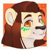
It's not the most efficient way - hell.. it's a big part of my problem with speed nowadays, but this is how I go about selecting the colours I do. I went ahead and put this together for several people in an attempt to better explain my colour selection process.
Step one shows the original sketch. I find most people that doesn't use black to sketch with use blue. I did it because I thought it added something to the mix but in reality I was just parroting people who used 'non photo blue' without ever knowing why and it just became a habit. Moving on.
Step two is the initial laying down of colours. I don't think too hard on it because what is done here will almost definitely change.
Step three is the most important part.... the background. It can be as much (or as little as you want it to be) but in order to select a more appropriate pallet it helps a lot if you have something there as it should influence the main focus. I usually opt for little detail because it's quick and effective. A few puffs of random colour will serve you much better than trying to colour on a black or white background. Hell.. even a flat colour is better but a few seconds added to the BG really couldn't hurt and in my case it helps a lot.
Step 4 is a trial an error phase with blending modes. I usually start off with a multiply layer making a few random puffs of red/purple/violet/blue and proceed to unify some colours or adjust the levels of others with an overlay layer. In this case I used overlay to punch up the contrast and tarken it overall. It was at this point when I realize what type of feelings I wanted to evoke so I adjusted the levels accordingly and darkened the foreground and the edges of the background. I throw a lot of blending modes into the mix but any random splashes of colour/ mode will help. Who knows, it may chance upon something you like better then what you intended! That's what happened to me in this case. One layer I didn't use this time is a colour dodge layer from PS 5.5 to brighten things up significantly. To get this layer in newer versions of photoshop double click on the layer to reach the layer options window and uncheck "transparency shapes layer" and set the mode to colour dodge. To get a similar effect in Sai use the Lumi & Shade layer and try to stick to brighter colours (since this works both like the classic dodge and classic burn on the same layer).
I would also like to point out that I use no actual gradients. Although I may say that I do realistically it's just a few puffs of random colours withing a given layer of large soft airbrushes within a selected area (ie I use selections!). Although it still amounts to what gradients achieve it is very controlled since I am using often oversized brushes to achieve the effect.
Another important layer I used is colour and hue. Although i spend very little time on these layers it helps to bring order into the chaos that may ensue. Although the effects I used were random the end result appears to be much more cohesive because I used colour and hue to bring the colours back, or at the very least more closer to what I originally intended. Before the corrective colour and hue layers it was actually a lot heavier on the reds and greens until I canceled most of it out.
Step five. With a much better idea as to what I wanted I cleaned it up and adjusted the levels even further accordingly. From here it's just a matter of how much you wan to clean and how many details you want to add. Seeing as how this was just a sketch (didn't take more than two hours.. I forgot how long it took exactly) I didn't push it any further. I took the easy way out and just use a texture of rust for the background.
Category All / All
Species Unspecified / Any
Size 204 x 1280px
File Size 683.4 kB


I can't speak for anyone else, but I actually don't like sketching in black. It ends up looking harsh (or at least I think so). Even pencil isn't really 'black'. I use blue, gray, pink, whatever, instead. Thanks for posting this. I feel like I'm trying to learn my fundamentals all over again that everyone else here already knows, so seeing this is really interesting.
Comments