 FA+
FA+
674
Views
Views
39
Favorites
Favorites
Category
Artwork (Digital) / Fantasy
Species Feline (Other)
Size 732 x 1280
File Size 73.4 kB
Report this content
More from V-Deus


Now with more clothing! This is how I imagine these feline-y people would go about dressing. Well, the males, at least. I assume the women wouldn't be wearing open chested tops. :P
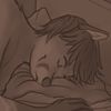
This is a concept for a comic I've all but dropped from my memory. This was the only anthro race in it.
This is a concept for a comic I've all but dropped from my memory. This was the only anthro race in it.
Category Artwork (Digital) / Fantasy
Species Feline (Other)
Size 732 x 1280px
File Size 73.4 kB


I forgot the tail in one of my pictures once too:s It was a little embarresing cos it was a subject that everyone could see was SUPPOSED to have a tail:p That's why i thought about it with this picture... I saw it last night, but i was to tired to comment on it then:p
This picture looks great btw, it reminds me of something one could expect to see in a booklet about a game like FF^^, You know, where they tell about the characters:)
I don't know if it is the paper you've used or if it's some photoshop effect, but the rough looking background gives the picture the perfect look:p
Thanks a ton. :D
The background is a grunge brush on low opacity and on texture setting. I used a dark blue colour, and the basic tan colour to blend. And the character's colours have the slightest bit of noise applied to give it an almost unnoticeable tooth to the image. :3
The background is a grunge brush on low opacity and on texture setting. I used a dark blue colour, and the basic tan colour to blend. And the character's colours have the slightest bit of noise applied to give it an almost unnoticeable tooth to the image. :3

I really like how this is set up and balanced. I haven't had the time, or ability to make time to to things like this. Also my lack of skill in digital art :P Self teaching is hard! I wish you would remember your comic it would be really neat. I'm planning on eventually.. once i'm settled making one myself. But the coloring on this is awesome... these natural based tone really speak to me.


sometimes you love peoples' avatars but they're totally irrelevant to anything you can find in their gallery. i was happy to find this staring me in the face as soon as i got to your userpage :D it's lovely and the composition is so perfect. nice muted colors too.


Also, his right knee is farther back than his left. Reasons for this position could be different angles in the feet, but this is not so, they are the same. It could also be caused by foreshortening. But the way the crease at the knee is and the position of the kneecap cause it to look like it is facing away, rather than towards you. Move the crease of the knee back and have more of the kneecap showing.
Wow, thanks for the critiques! I'm glad you took the time to look at it.
The foot's position should not be under the butt, and I shall tell you why: his posture does not have the weight of the butt applied to the heels. The line of support misses the butt and instead travels to the balls of the feet. The biggest factor in this is the forearms resting on the legs.
You're right about the toes and the kneecaps. His right leg was supposed to have some foreshortening, but the line from my sketch wasn't erased, making it look like we're getting a straight-up profile shot of the knee.
Thank you for favouriting it, and thanks again for the crits! :D
Sorry to be critiquing you so much, but this piece is really good and only tiny things are wrong with it (that's the kind of thing I'm best at pointing out- things that no one else notices.) If you want, I could redline the parts that I'm talking about (though I don't have a wacom I just have my mouse) PM me if you want more critiques! :)
Yeah, I should. I just need to get over a few hurdles first. Examples: I'm not good at sequential art, and the story contains a world that is only young adults, which I really hate. They're being born, dammit. There should very well be adults and kids and seniors there. I just don't know how something even as simple as that would be thrown in. :(


The balance is good, and I love the colors. His expression is also excellent!
Most though, I like your style. The strokes and the contrast in colors is very expressive, and the whole piece is harmonious. I would expect to see this in a professional book illustration(or comic).
Most though, I like your style. The strokes and the contrast in colors is very expressive, and the whole piece is harmonious. I would expect to see this in a professional book illustration(or comic).

Comments