 FA+
FA+
777
Views
Views
68
Favorites
Favorites
Category
All / Muscle
Species Dragon (Other)
Size 595 x 683
File Size 155 kB
Report this content
More from Oro
 Cry of the wolf")


")
")


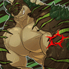
I dunno if i like this one...im thinking itr was awaste of the new techniques ive been looking at. This is obviously Durge as this picture was the best i had to shade, no lines on here now, all just colour.
Sorry for putting this up when i should be posting commissions...but no one will see it anyway and one of my backup stache cant hurt.....well..enjoy i guess.... sorry again
Sorry for putting this up when i should be posting commissions...but no one will see it anyway and one of my backup stache cant hurt.....well..enjoy i guess.... sorry again
Category All / Muscle
Species Dragon (Other)
Size 595 x 683px
File Size 155 kB


It looks like a wonderful start!
I think it lacks deeper tones (Like you could go one or two shades darker, and have it look more "defined"). Most of what you've developed seems to be all the same saturation which does cause it to look flat. If you look at your skin (or a lizard in this case XD) the light areas would be either bleached out (light wise) or receptive of the colour in the room. As you progress in tone, you progress in saturation as well (This is all kind of interdependent and a judgmental thing but a good starting point I feel)
I'm liking that you are experimenting with blending and "pre-shading" an orb to base your colours off of.
BEWARE A TRANSPARENCY BRUSH FOR YOUR EDGES! I would really recommend experimenting with clipping masks and layer masks so you can colour and still have an edge YOU COULD CUT YOURSELF ON!
What are those blending things you got going on in the top corners? I would like to be enlightened as to their nature.
Keeeeeep going! It's nice to see someone thinking outside "linework" every once and awhile ^_^
Well the blending bits were where i found my sources of light and dark and made varying degrees of the mid tone colour across it to find the shades which would work best. Not my smarted idea but it went...ok
Thank you for your really helpful and my first actual handy critique in months and months. The clipping masks might work and yeah i probably shouldnt use transparency but i was new to it.
Also sadly i agree, it needs more contrast with darker tones, but i always find i get nervous and over exaggerate them so they look silly.
The midtone on a skin is usually completely different, but it's a good start anyway for spheres and such.
Somone has to do it!
Practice and experiments are all that you need to really get comfortable. Some artists look at other great works to see how someone else did it, and then try to copy in their own way as a study piece.
Also: conceptart.org
Somone has to do it!
Practice and experiments are all that you need to really get comfortable. Some artists look at other great works to see how someone else did it, and then try to copy in their own way as a study piece.
Also: conceptart.org


Comments