 FA+
FA+
764
Views
Views
31
Favorites
Favorites
Category
Artwork (Digital) / Comics
Species Dog (Other)
Size 539 x 1280
File Size 455 kB
Report this content
More from Fiz


heh
Category Artwork (Digital) / Comics
Species Dog (Other)
Size 539 x 1280px
File Size 455 kB


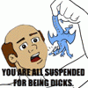
Isn't it kinda the standard for professional comics? Or have they switched over to verdana? Looking back at the latest from Dark Horse they still use it, they just use it with all capitals except for some lowercase l's which they appear to put in the place of all i's that aren't being used for the start of a sentence, a person, or a name.
Wait, my bad. Jesus I wish FA would implement an edit button. =/ But yeah, Comic Sans looks almost identical to the font that's been used in comics for decades now. And looking over at the latest AvP comics form Dark Horse, it looks like the differences that were present in older publications have vanished. Most notably how in the older comics, the letter S seemed to have a more jagged, straightened top half. Though U's still seem to have a narrower, more pointed bottom in the professional publications than in Comic Sans.


To me it just looks like More Different Word Shapes. And I spend kind of a lot of time looking at words.
I just don't see what there is to get at all worked up over. I'll agree that there are varying levels of quality among fonts, but not so much that people should actually hate or love them. :P
I just don't see what there is to get at all worked up over. I'll agree that there are varying levels of quality among fonts, but not so much that people should actually hate or love them. :P

Basically it's a font that gets overused in the "wrong" situations by a lot of people. Naturally this doesn't bother most people, except for those that deal with typography regularly, for example artists who make comics and deal with graphic design. Whenever they see someone who should probably be thinking better about their choice in font not doing so, it enrages them. D: at that point the only thing that can calm them is an episode of their current favorite show, or the corpse of the individual that made them so enraged. ._.


Comments