 FA+
FA+
936
Views
Views
26
Favorites
Favorites
Category
Artwork (Digital) / General Furry Art
Species Unspecified / Any
Size 750 x 972
File Size 140.2 kB
Report this content
More from RailRide


")
")


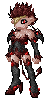
My entry for a contest dreamed up by  zinacat
The concept: Draw Zina's "Tristan" interacting with one of your characters.
Hey, crossovers are interesting. I even declare it in my profile. So, after a few days of thought, I got a concept and started on it a week before the original deadline of February 28 (subsequently extended to March 20).
The character of mine? Cynthia, chosen because she'd appreciate Zinacat's humor the most (as well as Tristan's shadier traits). The (suggested, but by no means mandatory) theme? "Music". And what is she listening to that's prompted Tristan's reaction? Kramer Racist Rap (caution: lots of "N" words, if you didn't already know).
Production Notes:
--In the original inks, Cynthia's head was too big, and I only noticed this after doing the flat colors. I had to clip out her head, remove the color, and turn it into a 2-bit lineart file in order to reduce it without the smoothing that would ordinarily occur in a color file (and would have been a pain in the bodunkus to re-color). Then paste it back into the image and stitch the linework back together and recolor.
--The backdrop doesn't exist in the original, it was added behind the characters after flatshading. My art app, Micrografx Picture Publisher, doesn't have layers in the sense that Photoshop has, but it does let you create floating objects that can be manipulated seperate from the base image. Thus I made an object of the two characters, pasted them atop a blank full-page object which was in turn created over a quick sketch of the backdrop traced over the original inks. I then "inked" the sketch with a straight line tool and discarded the sketch. If that's how most folks around here use layers in PS, so be it.
--A first for me: colored linework. I've dabbled with it before, but this is my first image composed almost entirely of it. And it wouldn't have happened without a short conversation with refleximage that gave me the idea to simply select the linework at the flat color stage and paint atop it. This proved to be an enormous timesaver, as it would have been insanity to seperate all those lines for bucket-filling.
--I was originally going to cel-shade this, but airbrush shading looked better with the colored lineart so, I made it so.
--Whoo! 98 megabytes of data (because I keep full-size versions of all the major stages--then I GIF-ed the flat-shade versions and it shrank to a mere 50 megs)
--Test sketch is now up in my scraps folder.
 zinacat
The concept: Draw Zina's "Tristan" interacting with one of your characters.
Hey, crossovers are interesting. I even declare it in my profile. So, after a few days of thought, I got a concept and started on it a week before the original deadline of February 28 (subsequently extended to March 20).
The character of mine? Cynthia, chosen because she'd appreciate Zinacat's humor the most (as well as Tristan's shadier traits). The (suggested, but by no means mandatory) theme? "Music". And what is she listening to that's prompted Tristan's reaction? Kramer Racist Rap (caution: lots of "N" words, if you didn't already know).
Production Notes:
--In the original inks, Cynthia's head was too big, and I only noticed this after doing the flat colors. I had to clip out her head, remove the color, and turn it into a 2-bit lineart file in order to reduce it without the smoothing that would ordinarily occur in a color file (and would have been a pain in the bodunkus to re-color). Then paste it back into the image and stitch the linework back together and recolor.
--The backdrop doesn't exist in the original, it was added behind the characters after flatshading. My art app, Micrografx Picture Publisher, doesn't have layers in the sense that Photoshop has, but it does let you create floating objects that can be manipulated seperate from the base image. Thus I made an object of the two characters, pasted them atop a blank full-page object which was in turn created over a quick sketch of the backdrop traced over the original inks. I then "inked" the sketch with a straight line tool and discarded the sketch. If that's how most folks around here use layers in PS, so be it.
--A first for me: colored linework. I've dabbled with it before, but this is my first image composed almost entirely of it. And it wouldn't have happened without a short conversation with
 refleximage that gave me the idea to simply select the linework at the flat color stage and paint atop it. This proved to be an enormous timesaver, as it would have been insanity to seperate all those lines for bucket-filling.
--I was originally going to cel-shade this, but airbrush shading looked better with the colored lineart so, I made it so.
--Whoo! 98 megabytes of data (because I keep full-size versions of all the major stages--then I GIF-ed the flat-shade versions and it shrank to a mere 50 megs)
--Test sketch is now up in my scraps folder.
Category Artwork (Digital) / General Furry Art
Species Unspecified / Any
Size 750 x 972px
File Size 140.2 kB
You put me to shame! I bow to your superior technique! Most people (myself included) choose a darker color for the lineart, but this works much better in the areas that you didn't (her hair and the black portions which I typically leave black.)
Well done all around! Thanks for the shameless plug too! Colored lineart proponents unite!
Well done all around! Thanks for the shameless plug too! Colored lineart proponents unite!
I never noticed there was a pattern to the lineart color choices :) I just arbitrarily chose to use a lighter shade around colors that were...well, just dark beyond a certain imaginary point. Funny how innovation can just...happen.
Thanks for the compliment!
Thanks for the compliment!


Comments