 FA+
FA+
364
Views
Views
10
Favorites
Favorites
Category
Designs / Animal related (non-anthro)
Species Western Dragon
Size 362 x 485
File Size 93.8 kB
Report this content
★
More from Stormslegacy


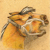
Still practicng my tribal style. This is a more open and linear one than the others I've uploaded. I really love the lines.
I noticed the rat one I had uploaded had a lot of roundness to it. I wanted to try something a bit more sharp and a dragon just seemed natural =)
I really loved this one, and dragons are popular so i wanted to restrict it's use, that's why there's a watermark. I don't mind giving permission, but I want to know when it's used.
I'm working out a price structure for taking commissions. I want to tidy up my linework first =)
If you are interested in using my designs, the rules are here:
http://www.furaffinity.net/journal/1813776/
Category Designs / Animal related (non-anthro)
Species Western Dragon
Size 362 x 485px
File Size 93.8 kB


Responding to your request for critique...
I'd like to start by saying your linework here is good, bold, and confident. :) There's a little angularity to some of the curves which I think could be tweaked (particularly at the base of the "fire"), but for the most part your curves flow well. My only really large critique from a design standpoint is to really push the shape of the wings, expand them and make them more of a focus. The ones here seem a bit understated.
Hope this helped!
Ohh I didn't think of doing that to the wings--they were almost added as an afterthought and it does show a bit. Maybe if I did them more like the body and the fire I could really get a nice trangular composition...definitely worth attempting in the nest version =) I hadn't noticed that about the fire, you're right! I think that's what's making it look "off" to me.
Thank you!
Thank you!
Comments