 FA+
FA+
2249
Views
Views
98
Favorites
Favorites
Category
All / General Furry Art
Species Bear (Other)
Size 964 x 1280
File Size 449.7 kB
Report this content
More from volkenfox


Listed in Folders


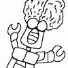
Here we have Breanne coming out of her apartment in the winter to head out for some errand, class, seminar, or perhaps just for fun.
I tried to go beyond a basic background again. I figure if I keep trying every so often, it will be good practice. I know the steps leading to the door in the back are very small, it was a mixture of perspective issues on my part and me trying to get the steps to match the character's pose.
As for Breanne herself, I went and tried adjusting her design to make her seem more bearish than before. I also wanted her to seem more mature than some of my other characters without looking too serious, though that's still a work in progress. The goal I sort of have in mind right now is to make Sasha look more like an undergraduate, where Breanne looks more like a grad student. I've also been playing around with trying to push her physique toward thick and stocky rather than simply being fat in effort to keep her build similar to what one might think of for her species. Her design will probably continue to evolve beyond this point, but I felt like it was a good start in the least.
I based this picture off pieces from various references. I tried to get the upper body pose from one photograph, some help with the leg anatomy with another photograph, and then I looked up some drawings of bears for help on the face. As for the background, I just went and searched for Brownstone Apartments on the internet and checked out the various images.
Credit to farx and
  vdisco for tips throughout, and to
  gillpanda for brainstorming ideas for the glass in the background.
I hope you all enjoy it.
I tried to go beyond a basic background again. I figure if I keep trying every so often, it will be good practice. I know the steps leading to the door in the back are very small, it was a mixture of perspective issues on my part and me trying to get the steps to match the character's pose.
As for Breanne herself, I went and tried adjusting her design to make her seem more bearish than before. I also wanted her to seem more mature than some of my other characters without looking too serious, though that's still a work in progress. The goal I sort of have in mind right now is to make Sasha look more like an undergraduate, where Breanne looks more like a grad student. I've also been playing around with trying to push her physique toward thick and stocky rather than simply being fat in effort to keep her build similar to what one might think of for her species. Her design will probably continue to evolve beyond this point, but I felt like it was a good start in the least.
I based this picture off pieces from various references. I tried to get the upper body pose from one photograph, some help with the leg anatomy with another photograph, and then I looked up some drawings of bears for help on the face. As for the background, I just went and searched for Brownstone Apartments on the internet and checked out the various images.
Credit to
 farx and
  vdisco for tips throughout, and to
  gillpanda for brainstorming ideas for the glass in the background.
 I hope you all enjoy it.
Category All / General Furry Art
Species Bear (Other)
Size 964 x 1280px
File Size 449.7 kB


"Dude, she's giving me that look again. You know? Like that look that says 'I'm so gonna hit you if you don't look up at my face.' I can't look at her face, man. What do I do?!?
I really like her redesign; it really brings out her character. The look your going for for her, that stocky look? It plays out real well...I'm hard pressed to find anything wrong with the picture myself! If anything...it would have to be the stairs. On the 3 top right corners, it looks rushed; perhaps you forgot to polish up that area? And for the lowest stairs at the center...I don't know why, but the dimensions look slightly flat. I can't explain why, but they just do.
As for Breanne, I can't find something wrong with either her design or outfit. Moving forward, you might want to either slightly thin out her thighs or add a tiny bit of padding to the stomach/upper body. But other than that, it's very good. Kudos, man!


Comments