 FA+
FA+
476
Views
Views
3
Favorites
Favorites
Category
Artwork (Digital) / Doodle
Species Unspecified / Any
Size 1280 x 1043
File Size 222.4 kB
Report this content
More from ARCR-CRic


Listed in Folders

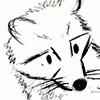
Saw some people asking this question and thought on doing the same ^^
Category Artwork (Digital) / Doodle
Species Unspecified / Any
Size 1280 x 1043px
File Size 222.4 kB
Listed in Folders

When you collect art long enough, you get used to an artist's style. One artist does art differently than another. Jim Starlin does art differently than John Byrne. Shawntae Howard does art differently than Rock Baker, yet all 4 of them do art. Watermarks help, if the artist in question includes one, it means the thief must also have something like Photoahop to remove it. Those of us who are older art collectors, can usually tell, and if something is presented as something else, we can sometimes tell on the outset that we are trying to be fooled. and this will raise red flags on our part.
Lately I've been putting a small reference to my website on the bottom corner of my drawings in case they somehow get shared in other places, so people interested can find the source easily. I personally don't like adding watermarks as they can get distracting, since I don't publicly post images in high resolution (thanks to FA's limitations) it would be easy to prove ownership if someone would ever bother stealing what I draw ^^


or those.
I used to read the MAD magazine a lot. the german issue fell behind at some point for reasons no one knows, and in the end was a year behind when it got canceled. couple years later another publisher picked up, and added 60% german-made content (including special artist Peter Kuper) and I started reading it again. a while after, Don Martin died, and they had an epitaph-page with possible reasons for Don's demise, including "died in search of the perfect toe".
I used to read the MAD magazine a lot. the german issue fell behind at some point for reasons no one knows, and in the end was a year behind when it got canceled. couple years later another publisher picked up, and added 60% german-made content (including special artist Peter Kuper) and I started reading it again. a while after, Don Martin died, and they had an epitaph-page with possible reasons for Don's demise, including "died in search of the perfect toe".

first, the overall art style. if one looks at a gallery long enough the gallery, err... looks back? personally I like to see distinctive art styles. I don't understand why skilled artists would emulate a certain style to the point you can't tell the difference anymore. don't they want to be recognized for their work?
the way you design your critters, the details, the colours... it all becomes a certain art style. I maybe won't be able to analyze it, but there.
when I was a wee lad I copied characters and stuff from comic pages. but soon I stopped, because I didn't wanted to be a copycat (ha!). when I started to draw animal people for real one of my goals was to make it my own art style, and the other goal was to make them look as believeable as I could muster.
am I successful? let the audience decide.


Oh! It wasn't a journal entry after all, I remembered it wrong!
The get the common properties of your work out of the way first, I place you in the same constellation as priscillasheep,
  mulefoot,
  vosyl,
  fauxlacine, and
  seyorrol (when they are in the more scaled-down, traditional media mood, like with this piece); the works done in this substyle rely on a combination of well-studied realistically depicted animal and human anatomy, with very little catroonish stylistic shortcuts, often resulting in producing slight awkwardness in poses and expressions, almost an uncanny valley feel, but they also possess an atmosphere of much greater creative maturity than furry art is usually associated with, especially when the thin wiry linework is employed with a pastel earthy palette.
There are other primarily realistic styles that are distinguished from the one I'm describing either in incorporating some of those simplifications to smoothen the edges, or hide the most awkward seams between the animal and the human with clothing, angles and hair.
I really admire this style, and enjoy it for the more ruminative and intelligent scenarios, and emotional depth that the aritsts favoring this aesthetic tend to also put into their drawings. Even basic portraits in this style seem to have more weight and consequence to them. And the palette is easy on the eyes.
As for you in particular, I love the hesitant and unsure mood your characters exhibit, like a first-time model in a studio, and it goes for both family friendly pieces and erotica; I love the forethought you show in the characters' behavior -- they always seem frozen in the middle of some deliberte activity, or processing an emotion; there's a lot of storytelling in your pieces that go before and after the depicted moment.
I like your versatility, and willingness to try out new settings and themes, to use unusual angles and poses.
I like the geometric, cultural and more designer-friendly objects and symbols sharing a frame with your realistic beastpeople.
I admire your honesty, both in using art to express your feelings, like in "Touch", and when feeling through the emotions of other depiucted characters, as evidenced by the intensely vivid expressions on them.
I respect your diligence in rendering complex backdrops in certain pieces -- your landscape and interiors game is top notch!
I'm also thankful for the variety of less popular body types in your works: short or gangly or chubby, old and youthful; defaulting to the standard medium body type A1, or to the latest revision of the beauty standard in art has done a lot of damage to the way we perceive other people and ourselves, I feel.
And I love the mood your drawings weave -- a sense of restful serenity, with subtle tension of thoughtfulness, and it doesn't matter if the setting is in a forest, amid ancient ruins, in the bedroom, at the spaceship boarding ramp, on a sunlit summer patio, a stuffy room or in the middle of a crowd. This is not to say that the specific emotion you're going for in either of those works isn't coming through, but that undercurrent is usually present there as well.
I don't know if I've captured enough traits you would consider distictive or unique, and it's important to stand out in the art market, but I wouldn't worry too much about it -- you have enough you-qualities to make me identify your authorship at a glance, and the style you're employing is only shared with a handful of prominent artists, and they are a wonderful company to be in.
Thank you for your hard work, and for sharing your gentle view of the world and it people!
The get the common properties of your work out of the way first, I place you in the same constellation as
 priscillasheep,
  mulefoot,
  vosyl,
  fauxlacine, and
  seyorrol (when they are in the more scaled-down, traditional media mood, like with this piece); the works done in this substyle rely on a combination of well-studied realistically depicted animal and human anatomy, with very little catroonish stylistic shortcuts, often resulting in producing slight awkwardness in poses and expressions, almost an uncanny valley feel, but they also possess an atmosphere of much greater creative maturity than furry art is usually associated with, especially when the thin wiry linework is employed with a pastel earthy palette.
 There are other primarily realistic styles that are distinguished from the one I'm describing either in incorporating some of those simplifications to smoothen the edges, or hide the most awkward seams between the animal and the human with clothing, angles and hair.
I really admire this style, and enjoy it for the more ruminative and intelligent scenarios, and emotional depth that the aritsts favoring this aesthetic tend to also put into their drawings. Even basic portraits in this style seem to have more weight and consequence to them. And the palette is easy on the eyes.
As for you in particular, I love the hesitant and unsure mood your characters exhibit, like a first-time model in a studio, and it goes for both family friendly pieces and erotica; I love the forethought you show in the characters' behavior -- they always seem frozen in the middle of some deliberte activity, or processing an emotion; there's a lot of storytelling in your pieces that go before and after the depicted moment.
I like your versatility, and willingness to try out new settings and themes, to use unusual angles and poses.
I like the geometric, cultural and more designer-friendly objects and symbols sharing a frame with your realistic beastpeople.
I admire your honesty, both in using art to express your feelings, like in "Touch", and when feeling through the emotions of other depiucted characters, as evidenced by the intensely vivid expressions on them.
I respect your diligence in rendering complex backdrops in certain pieces -- your landscape and interiors game is top notch!
I'm also thankful for the variety of less popular body types in your works: short or gangly or chubby, old and youthful; defaulting to the standard medium body type A1, or to the latest revision of the beauty standard in art has done a lot of damage to the way we perceive other people and ourselves, I feel.
And I love the mood your drawings weave -- a sense of restful serenity, with subtle tension of thoughtfulness, and it doesn't matter if the setting is in a forest, amid ancient ruins, in the bedroom, at the spaceship boarding ramp, on a sunlit summer patio, a stuffy room or in the middle of a crowd. This is not to say that the specific emotion you're going for in either of those works isn't coming through, but that undercurrent is usually present there as well.
I don't know if I've captured enough traits you would consider distictive or unique, and it's important to stand out in the art market, but I wouldn't worry too much about it -- you have enough you-qualities to make me identify your authorship at a glance, and the style you're employing is only shared with a handful of prominent artists, and they are a wonderful company to be in.
Thank you for your hard work, and for sharing your gentle view of the world and it people!
It took me a while to reply because I wanted to write a proper message. First of all, I want to thank you for taking the time to write to me, to say that what you wrote made my day is an understatement, it made my whole week.
I try to make everything I draw meaningful in some way, but never thought nor expected people to pick on the details I include for this purpose, let alone appreciate them and recognize my work for them.
Part of my frustration (and reason I made the drawing with the same title) has to do with the feeling that my messages don't really go through, and if they somehow go through, they are not captivating enough.
Going through your words I learned that if you could read what I've been creating with such clarity, perhaps there are others who also see it the way you expressed, and that is a comforting thought.
I find it extremely flattering that you consider my works to be on par with the artists you listed, specially seyorrol, whose works I admire a lot and look up to.
It might sound funny, but one of the reasons for my preference for more pastel tones is because vibrant colors actually hurt my eyes. I frequently have my display set to the "night light" feature which reduces blue light and gives a red-ish tint to everything ^^;.
The last thing you wrote I feel was extremely impactful, and expressed my personal art statement infinitely better than what I currently have written on my website, thank you for it, I'm certainly going to rework that part to make it more authentic and accurate.
With all that said, I'm putting some serious thought on printing your message, as a reminder that I'm not wasting my time by devoting a lot of energy to drawing ^^;
Thank you sincerely.

Thank you in turn for finding my feedback so valuable, and for letting me know!
I am sure there most viewers who are exposed to your works do feel the unusual depth of thought and emotion contained within your drawings, but articulating one's impressions of artwork is difficult, few people have the time or attention (while I'm privileged enough to have some spare hours), and these days there are literally thousands of good artists all competing for audiences on sites like this.
Don't ever feel discouraged by the slow response from the audience, or by the lack of in-depth response -- it's just too many people drifting chaotically, even great pieces can get lost in that commotion. The same goes for recognition in general -- you have to be both talented, and lucky, and good at self-promotion to ensure a successful creative career, and one of those elements is outside of human control.
I've visited your site, and it is excellent -- the design is professional-looking and elegant, and those horizontal bars sliding along different drawing for each section is a brilliant idea! I've also noticed a few more works of yours that I then had to find on this site as well.
The only small irregularity I noticed is the choice of art pieces on display: the site looks very professional and accessible to a general audience customer, but it also features the more narrowly-appealing pinup-style pictures that would be more at home here on FA.
The one that jumped out at me in particular was "Tranquility", which is a paradoxical drawing: there is a well-designed environment, the name-appropriate atmosphere, a complex activity for the character to inhabit and engage in, and the tigress' face is lovely and emotive beyond words, but the composition centers her bountiful bosoms in the same way many of the far less artful erotic pictures out there do, which distracts from the intended mood of the scene a bit, and may mislead a more prudish customer into imagining that this is the primary direction of your works. There are also a couple of "a furry character just standing there" works that may depend on outside context to become truly interesting (like "Flikka" and "Business Bun", which are perfectly delightful when viewed here on FA), when you have done so many drawings that tell sophisticated stories that could appeal even to those who don't find animal people appealing or captivating on their own.
Naturally, if you don't intend to use your site as a portfolio for big corporate clients to fastidiously examine, but rather as a personal space, representative of every facet of your creativity, or as a pricing reference point for a more down-to-earth clientele, I again have nothing but admiration for it. Pardon me for the uncalled-for criticism!
Thank you for explaining how your eyes' heightened sensitivity has impacted your style! It is always exciting to learn about the process of your favorite artists! My eyes don't endure oversaturated colors, too, so the "easy on the eye" expression applies quite literally to me as the reason for preferring the drawings that were made using softer colors.
I also feel terrbily embarrassed about the typos in my previous message -- I sometimes leave comments when tired and unfocused, and not every site has an unlimited capacity for editing posts.
Thank you again for your high opinion of my comments -- I am merely reacting to creations that have resonated with me, especially when I feel like the creator isn't getting the audience response they should (not to imply any disrespect to my fellow commenters -- onic in particular laid down my every point in a single paragraph, which is impressively efficient; I'm only referring to the number of people responding).
Ever since discovering you with the help of ophryon, I've been consistently impressed and charmed by your creations, and I appreciate your work immensely.
I am sure there most viewers who are exposed to your works do feel the unusual depth of thought and emotion contained within your drawings, but articulating one's impressions of artwork is difficult, few people have the time or attention (while I'm privileged enough to have some spare hours), and these days there are literally thousands of good artists all competing for audiences on sites like this.
Don't ever feel discouraged by the slow response from the audience, or by the lack of in-depth response -- it's just too many people drifting chaotically, even great pieces can get lost in that commotion. The same goes for recognition in general -- you have to be both talented, and lucky, and good at self-promotion to ensure a successful creative career, and one of those elements is outside of human control.
I've visited your site, and it is excellent -- the design is professional-looking and elegant, and those horizontal bars sliding along different drawing for each section is a brilliant idea! I've also noticed a few more works of yours that I then had to find on this site as well.
The only small irregularity I noticed is the choice of art pieces on display: the site looks very professional and accessible to a general audience customer, but it also features the more narrowly-appealing pinup-style pictures that would be more at home here on FA.
The one that jumped out at me in particular was "Tranquility", which is a paradoxical drawing: there is a well-designed environment, the name-appropriate atmosphere, a complex activity for the character to inhabit and engage in, and the tigress' face is lovely and emotive beyond words, but the composition centers her bountiful bosoms in the same way many of the far less artful erotic pictures out there do, which distracts from the intended mood of the scene a bit, and may mislead a more prudish customer into imagining that this is the primary direction of your works. There are also a couple of "a furry character just standing there" works that may depend on outside context to become truly interesting (like "Flikka" and "Business Bun", which are perfectly delightful when viewed here on FA), when you have done so many drawings that tell sophisticated stories that could appeal even to those who don't find animal people appealing or captivating on their own.
Naturally, if you don't intend to use your site as a portfolio for big corporate clients to fastidiously examine, but rather as a personal space, representative of every facet of your creativity, or as a pricing reference point for a more down-to-earth clientele, I again have nothing but admiration for it. Pardon me for the uncalled-for criticism!
Thank you for explaining how your eyes' heightened sensitivity has impacted your style! It is always exciting to learn about the process of your favorite artists! My eyes don't endure oversaturated colors, too, so the "easy on the eye" expression applies quite literally to me as the reason for preferring the drawings that were made using softer colors.
I also feel terrbily embarrassed about the typos in my previous message -- I sometimes leave comments when tired and unfocused, and not every site has an unlimited capacity for editing posts.
Thank you again for your high opinion of my comments -- I am merely reacting to creations that have resonated with me, especially when I feel like the creator isn't getting the audience response they should (not to imply any disrespect to my fellow commenters --
 onic in particular laid down my every point in a single paragraph, which is impressively efficient; I'm only referring to the number of people responding).
 Ever since discovering you with the help of
 ophryon, I've been consistently impressed and charmed by your creations, and I appreciate your work immensely.
I'll try to hold to this thought that people feel what I'm telling even if they don't react to it, it is definitely better than thinking nobody sees it.
Thanks for checking my website, I'm happy you liked how it looks, since I have a software development background I took the time to make it as professional as I could.
Your criticism is appreciated, I need to get the gallery choice more consistent, but I find it quite difficult to judge which are my best works to put on the main page and on the featured section of the archive. Truth be told, it doesn't take a long time for me to stop liking a drawing when it is done, so revisiting them to decide what to show is always tricky, I could say I enjoy the process more than the final results, but there are a few exceptions every now and then ^^;
Tranquility was the result of a recurring prompt I have in my head which is "a tigress who works in a Japanese style bath house", I drew her a few times in slightly different ways and I'm currently drawing another scene showing her life. Her body type specially the chest area could be a bit detrimental to the general feeling, but that is part of her character and personal conflict (which I hope to develop with time), to someone who doesn't know her, she may be just a pretty piece of chest, but in her brief moments of respite she can put down the façade a bit.
For the moment, the site is not more than a pet project and a way for someone interested in commissioning me to check the prices and TOS, but I have plans to make it more appealing to people who aren't just into furry art. I got a few pieces on the making that I hope will have a more wide audience appeal. If you are interested, I could share some of the sketches.
I always thought that people would also configure their screens to avoid intense colors and too much blue light, but only recently I learned that I'm on the exception, this knowledge came when I saw a video about color accuracy of displays for digital art. Because people won't see my paintings the way I see on my screen, I started using another screen properly configured to do color validation, I use it briefly not to hurt my eyes, this way I at least know how other people may see what I draw =3
I'm curious, did ophryon mention my works to you or was it just a coincidence? If an actual mention was made, gosh, that is very kind ^.^
Oh, the site was your own design? That's amazing! And again, the design is very inventive, convenient, modern and professional-looking! It's so cool when you have this kind of control over how your art is presented to the world.
I'm happy to see that my concerns weren't completely out of line, and something that could be considered and discussed; thank you for listening!
To be clear, I love the idea of exploring through artwork the personality and experiences of people with body types that commonly would be considered not only attractive, but stunning -- it is as important to humanize them as people who are overlooked because of their plain or unseemly looks. The quirk of "Tranquility" is specifically the focus of the picture's composition. And I will readilly admit that perhaps my perception here is colored by my own tastes, and the inescapable exposure to thousands of buxom characters over my decade or so on this site.
Apololgies for the split comment -- I got chased off a different PC at work, left an incomplete comment, then tried to edit it, but ran into the editing time limit, so it got eaten by the FA's unforgiving engine.
On Ophryon, I seem to have relied on a false memory again: their Artists of Interest journal *may* have been the starting point, but it was your comment on wuffe's drawing that had led me to giving your galleries a look and becoming captivated by its contents. But Ophryon would totally feature you if they'd found you earlier, they are very approachable and nice, and can be found on Twitter as IbenKrutt if you would like to exchange note on making art or website design.
It's phenomenal to me that you've made your own site! And that two-screen solution you've found to the color perception problem! You are remarkably resourceful.
For the "appropriate" choices for the site, I'd say your galleries harbor a lot of suitable pieces, especially if you crop some of them a little for the task. For a commercial site, I believe it is important to demonstrate your skill at a variety of drawing categories -- the portrait, the scene, the landscape, the applicable pattern -- all affected with a distinctive consistent style; tasteful nudity is okay as long as it's sexually-neutral (e.g. "Crystals", "Beacon", "Delicate"), and sexually-engaged characters are okay in the genre-heavy, advertisement-friendly context, like film or band posters with smoldering cool characters leaning against sportscars and lighting up a cigarette.
You've got most of that set of ducks in a row, it just needs a little more duck-herding to be perfect.
On Ophryon, I seem to have relied on a false memory again: their Artists of Interest journal *may* have been the starting point, but it was your comment on
 wuffe's drawing that had led me to giving your galleries a look and becoming captivated by its contents. But Ophryon would totally feature you if they'd found you earlier, they are very approachable and nice, and can be found on Twitter as IbenKrutt if you would like to exchange note on making art or website design.
It's phenomenal to me that you've made your own site! And that two-screen solution you've found to the color perception problem! You are remarkably resourceful.
For the "appropriate" choices for the site, I'd say your galleries harbor a lot of suitable pieces, especially if you crop some of them a little for the task. For a commercial site, I believe it is important to demonstrate your skill at a variety of drawing categories -- the portrait, the scene, the landscape, the applicable pattern -- all affected with a distinctive consistent style; tasteful nudity is okay as long as it's sexually-neutral (e.g. "Crystals", "Beacon", "Delicate"), and sexually-engaged characters are okay in the genre-heavy, advertisement-friendly context, like film or band posters with smoldering cool characters leaning against sportscars and lighting up a cigarette.
You've got most of that set of ducks in a row, it just needs a little more duck-herding to be perfect.
Comments