 FA+
FA+


246 submissions


Stole this from a poster I have. After watching a couple of speed paints on the youtube, I was feeling a mite bit inadequate, but I also kind of feel like I am in a artistic high, a creative groove. So I decided to put forth a little effort tonight.
I started, me thinks, when American Dad came on the Adult Swim. I ended a little bit ago. I have a more polished version, but because I like you more (and by association I like this more), I decided to share this one.
I've a long way to go before I'm any where near the skill of some of those people, but I am proud of this- and I might well come back to it in the future.
Also, big thanks to Rossford_Shepherd for lending me (selling me?) this tablet. Also, done in OpenCanvas.
I started, me thinks, when American Dad came on the Adult Swim. I ended a little bit ago. I have a more polished version, but because I like you more (and by association I like this more), I decided to share this one.
I've a long way to go before I'm any where near the skill of some of those people, but I am proud of this- and I might well come back to it in the future.
Also, big thanks to
 Rossford_Shepherd for lending me (selling me?) this tablet. Also, done in OpenCanvas.
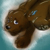
Category Artwork (Digital) / Fanart
Species Monkey
Size 1067 x 1280px
File Size 131.8 kB

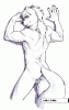
I've always been one of those people that watch art videos and just want the lady (usually) to stop right there. I tend to be more fond of sketches and such. This isn't going to be me hiding behind my "style", or anything. I would really like a cleaner version of this some day.
I posted it just because I felt I had made a lot of progress and sort of hit a wall; That being said, what would you recommend? This is all one layer, and only using black and variations of gray (including white), and the standard size given on the paint brush tool. I am also using a very old version of OC.
I posted it just because I felt I had made a lot of progress and sort of hit a wall; That being said, what would you recommend? This is all one layer, and only using black and variations of gray (including white), and the standard size given on the paint brush tool. I am also using a very old version of OC.
Okay here is a long list of small... small things that I would consider at least. It's of course still a great sketch but to balance the image out you could use with a bit more sharpness. That way you can make the face an area where you want the viewer to focus more (naturally, this is where the light strikes) and the other parts of the character's clothing is less important. In fact it could very well work as it is but for clarity you could try and enforce the shapes of the armour a bit.
So...
Try and define the contour of him with a hard brush so it's more sharp first (a nice contour is important around the area you want to highlight).
Use the colourpicker frequently to maintain the correct shading and try to make the strokes finer around the face. Once you have a nice detail added to the face you can experiment with a texture-brush so the skin looks alive and finish it off with the sharpen-tool (be gentle with this tool, you only need a little sharpness in the relevant areas that are exposed to a more direct light). Might want to create a backup layer so you can revert to the old one if it doesn't suit you, but the sharpness tool is still great to use in small doses overall.
Also the same applies to the blur-tool. You could add a very small amount of blur at the bottom of the character on-screen to further enforce the contrast between area of interest and the body. Again be very gentle here, and take a step back to see if you've overdone it or not.
I think the background could feel better with a solid black, and if you feel like it you can make a subtle gray-to-black gradient in a layer with a layer-mask.
Start making a more controlled and fine strokes to maintain the style you have and make sure that the character really stands out from the background (strokes going from top right to bottom left I think from the lightsource).
Also a simple thing to add more dimension to the character is to introduce another lightsource (like from behind) or just use ambient light bouncing from the environment if you have one. That way you have a way of making out the parts of the character that is in deep shadow such as the upper part of the shoulderpads.
When it comes to contrast you have a nice spread of black to white, but you could do with just a tiny bit of highlights/rimlights in pure white.
The hair itself could use some more love, the hair looks greasy to me so it could be a bit more smooth and don't rely too much on 1px sized randomized strokes.
The character too looks a bit aged so I'm curious why he has no shadows cast from wrinkles on his forehead or similar?
Also think of bouncing light. It looks like you could lighten up the neck-protector a bit in the reflection of the light hitting the chest.
What's going on with the left shoulder on the character? You could work it out a bit more so we can distinguish more on what he is wearing. To me it looks like a cape of sorts.
The eyes look quite hollow, it is intentional I'm sure but judging by the light that strikes the character slightly from the front it could reveal some more. Try making subtle indications on the part just below the eye and bottom rim of the eyelid perhaps and see how it turns out.
Finally you can quickly try adding a bleak colour on top of the image on another layer using "Overlay" as layer-effect (Photoshop term but still) and see if colour will make the image look better. If it doesn't just throw it away.
Hope this helps!
I have no idea what OC is though (argh abbreviations!), but I use Photoshop CS5 myself.

Comments