 FA+
FA+
850
Views
Views
6
Favorites
Favorites
Category
Artwork (Digital) / All
Species Otter
Size 954 x 742
File Size 320.8 kB
Report this content
More from VileFlesh

")
")

")
")

This is a very important question, so I decided to ask which version of the line do you like? You can write numbers 1 or 2 in the comments. If you want, you can express your opinion in more detail, I will read it with interest~
Category Artwork (Digital) / All
Species Otter
Size 954 x 742px
File Size 320.8 kB


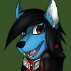


1 is definitely very clean, but 2 is rather expressive, and I do admire the thick lines around the eyes and the eybrows.
It's a difficult decision to choose between either.
I will say, It looks like 2 might be easier one your hand? Thinking from experience there.
I'd say if you're thinking of offering one of these as a quality for commissions, simply offer one when you feel you can handle it,
and the other when your need a break from the more detailed work.


2 has a lot more pop to it, and for a stand alone image or one on a stylized background, I think it stands out more. Also, the heavier upper eyelid eyebrows are probably the most catching differences in the faces.
1 I feel would look better with complex backgrounds as it might blend in a little more for a softer, more integrated look.
1 I feel would look better with complex backgrounds as it might blend in a little more for a softer, more integrated look.


Comments