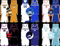
Got inspired to put a few logos and unis together over the past few weeks. Here's some of the ones I'm happy enough with to share. I have about 2/3 of the league done, but I like a lot of them enough to share. Anyway, here's too much description for each look.
Santa Ana Spectrums the current SAS look is one of the most interesting and unique set the league, but I couldn't duplicate it. I feel this works as a simplified version of their currently look.
Albany Alphas I like ALB's current logo, but I also like one of their past logos so I combined the two. Same with the uni. Elements of both with my own little touch mixed in. I also cut the tan color that they use for the paw sometimes and introduced more of the brown that's listed as their main color without completely losing the black.
Edmonton Excavators EDM did a full overhaul of their look, but didn't put a mole in a excavation helmet and I feel like that's a missed opportunity. I went with "fierce," but I also think, "cuddly, cartoon mascot could have worked here as well. I kept the uni design for the most part. flipped the direction of the stripes and cut down the number of colors used.
Winnipeg Voyageurs I've already posted that blue one so the gold one is the only update here. Relegated the red to more of an accent color and almost fully eliminated white from the look. Go team Canada!
San Jose Thrust Didn't do much here. Just changed the home from blue to white and made the thrusting SJ the primary focus.
Oregon Swashbuckelers Did I post this relocation and rebrand? I don't think I did. Anyway, the Texas Lone Stars are no more and the Oregon Swashbucklers are walking away from the explosion in slow motion while putting on cool shades and wearing these unis. I was asked to recreate the old Sonics look.
Las Vegas Wildcards The black jersey from this redesign was my favorite of the bunch, so I adapted the look for a white home uni and dropped the blue.
Category All / All
Species Unspecified / Any
Size 1280 x 683px
File Size 239.5 kB

 FA+
FA+


Comments