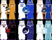
These are the concepts I am least comfortable sharing because these are the logos and unis that would need the most work before I would be happy with them. I'm sharing them anyway because with the season starting soon I don't want to be distracted by wanting to finish this project that nobody asked for lol
Have some thoughts!
Hawaii Kahunas : Probably my favorite of all the concepts I've done so far. Look at that little pineapple buddy! They need some work, but the direction is solid. Also I love them. Kudos to whoever came up with that color combination, it was easier to work with than I anticipated it being.
Queens Pride : And then there's Queens. I didn't have a lot of ideas for the Pride so I tried to keep it simple. I admit that it's not one of my better looks, but it's not the worst thing I've ever done.
Lorain Firestorm : That logo, man. There are so many ways to make an "F" out of flames, but I wanted more than that. There's kiiiiinda an "F" in there, but if you can find the attempt at an "L" then maybe I was actually on the right track. For the unis I pretty much just followed what they have now with the exception of the home. There's much less red on the home because I've never been a fan of two tone basketball uniforms as a home look. Just a personal preference.
Plymouth Taproots : "T" Tree without the roundel. That's one leaf that's been resized and duplicated a bunch of times to make it look like a tree. If I ever revisit it I'll probably ditch individual leaves all together since you can't really see them if you're far away. For the unis I wanted to go away from the "Duke" design they have now and used the stripe from their old away unis as a design focus. After that I kept it simple. I wanted to make their road uni green, but it didn't really look right so I kept it as black.
Dakota Bikers : My original idea was to put a classic motorcycle on an stylized interstate sign, but that exact thing has already been done. So I went with a winged sign and a V Twin engine. It's very generic and if I ever come back to this, I'm almost certainly going to redo this one. For the unis...welll...I wanted to do something different. I'm not a fan, but it's not a bad look.
Biloxi Voodoo : First off, I love the Voodoo's current logo so I didn't change it at all. The unis are a little simpler than the ones they have now, but it should be noted that the back of the road uni is a different color than the front and that pattern on the side panels extends to the back as well.
The last six may take a bit longer to get out. I don't even have concept ideas for them at the moment and two teams, the recently moved Arizona Demons and the Tallahassee Typhoons, have already updated their looks recently. We'll see what happens, though.
Category All / All
Species Unspecified / Any
Size 1280 x 1056px
File Size 411.7 kB
As a fellow "designer":
Love all of the uniforms, would only tweak the colors of Taproots, the black one doesn't look that good.
Logos of Bikers, Pride and Taproots are a slam dunk, Kahunas as well, but that would fit more as a secondary logo. Same with Firestorm, although the first impression was...meh.
But honestly, GREAT work all around ❤️

 FA+
FA+


Comments