 FA+
FA+
1114
Views
Views
37
Favorites
Favorites
Category
Artwork (Digital) / Fanart
Species Unspecified / Any
Size 800 x 768
File Size 73.5 kB
Report this content
More from Sparky the chu


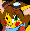
Drew this for Vox as a lil quick commission (thinking of starting to accept those maybe in livestreams to earn a bit more of money also to help myself with a few things ^^;) anyway, here we have Ein in his kitty pakkun form and I kinda think I managed to improve my OC skills a little ^^; even if the lineart still isn't smooth and I'd like to find someone who could teach me a bit x.x;
Category Artwork (Digital) / Fanart
Species Unspecified / Any
Size 800 x 768px
File Size 73.5 kB


Very sweet, Sparky! =3
And I have to agree, you've really improved!
As for maybe a few suggestions:
-For inking, You could use the pen tool in photoshop (then right-click and select 'stroke path' set to your current brush (maybe in combo with pen pressure)). that way the lines automaticly look smooth and stylish and saves a lot of time. =3
-For the footpaws, I've noticed that adding a mid-section (from the toes to the ball of the foot) is becoming a habit of yours, nothing wrong there. But in some cases they tend to be too long (or too overly extended) which makes the toes look a bit... (I dunno how to put it) 'awkward' in some way(s). In this pic it's especially noticeable. If the mid-section was cut in half for example it'd be perfect. =3
-Another thing is, is that sometimes (in your other pics) the toes aren't exactly resized (or in cope, dunno how to put it) with the rest of the foot, making the toes look more square while they are more organic. (Especially noticable in this pic -> http://www.furaffinity.net/view/4855242 where they look a little 'too' square and also a bit 'attached' rather than showing a natural flow). Also, try to make them look a bit more squishy in contrast to their body-shape. (like this pic for example)
For other ways to help you improve: Study how Cougr, Beherit or Skat/Pinch draw their footpaws. As they thend to look more meatier, flexible, realistic or in some cases more vast.
Offcourse this could be part of a 'style-of-choice' but tend to look in other directions as well, since I've noticed a great improvement in your anathomy but a great decrease in physical continueity. (dunno the right way to express it, but in plain english: how the shape(s) of some bodyparts are in contrast with the rest of the body.)
For example: Skinny people have thinner/longer fingers, while more fatter people have more fatter/stubbier ones. That's the Continueity I'm talking about, in some of your other characters it's placed (sometimes) at complete random (or actually it 'looks' that way.)
I'm trying to help you improve and I thought this might be an interesting point of view to improve. (since I think this is the right time/moment to adress it. =3
Anyway, keep up the great work and good luck my friend! ^_^
NOTE TO OTHER USERS: DO 'NOT' REPLY TO THIS COMMENT!!


Comments