 FA+
FA+
997
Views
Views
143
Favorites
Favorites
Category
All / All
Species Mammal (Other)
Size 403 x 504
File Size 51.9 kB
Report this content
★
More from AnimeCat


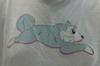
Commission for  commodoremarie of her goat/sheep character, Moo.
Now, normally you see Moo as a muscular, adult male; rather fine specimen of one, too. But I was requested to give me take on what Moo pay have looked like as a kid. And I think he must have been adorable! His chubby, pink baby belly shows through the think white fur, which only adds cuteness. His tribal markings haven't fully developed yet, so they only show up as a faded sort of "shadow" on his fur.
Moo is © commodoremarie
Artwork © Nicole "AnimeCat" Holland, Studio Neko-Neko 2010
Please do not reuse, repost or redistribute!
 commodoremarie of her goat/sheep character, Moo.
 Now, normally you see Moo as a muscular, adult male; rather fine specimen of one, too. But I was requested to give me take on what Moo pay have looked like as a kid. And I think he must have been adorable! His chubby, pink baby belly shows through the think white fur, which only adds cuteness. His tribal markings haven't fully developed yet, so they only show up as a faded sort of "shadow" on his fur.
Moo is ©
commodoremarieArtwork © Nicole "AnimeCat" Holland, Studio Neko-Neko 2010
Please do not reuse, repost or redistribute!
Category All / All
Species Mammal (Other)
Size 403 x 504px
File Size 51.9 kB


He's a really great character! Go visit commodoremarie's page to see!
commodoremarie's page to see!


B'awwwdorable. Wonder what he's looking at, hehe.
I hate to add to the watermark complaints, but this one's more of a suggestion:
With pieces like this that involve faint patterns in greyscale on the character or background, the watermark you're using is...disorienting, to say the least.
I think it'd be great if you had perhaps a different watermark for works like this, or maybe you could color the watermark, instead of having the grey that blends into the art like that.
The watermark is actually color, just the layer is set to "multiply" and at a transparency. I thought the full color would be more distracting.
And what you're saying is less of a complaint and more of a creative solution, so I appreciate that. I'll look into trying some alternatives for watermarking for grey tones in artwork. Thanks for the suggestion!
And what you're saying is less of a complaint and more of a creative solution, so I appreciate that. I'll look into trying some alternatives for watermarking for grey tones in artwork. Thanks for the suggestion!

Comments