 FA+
FA+
237
Views
Views
7
Favorites
Favorites
Category
All / Animal related (non-anthro)
Species Dog (Other)
Size 1172 x 445
File Size 102.9 kB
Report this content
More from CinnamonMutt


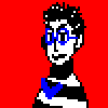
Which one do you like better?
Concept art for my comic. HURR.
Concept art for my comic. HURR.
Category All / Animal related (non-anthro)
Species Dog (Other)
Size 1172 x 445px
File Size 102.9 kB


I like 2 better hun ^^
it shows more of the characters potential and makes her more interesting
the colour scheme for nr 2.
you could see it like a black spot on a white piece of paper.
if you look at it it looks interesting but after you've seen it you move on but if you make a series of spots you can make
it interesting for a longer period of time.
the hair on nr1's head looks so lonely and kinda looks like a bird made a nest there and flew off cause she moved to much xD.
but Nr. 2 is equally devided over the character.
AND IT LOOKS SO CUTE YOU CUTIE YER SO CUTE! HAHA XD

I like them both but...have to say two, the darker color on more than just the top makes it look more like a natural dog marking, IMO. Where as in the first one it looks more like hair, but maybe that's just me. They're both adorable, have to give a vote to two though!


Comments