 FA+
FA+
774
Views
Views
30
Favorites
Favorites
Category
Scraps / Fanart
Species Unspecified / Any
Size 697 x 959
File Size 349 kB
Report this content
More from putalaweA


Well, not much to say, I had this in my gallery

before and due to some reasons I don't really

remember why I deleted it, so well; here it is.


For those who don't know who he is, he has the

role of a villain in the videogame and anime

series, Viewtiful Joe. I just love this guy haha.
Category Scraps / Fanart
Species Unspecified / Any
Size 697 x 959px
File Size 349 kB


First off, I was busy with the computer and school. Now...
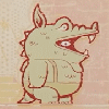
I can see why you uploaded only the "better" version of the picture. Sure, the older one had an angled pose (which tend to be more dynamic than regular side poses), but this version truly wins out.
From the top, although I find rather odd that the spikes concentrate at the front and lack on the back, I like the lighting effects on the helmet, what with the little shading on the helmet horn and the stippled highlights on the back of the helmet. I also notice the subtle colouring around the helmet brim. On the topic of his face, I can see the little dino-esque ear ridge near his detailed eye. The folds of skin on his snout give character to Hulk. The way you coloured his face horn gives a "bone" feel. I also notice the folds of skin in front of the horn. You also seemed to have taken a more realistic approach towards his fangs, using their size to give Hulk a noticeable expression, accentuated my his smaller teeth. I also noticed that also formed a jawline.
Further down the picture, I focus on his stomach, jacket, and arm. From the way you formed his chest and belly, the "musclegut" route you chose for depicting Hulk is clear. You drew his belly in an appropriate size while still making him handsome, the little fold on the belly giving him bely a small touch of realism. Another small touch is the little clip you gave his belt, tough the depth you gave the buckle is not to be missed. The only problem I find is that the top side of the belly does not seem to me at the bottom side of his belly (where the belly touches the legs), but that may just be me. The most unique point of the jacket is the row of dots aligning the edge of the jacket and zipper line. You did quite realistic colouring on the zipper teeth, though the occasional "big tooth" is a bit unsettling up close. Also, the "connecting point" of the "main" zipper seems to small to me. But of course, I like that you added the "zipper cloth" to the jacket. An improvement over the original is the way you drew and lighted the stretching folds on his jacket, following a true realistic approach as to how a jacket would look when held such a way. The muscles on his arm seem to follow proper anatomy, though the shoulder looks too square, and the forearm looks a bit too flat on the bottom, but, once again, I think I am wrong here. Of course, once again I should note the way you shaded the insides of his arm, defining the arm muscles and maintaining the realism. His black band were not neglected either, what with their highlighting and and the realistic way they are positioned on the arm, the latter being my favourite feature of the bands.
Though the legs seem too wide to me, they deem a great starting point had you ever decided to draw his feet. (Once again, I could be wrong about the leg size.) In all, you have truly succeeded in implementing realism in my favourite Viewtiful Joe character. I can learn from quite a piece of art as this.
Well, I can only believe that such a detailed reply possesing of such a caring style can only receive an equally
long answer back, though I'm sure I will fail trying to do so.
I can't really thank you enough for such detailed comment on this drawing that, nedless to say, made me feel
quite proud when I finished it. I must confess, I never thought a drawing of this guy, neither a drawing of mine
would provoke such an excited reply, and I really appreciate the fact you say you can learn with what that word
means, from this, it makes me feel flattered.
I would believe I'm the best around if I don't accept you are right in those points you indicated, like the zipper, the legs
or the forearm, which I believe could have been better. Of course, I can only appreciate such positive criticism. It makes
me glad you even noticed those tiny details like the connection of the zipper or the jacket's folds, it makes one feel like
all the effort had its reward.
Once again, thank you for this big comment that is nothing but a big compliment for my work (if it deserves that word),
and something I deeply thank as I didn't expected it.
As hulk davidson is also a fave of mine, I can only hope I'll have the inspiration to repeat a decent fanart of him.
Comments