 FA+
FA+
498
Views
Views
14
Favorites
Favorites
Category
All / All
Species Unspecified / Any
Size 327 x 294
File Size 23.3 kB
Report this content
More from arcanewind


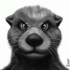
Okay, a few things were pointed out to me which I believe i sorta fixed~
first, it was brought to my attention that the face seemed to lack a depth of field, so i added more shadows to hopefully give it more of a shape. All in all, I kinda like the extra shading, so thanx.
also, fixed the eye up a bit. Nothing major, just got rid of that dark line i had and added a slight highlight on it too.
Honestly, i had no problem with the neck, even after I heard about it, but I went and thinned it out a bit, and you know what? HUGE difference (to me anyways o.o ) so thanx a lot there too!
anything else that you see i should fix? or that you miss from the old style??
I myself am still wondering about the lineart, I still like my old think style, but this is really nice for the rest of the work I think (in any case, Its not like im totally abandoning the old style, I'll still use it and all --and for comissions you'll be free to let me know which you'd rather me use--)
but what im wondering about it, is mostly the color thing, Is it ok to be using colored lines or should i just go for black? what have you liked best from other works you've seen? (from diff artists) and in any case, is there any way to make it better?
Note: I'm asking for HELP, not just criticism (I can take criticism, but on its own its not very helpful) I need to know what's wrong or looks off and an IDEA of how i should fix it, ya know?
Category All / All
Species Unspecified / Any
Size 327 x 294px
File Size 23.3 kB


I think it looks better and as for the lineart it looks fine. They aren't too noticeable, but the thin black does define the features in a way the colored lines might not be able to since they would blend in more. If you use colored lines you may need to compensate with more shading to help subtly define areas with depth so the colors from say a shirt to fur doesn't just blend together but you can see that one is beneath the other. That's just what I've seen in other people's works though ^ ^;


i think colored lines work fine, either way works for me, but i still think the white muzle area looks odd, i'm not sure how to fix it though, cause it needs to hit the eyes, but yea...thats just minor details that dont apply to the over all style so yea...i'ma look a bit closer and see what i can see
Comments