 FA+
FA+
3124
Views
Views
145
Favorites
Favorites
Category
Artwork (Digital) / Miscellaneous
Species Unspecified / Any
Size 1006 x 658
File Size 1.11 MB
Report this content
More from Rukis


")
")


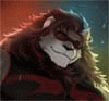
More concept work from Red Lantern. This time a coat of arms. . . easily one of the coolest things I got to design. Red Lantern's got a massive world, so. . . look for a lot more conceptual artwork like this in the future. And of course, you can read all about it in the comic! This'll show up in just a bit, when the Amurescan navy finally makes an appearance. Exciting stuff :)
You can find the comic here: http://www.furaffinity.net/view/4260941/
or on its' own website, here: http://www.red-lantern.net/comic
(note: website is down for maintenance for the rest of the day. . . it'll be back up shortly)
You can find the comic here: http://www.furaffinity.net/view/4260941/
or on its' own website, here: http://www.red-lantern.net/comic
(note: website is down for maintenance for the rest of the day. . . it'll be back up shortly)
Category Artwork (Digital) / Miscellaneous
Species Unspecified / Any
Size 1006 x 658px
File Size 1.11 MB


As a Herald I have to say this is an odd picture. The point of heraldry is to easily identify someone froma distance or when in armor. Strong contrast and simple paterns work best. Also the swords comeing off the sheild makes it odd as well. Sorry just critique from someone who has studied this alot!
It's actually not for heraldry. . . this is the combined design for an admiral's coat of arms, and a country's flag. . . it's actually on a sail. The 'era' this comic is set in is actually far past the time period in which heraldry on the battlefield would be used. The Amurescan country is an Empire at this point, and being 'titled' is far less important than it might have been a few hundred years ago. The design on the ship's mast sails is the Amurescan flag, which you can see there on the shield, IS a simply-colored design. (Maybe I should post it, too). The coat of arms for this particular family is the plain design on the right, and the swords separate the shield for individual family crests. I have seen some WICKED complex coats of arms, and some that are very simple. . . this is meant to be somewhat in the middle. The cerberus head design is meant to be fairly recognizable, and the three swords is a take on the three of swords tarot card. Hope the whole explanation makes things a bit clearer :)
I understand that it is fantasy and artistic, bbut a coat of Arms or Arms as they realy are, IS Heraldry by definition! Think of them like company logos, easily recognised and (relatively) easily reproduced. Yes there were some periods in History when arms became VERY complex in some areas, but that is not the best examples or most common. Anyway, it's your art and you can do what yu want, I was just trying to maybe help somehow.
I think folks are getting overly invested in 'reality' on this site. . . on a whole. Whether it's biology, zoology, history or anything else. . . it's just never going to be what an expert can imagine. Just let it be fantasy, if you can. I understand it's something you're passionate about, but without being a herald myself. . . I'm not going to design something historically accurate, and I would have to be an expert in about a thousand different things to get every facet of this comic to a point where it pleased every specialist out there. I specifically chose to create a fantasy world to avoid historical nitpicking, because I'm not an expert in antique arms/armor/vessels or uniforms/clothing.
Now. . . all of that being said. . . here's the amount of research I put into this design. If you want to look at it from a 'realistic' standpoint, the three arched red heads of the cerberus are very recognizable, even from a distance. They're what's called 'supporters'. . . animal or human depictions usually above or around the shield. The 'ordinaries' (what you're referring to with the bold colors and shapes) are what was usually painted on shields, and recognizable on the battlefield. The ordinaries in this design are behind the swords, which I'll grant is unusual, but I got this idea from the practice of hanging shields on walls with swords crossed over them. Since this design is purely ornamental, I figure an artist from this period might've designed it that way, as well. And the shield can also showcase the colors of other families that, in the dark ages, would've fought alongside the Denholme nobles. I believe that's called marshalling. . . and I didn't want to do that on this design, or it would have been MORE complex. This design shows up several times in the comic, and needs to be recognizable. . . but not overly complex.
ALL of that being said. . . I'm not a herald. But I did the best I could, to coast the line between historical accuracy and what's visually appealing today.


Thats such an interesting design, my ancestor's coat of arms is just has two colours and couple of lines on one half. Not that they were great or anything, actually they were hated... Either way I like it, and the design thats directly on the shield looks kinda like the lunar cycle.


Comments