 FA+
FA+
803
Views
Views
122
Favorites
Favorites
Category
Artwork (Digital) / General Furry Art
Species Canine (Other)
Size 640 x 786
File Size 606.8 kB
Report this content
More from Sephyfluff


Lol the title.
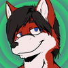
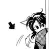
Rushed project done for my Computer graphics class. Decided to draw Ventus from KH. Because I scrapped my original idea last minute, had to hurry up with something, finish it and turn it in. I started on this yesterday. It's suppose to effectively use the principle of design "emphasis." Hence the title. Lol. We're suppose to only use Photoshop or Illustrator. But I found it easier to draw the character on SAI, since I couldn't locate a photo model for my original idea. Created and added filters on both the background aswell as Ventus, because I didn't want to get points taken off for only using photoshop on the background. It doesn't look horrible I guess.
The black outline is meant to draw attention to the character and the thick blotchy background is nothing but a thick blotchy background. Haha. I guess its to attract less attention if any.
"TL;DR" version: Art by me. Enjoy!
Comments are welcome :)
Category Artwork (Digital) / General Furry Art
Species Canine (Other)
Size 640 x 786px
File Size 606.8 kB


and now for constructive critique! It seems to have a bit of a motion blur(it might just be me), which negates the emphasis a tiny bit. I can see you used the drop shadow filter (I think?). a bit pixally in places, and some spots are a little transparent showing the lines beneath.
and that's about it.
still looks awesome. but I didn't have to read the description to tell you rushed.
and that's about it.
still looks awesome. but I didn't have to read the description to tell you rushed.


Comments