 FA+
FA+
1886
Views
Views
115
Favorites
Favorites
Category
Artwork (Traditional) / General Furry Art
Species Tiger
Size 640 x 908
File Size 417.8 kB
Report this content
★
More from djdarkfox

")
")

-final")
")
Listed in Folders


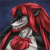
Zephir the tiger (final)
This is the final version of Zephir's char, I've given him a new design!
Well, I've given him green eyes, but Zeph has blue eyes.... I'm sorry, zeph....
Well yea, hope you like it, Zeph!
Enjoy it!!!
main pose © wolfgangcake
edited by me
zephir proudhon © zephir
Well, I've given him green eyes, but Zeph has blue eyes.... I'm sorry, zeph....
Well yea, hope you like it, Zeph!
Enjoy it!!!
main pose ©
 wolfgangcake
edited by me
zephir proudhon ©
 zephir
Category Artwork (Traditional) / General Furry Art
Species Tiger
Size 640 x 908px
File Size 417.8 kB
Listed in Folders


Toby,
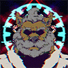
Nice work with this drawing! I was impressed with the line art and the sketch but this is nice indeed. The reflection of light on the sword is a nice touch, as are the flames at the bottom of the pants. It looks like quite a bit of thought has been put into this drawing.
I also love the shadowing and the portrayal of light throughout the picture. The folds on the pants and the muscular tone are nice as well.
A bit of critique though:
The mountains in the background, they seem too small. Or if they're rocks, they don't look quite right for their size in the drawing. At the upper two corners and around the clouds, the colouring is quite uneven. My eyes were drawn to it right away. Maybe you could avoid this by continuing the colouring style used below the clouds (i.e. the left/right motion vs. the up/down motion). This is around the sword as well, but I’m not sure if this was intentional or not. One last thing: the bicep on the right arm looks a little exaggerated for the character's size.
Overall, this is a very well drawn picture. Keep up the good work and remember what I said last night. :)
Well, thank you for compliments!
So, to the critiques:
-The mountains aren't mountains, only rocks.
-the clouds and the sky are been so silly, cause I have very soft pencils, they're melting a bit, when I draw too fast, I've bought me the wrong pencils in December (Aquarell pencils are not really good for drawing furs).
-And the biceps isn't exaggerated, it's the exact anatomy, I've looked at some pics from Bodybuilders to draw muscles.
All critique answered now?


Comments