 FA+
FA+
1129
Views
Views
56
Favorites
Favorites
Category
All / All
Species Housecat
Size 849 x 1067
File Size 850.6 kB
Report this content
★
More from o-kemono


Listed in Folders


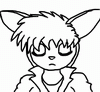
Lucids Dream Cover
A cover illustration for a comic Im working on. This was the second try at the cover. I was trying to go for a realistic approach, but I guess I like to warp things in my own style to make it stand out.
The comic is about cats in a world where dreams manifest into demons during the night.
Lucids Dream Cover © 2011 Alex Cockburn
The comic is about cats in a world where dreams manifest into demons during the night.
Lucids Dream Cover © 2011 Alex Cockburn
Category All / All
Species Housecat
Size 849 x 1067px
File Size 850.6 kB
Listed in Folders


I know I've said it before but I'm very impressed with your work!
I was going to comment on one of your recent color pieces because I think you handle colors very well and I especially like the composition of your "Three Little Pigs" piece, but I think perhaps more impressive is all the detail you can do using only black and white. All of the Lucid Dreams submissions have been absolutely awesome. You seem to have a real talent for hatching and cross hatching. Using them gives things like this cover a wonderful sense of depth and a real presence you don't see in a lot of modern work. I also liked how you switched to stippling for the nose because that gives it a different texture and makes it look like a real cat's nose.
With all the detail and stylization here it has leaves a much more serous impression than your cute more toony work. All the posters and this cover as well look very deep and intense. If that's what you're going for I think you're doing a very good job.
I always try to critique so I will say because of the white space some of the letter of the title seem to blend into the background, specifically the "I" and "C" in "Lucid's." They don't seem to have the same shadow effect as the other letter, perhaps you could add it or deepen it to mke the letters stand out more on the page?
As a side note, "The comic is about cats in a world where dreams manifest into demons during the night" - that sounds awesome! It's definitely something I would check out.
Sorry to hear the economy's been hard on you-it's not good for anybody. I hope you keep having enough to get by, at least. And please don't let people on the internet get to you with all the drama and everything. Thanks a lot for sharing your work, and good luck with everything! ^^


Comments