 FA+
FA+
3763
Views
Views
226
Favorites
Favorites
Category
All / All
Species Unspecified / Any
Size 754 x 349
File Size 72.3 kB
Report this content
More from keovi


Here's a sneak-peak at one of the panels from the comic, "Short Film", that will be released in this year's edition of HEAT. This project is a collaboration with the talented writer  tempo321 and is chock full of CUTE CORGINESS.. so be sure to check it out :3
TVPaint + PS CS4
 tempo321 and is chock full of CUTE CORGINESS.. so be sure to check it out :3
TVPaint + PS CS4
Category All / All
Species Unspecified / Any
Size 754 x 349px
File Size 72.3 kB


Well, if where they sell Heat is any indication... http://www.sofawolf.com/catalog/


Hopefully you even get to reading this:
I have tried using TVPaint because you guys recommended it to me at FC last year (if I remember correctly).
I tried to use it and it does not even look half as smooth as what you have posted here. Are there any tips you have to using TVPaint for the lines? Also, the fill tool doesn't seem to work the best either... do you even use that or just manually "block" in the colors behind the line art?
Thanks! :D
I don't mind discussing it here, since I figure some others might find it interesting, too.
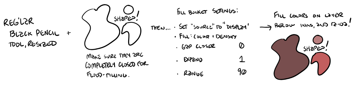
Here are the basic steps that I use for flood filling. For inking I select the black pencil, then adjust the size to whatever I need. I work at 300-600 DPI (this file is about 5000x6500 px at 600 DPI, so it's pretty big. Lineart often looks smoother and cleaner when you shrink it down, which is why I like to work big. Also, I've found that TVP doesn't have the best damping, so in addition to working large, I also zoom in to 200% all the time for inking. It looks very sloppy very quickly if I work any less zoomed in.
http://kendavi.com/tvp/steps.png
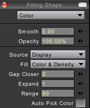
And here's a screenshot of the fill bucket settings.
http://kendavi.com/tvp/fillbucket.png
Does this help, or not so much?
Here are the basic steps that I use for flood filling. For inking I select the black pencil, then adjust the size to whatever I need. I work at 300-600 DPI (this file is about 5000x6500 px at 600 DPI, so it's pretty big. Lineart often looks smoother and cleaner when you shrink it down, which is why I like to work big. Also, I've found that TVP doesn't have the best damping, so in addition to working large, I also zoom in to 200% all the time for inking. It looks very sloppy very quickly if I work any less zoomed in.
http://kendavi.com/tvp/steps.png
And here's a screenshot of the fill bucket settings.
http://kendavi.com/tvp/fillbucket.png
Does this help, or not so much?

I've often worked larger and zoomed in, sometimes at 300 dpi; now I'll always do that. I'm guessing you do a little sharpening and other tweaking afterward?
I've painted solid colors in before but I'm now fiddling around with the paint bucket in Photoshop CS3.
✔Anti-alias ✔Contiguous ✔All Layers
Look ma, no halos! And the paint's on a different layer, too!
And the big question: So it ISN'T one continuous, nuanced stroke at a memory-intensive resolution prone to lagging? It just looks like it? What a relief! My only smooth lines came in one low-res stroke, with lots of Ctrl-Z. Now I know I can do better. I've just been derping about it the wrong way.
I resize my web versions using the bicubic sharper algorithm, but I almost never use additional sharpening filters, because I don't like the effect it has at the borders of colors.
When inking, I think in arcs, and draw them in one swoop. This makes them much smoother than if I did them as a series of strokes. I also move quickly, to help keep the jitters and indecision out of the pen.
When inking, I think in arcs, and draw them in one swoop. This makes them much smoother than if I did them as a series of strokes. I also move quickly, to help keep the jitters and indecision out of the pen.


Comments