 FA+
FA+
705
Views
Views
66
Favorites
Favorites
Category
All / General Furry Art
Species Lion
Size 484 x 768
File Size 255.1 kB
Report this content
More from Deathpuppy


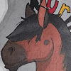
This was meant to be a furry/sci-fi crossover piece for a book illustration portfolio, but it never really seemed to take off. I like it, but it always got mediochre interest as cover art.
Take a close look at the eyes. ^0^
Take a close look at the eyes. ^0^
Category All / General Furry Art
Species Lion
Size 484 x 768px
File Size 255.1 kB


A very nice serie of SF novels written in the '80, sort of a space opera, with feline protagonists
http://en.wikipedia.org/wiki/The_Pride_of_Chanur
http://en.wikipedia.org/wiki/The_Pride_of_Chanur

maybe it got mediocre interest because the negative space in the sky is so light compared to the figure and the building behind it. It kind of drove my attention away from the dynamics of the figure for a moment.
However I for one think its awesome. Those scars and expression are amazing.
However I for one think its awesome. Those scars and expression are amazing.
lol no, youre not lazy ^^ I like the minimal detail you use, I just think the contrast of light color catches your eye and draws away from the figure a bit. Not that that is a bad thing, because otherwise you wouldnt notice the planets, however that may be why the lion didnt get the attention he fully deserved from the onlooker.

I usually don't like this topic in artwork, but I must say the quality of your work is astounding, it reminds me very much of the high fantasy artwork of the mid- to late-eighties and is very much a style I had hoped to attain.
For whatever reason, I seem to be taken a different direction, possibly the peril of self-tutelage. What's your usual mediums, I'm presuming oil paint?
For whatever reason, I seem to be taken a different direction, possibly the peril of self-tutelage. What's your usual mediums, I'm presuming oil paint?
Hi Angyl!
Thanks for taking a moment to drop by and say hello. Yeah, I'm sort of a product of the 80s artwise. I graduated HS in '83, so my early artistic meanderings were shaped by the 80s.
I'm self taught as well...at least, I never went to art school. Most of my training has been on-the-job. I've always worked as an artist and have just worked to figure stuff out as I went along.
This image is mostly gouache, with a bit of acrylic. This was done before I started mixing acrylic and gouache more heavily. I've done a few oil paintings, but have never really stuck with that medium.
I've never worked with (nor know what) gouache is, though I've heard of it. It shows that you've been working at this for about as long as I've been alive too, as I said before the quality is astounding. I'm wondering if there are any obvious tips (without giving away trade secrets, of course) you could pass on that might help me improve?
Gouache is an opaque watercolor. It even reactivates when it gets wet, so I always fix my paintings--although you need to do that carefully--fixative will make it reactivate too.
The only tips I know are--LOADS of practice, and find examples of work you like and try to duplicate it. Also--don't be afraid to experiment on the side--do studies, things that you don't need to turn out, throw-away stuff for practice. One of my biggest problems is that I want everything I do to be perfect...sometimes you just need to play without worrying about trying to create a masterpiece!
The only tips I know are--LOADS of practice, and find examples of work you like and try to duplicate it. Also--don't be afraid to experiment on the side--do studies, things that you don't need to turn out, throw-away stuff for practice. One of my biggest problems is that I want everything I do to be perfect...sometimes you just need to play without worrying about trying to create a masterpiece!


I think the problem might well be, that: a) The colours aren't bold enough/ there's not enough contrast, and/or b) The figure isn't dynamic enough.
Technically it's actually very impressive, as most of your work, and it has some very cool details. But I think the aforementioned basics aren't striking enough to provide enough impact for a successful cover image. The cover is a major factor in sales, after all, and it should capture the viewer's attention right away.
Just my two cents worth, anyway. :P
I'm not sure I agree--but then again, there's SOMETHING off about it. I think it's more of a stylistic issue...the background and foreground don't match. And the foreground figure is too clean, too fake. You may be right about the colors, tho--I do have a tendency to lean toward subdued tones, which I prefer generally--but they didn't work here.
Comments