 FA+
FA+
262
Views
Views
6
Favorites
Favorites
Category
Artwork (Digital) / Tutorials
Species Dog (Other)
Size 250 x 1280
File Size 30.3 kB
Report this content
More from BlackDoggie


Well, here is an update on my current piece. I really wish I could have more time to work on it, but Uni is really giving me a hard time and I have to get my grades up.
Anyway, to the drawing. This is a quick overview of what happened during my new experience with values painting. As I explained in the last update, painting with values is a technique when you paint all the shading and light before you paint the color. The objective is achieving a better looking and impressive drawing while spending less time working on it. I am not saying that painting with values will make you finish your work faster. It is just that compared to how I've been doing my work so far, values give me a better vision of where I'm going and also allow me to boost my style without having to worry about getting the right tone for each shade - Or painting my shades all black with opacity (which I think looks ridiculous in my style). In the end, it really saved me a lot of time and I get a gorgeous visual in the end.
With this technique, you can certainly expect more work from me done in less time. I feel very motivated right now and eager to share my experience with you. Now lets get an overview of what happened in each stage.
DISCLAIMER: This is not supposed to be a tutorial about values. I am just sharing my findings and my experience with it.
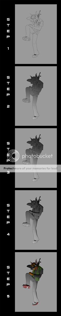
THE EVOLUTION OF SLICE (Full view isn't working, please go here: http://i477.photobucket.com/albums/.....ps_display.jpg)
==================
STEP 1 - I scanned my drawing and got the line art done, fixing any mistakes I can find in the process. So far, nothing new.
STEP 2 - This is where the magic starts. I decide where the main light source for the scene in coming form and trace a grayscale gradient originating from it. The lightest value should be darker than white while the darkest value should be lighter than black (unless you are going for very high exposure or total darkness), adjust the tone according to your need. This is the most important step, since this is when you establish the base values from your image and also get a good notion of how the light is interacting with your scene. Also, make sure that only your character(s) and any other object reflecting the light source contains the gradient. This is fundamental for the next step, since we are going to work with clipping.
STEP 3 - I created a new layer named highlights and clipped it to the gradient layer. With a soft brush set for Transfer, I started to sample the nearest light value from the gradient where I was going to work, and painted where i thought there would be light. This process was repeated over and over until I thought I covered all the spots where I thought there would be light.
STEP 4 - I created a new layer named Shadows, clipped it to the gradient and did the exact same thing as in step 3, but the inverse. Instead of light, I painted the shadows. Notice how the character now looks more three dimensional than in step 2. It looks almost like a rendered 3D model. While painting the shadows I still had to go back to the highlights and paint it some more, just to make it all look good and make sure the transitions between light and dark was smooth. The biggest advantage of working out your values before applying color is that you get a full notion of the surfaces in your image. This allows you to shade better. If there was color already, the shading on dark colored surfaces wouldn't be so efficient and you would probably miss some spots (believe me, it makes a big difference). And so we have completed our values.
STEP 5 - Now this is when you see the fruits of your work. I created three more layers: One set to Color, one to Overlay and one to Soft Light (all clipped to the overlay layer as well). The Color layer is for soft colors, the Overlay layer is for vivid and intense colors, and the Soft Light layer is for painting black surfaces (because the other two can't work with black). The reason for setting them to different blending modes is to allow their colors to blend with the layers underneath. Just look at step 5. There is nothing else there besides plain color, no special effects added other than the blending modes. It felt magical and it felt so natural. The shades and highlights automatically adjust their tones to match the color of that region, everything just fall into place automatically and save you a lot of fine tuning work. After I finished coloring, I took the time to add some other special touches such as the shine in his eye and a texture to the red area of his shoe's sole.
And that's it! Slice is now ready to be integrated into the final composition. As soon as I get some more time I'll get started on Zack and keep you all posted on my progress!
Total time consumed: 3h 47min <= I had a quick snack while working on it and forgot to stop the timer. So I am guessing I actually used 3h 15min. I'll probably go faster next time, I was new to this and had to experiment a bit before figuring out how to do some stuff.
Enjoy.
Anyway, to the drawing. This is a quick overview of what happened during my new experience with values painting. As I explained in the last update, painting with values is a technique when you paint all the shading and light before you paint the color. The objective is achieving a better looking and impressive drawing while spending less time working on it. I am not saying that painting with values will make you finish your work faster. It is just that compared to how I've been doing my work so far, values give me a better vision of where I'm going and also allow me to boost my style without having to worry about getting the right tone for each shade - Or painting my shades all black with opacity (which I think looks ridiculous in my style). In the end, it really saved me a lot of time and I get a gorgeous visual in the end.
With this technique, you can certainly expect more work from me done in less time. I feel very motivated right now and eager to share my experience with you. Now lets get an overview of what happened in each stage.
DISCLAIMER: This is not supposed to be a tutorial about values. I am just sharing my findings and my experience with it.
THE EVOLUTION OF SLICE (Full view isn't working, please go here: http://i477.photobucket.com/albums/.....ps_display.jpg)
==================
STEP 1 - I scanned my drawing and got the line art done, fixing any mistakes I can find in the process. So far, nothing new.
STEP 2 - This is where the magic starts. I decide where the main light source for the scene in coming form and trace a grayscale gradient originating from it. The lightest value should be darker than white while the darkest value should be lighter than black (unless you are going for very high exposure or total darkness), adjust the tone according to your need. This is the most important step, since this is when you establish the base values from your image and also get a good notion of how the light is interacting with your scene. Also, make sure that only your character(s) and any other object reflecting the light source contains the gradient. This is fundamental for the next step, since we are going to work with clipping.
STEP 3 - I created a new layer named highlights and clipped it to the gradient layer. With a soft brush set for Transfer, I started to sample the nearest light value from the gradient where I was going to work, and painted where i thought there would be light. This process was repeated over and over until I thought I covered all the spots where I thought there would be light.
STEP 4 - I created a new layer named Shadows, clipped it to the gradient and did the exact same thing as in step 3, but the inverse. Instead of light, I painted the shadows. Notice how the character now looks more three dimensional than in step 2. It looks almost like a rendered 3D model. While painting the shadows I still had to go back to the highlights and paint it some more, just to make it all look good and make sure the transitions between light and dark was smooth. The biggest advantage of working out your values before applying color is that you get a full notion of the surfaces in your image. This allows you to shade better. If there was color already, the shading on dark colored surfaces wouldn't be so efficient and you would probably miss some spots (believe me, it makes a big difference). And so we have completed our values.
STEP 5 - Now this is when you see the fruits of your work. I created three more layers: One set to Color, one to Overlay and one to Soft Light (all clipped to the overlay layer as well). The Color layer is for soft colors, the Overlay layer is for vivid and intense colors, and the Soft Light layer is for painting black surfaces (because the other two can't work with black). The reason for setting them to different blending modes is to allow their colors to blend with the layers underneath. Just look at step 5. There is nothing else there besides plain color, no special effects added other than the blending modes. It felt magical and it felt so natural. The shades and highlights automatically adjust their tones to match the color of that region, everything just fall into place automatically and save you a lot of fine tuning work. After I finished coloring, I took the time to add some other special touches such as the shine in his eye and a texture to the red area of his shoe's sole.
And that's it! Slice is now ready to be integrated into the final composition. As soon as I get some more time I'll get started on Zack and keep you all posted on my progress!
Total time consumed: 3h 47min <= I had a quick snack while working on it and forgot to stop the timer. So I am guessing I actually used 3h 15min. I'll probably go faster next time, I was new to this and had to experiment a bit before figuring out how to do some stuff.
Enjoy.
Category Artwork (Digital) / Tutorials
Species Dog (Other)
Size 250 x 1280px
File Size 30.3 kB

Ah, this is awesome!
It's looking absolutely great, and I'm honoured that you're doing it for me. Again, don't worry about the time it'll take. I'm going through Uni myself, I know how much of a drain it is.
But yeah, I love the coloured one! The eye looks awesome (and the rest of it of course! But I particularly like the eye)
Thanks! Its a pleasure, my friend.
I personally care a lot for the eyes, hands and feet of a character. I think that those three body parts are fundamental to deliver a character's expression right. The eye is an even more special case for me, as it is through them that you can say a character is actually alive. That's why I always give my eyes a special treatment. I am glad you noticed that and liked it.
Now that I am more familiar with the technique and also more confident about it, i will see if I can get this finished until the end of this month. I've got my final exams coming next week, so time will run a little short, but given the speed values painting allow me to work, I think I might just make it. Of course, i won't sacrifice quality over speed, but I will try. If not, It'll definitely be out by August (because I won't have access to my tablet on July).
Take care!
Hah, well I really appreciate it, and whenever it's finished I'm sure it'll be fantastic!
I definitely agree that the eyes are extremely important in a picture. The other day I had an idea for a long comic without any dialogue, so everything would rely on the character's expressions. I've not drawn in quite a while, so getting the character to look right was taking me a while, but as soon as I got the eyes drawn in a particular way, it became so much easier, and the expressions so much more... expressive.
But anyhoo, I hope you enjoy making it, and thanks once again :)


I agree. I was surprised to see that. I don't recall my being able to shade that well. So either my skill has improved greatly or it was a side effect of the technique. A bit of both, I suppose.
This image was published like this targeting you, actually. Since you enjoy seeing the "behind the scenes", I thought it would be nice to show how it was done, instead of just exhibiting the final result.
Zack will be in the final image too, but since I'll paint him using the same process, I'll just publish the final look for him. Besides, he doesn't look as cool as Slice to show the step-by-step.
Thank you for the comment!
Comments