 FA+
FA+
298
Views
Views
7
Favorites
Favorites
Category
All / All
Species Unspecified / Any
Size 629 x 1177
File Size 715.2 kB
Report this content
More from arpad


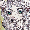
a continuation of this. Everyone liked different things, so I combined the elements (the trees and may-apples and puddles - I know nobody said anything about puddles, but I liked them more than a stream). . .but that left me confused on the colorscheme.
SO, which do you guys like now?! Any other suggestions/changes/critiques on the composition?
(BTW, sorry for being annoying with this, but I've decided it's more important to have one good piece for the artshow than have two OK ones. . .and so I want to make sure I pick the colors that look the best)
EDIT: Alright, going with #6, by popular demand. I was afraid it would look too unrealistic, but in real media it looks a lot more natural, so all's well :) Thanks for the help, guys!
Category All / All
Species Unspecified / Any
Size 629 x 1177px
File Size 715.2 kB


I think I like 6 best. It's just.. I really like the contrast of it, yet because the unicorn is white, it still pops out pretty well against the yellow background.
3 and 7 are the ones I wouldn't go with. 3 is too light, so nothing really stands out, and with 7 you completely lose the details of the far-off background. It looks cool, but it doesn't have that added depth and detail.
>u<
3 and 7 are the ones I wouldn't go with. 3 is too light, so nothing really stands out, and with 7 you completely lose the details of the far-off background. It looks cool, but it doesn't have that added depth and detail.
>u<


I am finding myself partial to 6 and 8.
6, because I feel like the contrast between the background lighting and the foreground is a healthy one.
8, because I feel the color of the puddles gives it some contrast while the overall tone of the picture is more soothing.
<3 Best of wishes deciding!
6, because I feel like the contrast between the background lighting and the foreground is a healthy one.
8, because I feel the color of the puddles gives it some contrast while the overall tone of the picture is more soothing.
<3 Best of wishes deciding!

I like 1, 6 and 8 the most.
1 has a nice natural, eathy feel to it which emphasizes the daintiness of the creature. As does the fact that the colors are all soft and pastel.
However, on the opposite hand, 6 does a great job of really putting you in a fantasy, other-worldly feel. The creature is obviously something fantastic, and so the coloration of the environment emphasizes that aspect of it. As well the yellow background does a great job of really making everything pop.
8 has a more natural feel to it as well, but in a more autumn kind of setting. The deeper browns help make the creature stand out more, but at the same time doesn't isolate it since the background is very light as well. I also really enjoy the autumn.
On a side note, 5 is interesting, though not a favorite. It could make for a nice night-time kind of setting though.
Hope that helps. =)


Hmmmmmm.
I wouldn't go with the pastels, cause those are a bit played out with Unicorns, but that's just me.
My favorites are 2, 5 and 6.
2's just a classic forest coloring, but it's not pastel.
5 reminds me of one of the forests outside of Stormwind in WoW. Didn't really play much of that game, but loved the art direction.
6 is just neon colors. forest rave party. But in seriousness, the colors are interesting for a unicorn.


I am the most drawn to 2 for several reasons. My first reason is that I feel that unicorns are a quiet, withdrawn kind of creature. The ones where the unicorn sticks out majorly don't resonate with me. My second reason is The colors in 2 make me feel relaxed, where as none of the others really do that for me. My final reason is probably purely me, but I feel like the colors go together rather than clash in 2.


Comments