 FA+
FA+
12789
Views
Views
2041
Favorites
Favorites
Category
Artwork (Digital) / General Furry Art
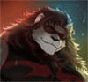
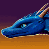
Species Tiger
Size 660 x 840
File Size 1.29 MB
Report this content
More from Rukis


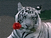
This took me a million years longer than it was supposed to. It's supposed to be for EF's conbook, but it's a tad late. Hopefully they'll find *some* use for it. I may tweak it a tad more. . . time shall tell.
Their theme this year is 'Kung Fur Hustle'. I'm not so much into Kung Fu, but the idea of zen meditation has always appealed to me. I went with a blue, or 'maltese' tiger, because the idea has always fascinated me. I love the blue coloration in almost any other animal, and I've always wanted to take a crack at it with a tiger. This project was free enough that I could do pretty much whatever I wanted within the theme. Thus. . . maltese tiger. Duh-nuhhhhh!
The color's crazy vibrant, I know. . . but I wasn't really going for realistic color with this one. It's just pwetty. I have too many pieces full of brown. I needed something vibrant.
Category Artwork (Digital) / General Furry Art
Species Tiger
Size 660 x 840px
File Size 1.29 MB


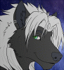


I'm also not a fan of the yin-yang...mostly because it looks out of place to have a solid tattoo/medallion placed in the fur texture. But other than that, it's a well executed pic, with a nice implication of duality in the black/white stripes, good color contrast, and a tranquil background.


Actually, saturated colors work great when there is a nice balance of desaturated colors in an image.
I really think this concept is cool!
My only concern is the fact that he appears to be rather neckless, "scrunched up", and un relaxed at the top of the page. I believe this is because his face is very frontal and flat. We would see more of the top of his head, and slightly less of his bottom jaw if he is in a serene *head bowed-slightly looking up* position.

Yes, it is clear that it the position is intentional, and its a good attempt: but regarldess, the perspective of the head isn't pulling it off. Thats not to say the piece isn't nice, and I am certainly not attacking the artist, just trying to be helpful for future images


Looks really nice. I like the vibrant background in contrast with the duller character.
One thing that looks off though is his center of gravity. Of course this would be impossible in real life anyway, I would imagine the tail would make contact with the ground in his center of gravity (which would most likely be just right in the middle instead of off to the side). I also agree with what melo666 said about the scrunched up neck.
One thing that looks off though is his center of gravity. Of course this would be impossible in real life anyway, I would imagine the tail would make contact with the ground in his center of gravity (which would most likely be just right in the middle instead of off to the side). I also agree with what
 melo666 said about the scrunched up neck.


Absolutely gorgeous. I do tend to agree with others that the yin-yang is a bit out of place, but it is small enough that it doesn't draw focus away from the image. I actually missed it at first glance. As far as the coloring and environment goes, I think it fits very well and is quite beautifully executed. The "neck scrunched up" that others have mentioned doesn't really strike me as such... more like he is peering intently (almost glaring) ahead, perhaps at the person who has interrupted his meditation!


I know critique is a good thing, but people are a little too picky about YOUR art...like damn. The anatomy critique, i get it. Pickiness about "cliche" and placement of a symbol? God damn people, if you want it to be a certain way then you draw it o_O
I like the yin yang where it is. It draws the eye right in. I think it fits in with the pic perfect bc the trees are very detailed and "circular" (hard to explain) so the yin yang sort of balances that out on the figure. pardon the pun lols. You did a great job on this ^_^
I like the yin yang where it is. It draws the eye right in. I think it fits in with the pic perfect bc the trees are very detailed and "circular" (hard to explain) so the yin yang sort of balances that out on the figure. pardon the pun lols. You did a great job on this ^_^
i dont see what the big deal is about anatomy... like look at a lot of famous arts or just "good arts"... furries are just obsessed with PERFECT anatomy. Im sure you have good knowledge, and youll eventually be able to implement it. (: it is a nice thing, but yeah, my two cents.
To reply to both your comments on critique, I think its fair to say that with 1000+ favs, Rukis is a well known artist. So of course there will be MANY more critiques and opinions.
And not all people who critique are out there to push buttons. 9_9 , I just like an artschool type environment & want to help.
If people are obsessed with perfect anatomy, then its with good reason, because its the foundation of a good drawing. You can render on top of a weak drawing all you want, bad anatomy still sticks out like a sore thumb. That is why it is a big deal. Anatomy is very difficult,and artists will struggle with it(myself included!) for a good deal of time. This of course is not in reference to Rukis, just a general statement on your comment on anatomy.
Anyhow, this was in no way some sort of an attack(just specifying that incase the tone isnt coming across as friendly over the internet X3). Just took notice of your comments and wanted to deliver my two cents on the matter.


Comments