 FA+
FA+


541 submissions


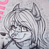
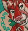
Bad T-shirt design #2 by Scurrow
A second T-shirt design, this time with 2 colors. This is a perfect gift for that sleazy yet uppity oh-so-hard-to- buy-a-gift-for person in your life.
How do you feel about the balloon placement and the lettering color?
How do you feel about the balloon placement and the lettering color?
Category Designs / All
Species Kangaroo
Size 866 x 891px
File Size 157.8 kB


http://scurrow.tumblr.com/post/7356950801 This is what it looks like without the balloon. I think the balloon adds a weird unstable touch to it that i like, but i like the simplicity of the balloonlessness too. I'll have to think about it some more. I appreciate your input!!!


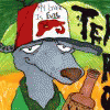

Damn I want this shirt. I like the lettering, it's so loud that it's unsettling, but in a good way as it really compliments the uh atmosphere of the image. I love that he has a balloon on his tail but it might look better slightly lower and to the left just a tiny bit more, because it's almost touching his cheek but not and it's like ahhh tension.
but.. I super duper love this.
but.. I super duper love this.
thanks! I know what you mean, it's an awkward distance from his cheek, but it's supposed to be in back of him a bit. I could probably move it, i just wanted the string to be straight. I could make the string a lot longer and maybe move the I, or make the string shorter. Yeah, it's real close this cheek, now that you mention it i can't deal with it either aaaaaaah!!!!


Comments