 FA+
FA+
348
Views
Views
38
Favorites
Favorites
Category
Artwork (Digital) / All
Species Dog (Other)
Size 500 x 500
File Size 507.8 kB
Report this content
More from Blaushepherd


Happy Jack wasn't old, but he was a man
He lived in the sand at the Isle of Man
The kids would all sing, he would take the wrong key
So they rode on his head on their furry donkey
The kids couldn't hurt Jack
They tried and tried and tried
They dropped things on his back
And lied and lied and lied and lied and lied
But they couldn't stop Jack, or the waters lapping
And they couldn't prevent Jack from feeling happy
http://www.youtube.com/watch?v=52cQ.....Kw&ob=av3e
HE HAS A NAME NOW
Category Artwork (Digital) / All
Species Dog (Other)
Size 500 x 500px
File Size 507.8 kB

One of the most distracting things, for me, is the white symbol up top. The rest of the picture is dominated by a thick, dark, heavy line and then poof! there's the white Arabic character. Other than that, I think this is pretty pleasing. I like how your tones contrast rather than just basic light/dark... like how the character is a saturated brownish tan while the background is much less so. You're using the same color family very successfully.


http://www.iaza.com/work/110829C/ia.....6215898600.png
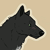
the biggest thing i noticed was that the bottom jaw looks too short. as i've learned from studying that skull i got from you, the bottom canines are actually in front of the top ones when the mouth is closed, so they would need to be farther forward here.
also the shape of the top of the head looks too... flat, i guess. unless he has no brain, then it's cool
besides that, i like the colors and shading, and just the general style you have here. although i agree with bludiepaws that the white character is a little distracting.


like i said, i love this
one thing that looks kind of off (that i just now realized) is the lip on the outside
it seems like it goes too far forward in comparison to the nearest side
ignoring most major anatomy things because it's stylized, but the angle of the nose also seems a little off whether it's stylized or not. the nose seems to face the viewer more, while the actual head seems to be pointing more straight forward

Comments