 FA+
FA+


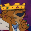
A much overdue Colored Lineart piece for  grrratch of the leaderly liger.
Not all colored linearts will look like this, my extra rendering of this piece is mostly due to the fact I've neglected it in so long, hence Bonus for my commissioner this time.
Hope you like!
 grrratch of the leaderly liger.
 Not all colored linearts will look like this, my extra rendering of this piece is mostly due to the fact I've neglected it in so long, hence Bonus for my commissioner this time.
Hope you like!
Category Artwork (Digital) / General Furry Art
Species Feline (Other)
Size 576 x 864px
File Size 186.1 kB


Sequentially I'm tackling new techniques in digital paintings. For this next little while it's atmospheric lighting, dual light sources and color combinations. In previous it was shade texture and color blending, which I'm much better at now, among other smaller things.
Danka. *has stalked your gallery* You're doing great too! I like your dynamic poses, and your coloring has style! I push people to experiment moar. *push push* I think I tend to post the works I'm alright with as well as the ones i'm proud of in order to gather some retrospect later. I can look back a year in my gallery and go "Okay, I improved!", or find the things I liked in my work and remember to keep that piece of me. Not all, but most artists tend to have an aspiration towards something, and I try my best to see the things that I like in all pieces of work and stare it down to see how it works, and try myself repeatedly until I achieve something similar or that works the same. Anatomy is a big thing for me, but Style is the second. Not that I don't have one myself, which is often what works best.
Thank you very much! I've scrapped most of the things I've submitted and I just get so frustrated :( So it's nice to hear that someone thinks I'm headed in the right direction at least.
But I definitely try to surround myself with people who actually want to improve and aren't complacent with cell shading and wonky "styled" anatomy :P It's definitely a journey I couldn't make on my own. I'm just not motivated enough! But at this point I feel like I've taken a pretty big leap in skill level (somehow) so hopefully that'll encourage me to go for a while :)
Right now I'm working on values and volume through shading. I'll probably work on that until I'm somewhat comfortable with thing not looking completely flat. Then I'll try to tackle color relationships x.x That's something that just hurts my brain right now. I mean I get it, but it's just... Hard! LOL.
I guess along the way I'll work on anatomy, composition, etc. But I'll try to take it one step at a time.
I'm always looking for critique (serious critique, not back-patting and hand-holding), so if you ever feel the need to work your critiquing muscles, give me a holler :P Same goes for you. I'd be more than happy to give you input on any of your submissions.
I usually don't critique right off the bat because a lot of people take it very poorly. Which is a shame. If you never see a mistake, you'll never correct it!
Sorry for the wall of text :S
You don't seem so unused to the idea of value (in your works that is). Your latest greyscale wasn't a bad try in the least. If I can find the resources that led me to understand lighting a bit better, I'll hand them to you. I believe there's one by Damie M ( http://www.furaffinity.net/view/4098394/ ) that I found Really helpful. It also helps to, when adding value with colors, attempt to make shadows... colorful. Your highlight is either a plausible natural light color, or an unnatural one, but your shadow is quite literally always a mixture of the colors of the objects nearby and the light reflecting them. The last hint I can give you to a more convincing Value in shading characters is that the edge of highlight will be the darkest shaded area (as in the shadow might be considered an alternative light source, and the darkest value to which will be to the edges of the highlight, usually better seen in swift folds and flat-like surfaces). In any case, I'm a horrible person and don't always remember my own teachings. It's always helpful to play with images you respect. I admittedly search thru DA for my fav Superhero pics and soul-steal the lighting effect on occasion to test how I might play with the concept.


Comments