 FA+
FA+
2067
Views
Views
65
Favorites
Favorites
Category
All / All
Species Tiger
Size 1280 x 706
File Size 919.6 kB
Report this content
★
More from Denucard


EDIT: I choose C. :) THANKS EVERYONE!!! I will explain later in a ref sheet why.
Help me choose the right marking? I can't choose lol. And yeah she looks tipsy cuz she's tired just like I am right now.
Help me choose the right marking? I can't choose lol. And yeah she looks tipsy cuz she's tired just like I am right now.
Category All / All
Species Tiger
Size 1280 x 706px
File Size 919.6 kB


B & C flow well with the face and don't add clunkiness. G D H, I feel, as floating-markings not anchored to anything, will be a pain from certain angles or in certain styles that might push the cheek/eye closer.
B would be the best choice, I think, because the markings wouldn't become frustrating if you, say, pushed the expression of the mouth back! There is plenty of room for movement in the face without obscuring those markings.
(in case you wanted an answer that wasn't just a letter!)
B would be the best choice, I think, because the markings wouldn't become frustrating if you, say, pushed the expression of the mouth back! There is plenty of room for movement in the face without obscuring those markings.
(in case you wanted an answer that wasn't just a letter!)


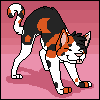


I really like C, and how it frames the cheek fur. <33 I like it better than B, though, because the second, smaller stripe looks tattoo-like, like it does in H, which is also pretty appealing (at least to me. xD;), as compared to just kind of "hanging" along the cheek-line as in B and F.
In D and H, the stripes just kind of look like tattoos, which is neat if that's what you're going for, but I think it'd be neat if you mixed the two concepts as in C, so it sort of appears like a mix of stripes and tattoos (if this makes ANY sense at all, let me know. xD). I like A as well, if you're going for the natural stripe kind of look, rather than making them look more design/tattoo-ish...
eh, I don't know. xD I'm trying to make my two cents make sense in a design-aspect-y way, but I'm not sure it makes any sense at all, so feel free to ignore!


B-but...they're all the same...just kidding.
G, definitely G, it's the one that stuck out the most for me, and if something catches your eye more than the others you go with that.
I stopped counting how many others said G before me though...if only you could of just did a poll instead. ^^;
G, definitely G, it's the one that stuck out the most for me, and if something catches your eye more than the others you go with that.
I stopped counting how many others said G before me though...if only you could of just did a poll instead. ^^;


This was the first thing that came to my head when I read the title XD http://www.youtube.com/watch?v=gpolkLoXM2g


Comments