 FA+
FA+
1873
Views
Views
92
Favorites
Favorites
Category
Artwork (Digital) / Fanart
Species Western Dragon
Size 1280 x 905
File Size 407 kB
Report this content
★
More from Ranger
")
")
")


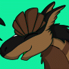
Just a little image I did up for the re-do of "Visiting Ponyville".
I plan to draw SolidScale and Ranger the same size as I did for
  KazulTheDragon in the original image, so as to make story progression possible. (IE, kinda hard for them to do anything story related when they can't move).
So yeah, just a doodle of Ranger in a sorta MLP Dragon style, with a silhouette pony for comparison. Much larger, so it'll be easier to carry several ponies without much trouble... :3~
FULLVIEW: http://dl.dropbox.com/u/14597086/Hi.....nyToDragon.png
I plan to draw
 SolidScale and Ranger the same size as I did for
  KazulTheDragon in the original image, so as to make story progression possible. (IE, kinda hard for them to do anything story related when they can't move).
So yeah, just a doodle of Ranger in a sorta MLP Dragon style, with a silhouette pony for comparison. Much larger, so it'll be easier to carry several ponies without much trouble... :3~
FULLVIEW: http://dl.dropbox.com/u/14597086/Hi.....nyToDragon.png
Category Artwork (Digital) / Fanart
Species Western Dragon
Size 1280 x 905px
File Size 407 kB


I suggest toning down the colour on him a bit, as right now he's blinding, and if it were on TV it'd probably mess up the screen. Avoid using absolute RGB values (that is, 255 in one, 0 in the others) since it looks flat and unnatural, and is aesthetically dull.
Taking colour cues from the show, you might want to consider:
Red: 235,65,66
Dark Red: 160, 26,27
Yellow: 240, 212, 116
Darker Yellow: 236, 182, 66
Green: 97. 185, 81
(values are clamped to max 240 and min 15 in any channel to avoid color bleed, and to save people's eyes from bleeding)
Always temper your colours with the other colours, and remember: As a colour gets darker, it becomes more saturated and shifted towards another hue. Yellow becomes orange, orange becomes red, red becomes purple, purple becomes blue (green, on the other hand, has yellow as it's lighter colour and blue as it's darker colour, generally). If you start out with your mid tone being maximum saturation, the colour has nowhere to go, ergo the flatness. Also, as a colour gets lighter, it becomes less saturated. Colour depends on the light, and there is (functionally) no situation in which absolute RGB values exist. Take better care of your colours, and your work will be a thousand times better.
No offense meant but I wasn't really looking for color critique here. This was sorta meant to be a representation of my usual 'Sona, Ranger, whom does, admittedly, have some rather "absolute" colors. It's just my style, really, and the way Ranger's been for years, so I don't really like the idea of changing it too much.
Not to say I won't consider it though, I've experimented before and I just have yet to find the right balance. For now though, this red is what I use until I find it~
Not to say I won't consider it though, I've experimented before and I just have yet to find the right balance. For now though, this red is what I use until I find it~
Style isn't colour choice. Style is mutable. If I had a penny for every time someone used "style" to excuse poor colour choice, I would be a very rich man. I once had a character who was magenta (255,0,255) but I changed him because the colour was ugly and overbright. He's still purple, but a lot better purple.
Your character design, in regards to colour, doesn't need to remain the same - no point not evolving as you know more. Poor decisions can be replaced by good ones. Sure, he can still be yellow and red with green eyes. But he doesn't have to be absolute red and yellow and green. Depending on the lighting he could be a purpley red, with a warm orangey yellow, or a pinky red and a pale yellow. Colour itself isn't absolute. Using absolute colours is garish and one of the first things you learn not to do - and it clashes with everything. It sucks life from everything. Wise colour choices can change a character from a flat blandness to a rich and developed sophistication.
The colours I suggested were just to match the colour palette of the show, not "replace your character's colours with this forever after" because that's ridiculous. No character is exactly the same colour in all situations! That's impossible.
Now don't get me wrong, I used to use absolute colours too, thinking they were the bee's knees. But you have to learn - colour isn't a hammer. It isn't a blunt instrument you whack pictures with. It's a delicate tool that can make or break a picture, that can warm a person to it or chill their heart.
You may not have asked for critique, but I saw something off and wanted to help you - after all, how can you improve without people helping you? There's no reason to be afraid of it. Not one of us is a perfect, solitary machine. I could point you in the direction of colour theory and give you the groundwork so your experimentation has some context. Knowledge is a beautiful thing, and the more we have, the more we can do with what we know. To reject it is to embrace hubris and decadence, to stagnate and the last thing you want to do is stagnate.
For that is the most dangerous thing to do.


Comments