 FA+
FA+
5142
Views
Views
312
Favorites
Favorites
Category
Artwork (Digital) / General Furry Art
Species Eastern Dragon
Size 598 x 844
File Size 148.9 kB
Report this content
More from TaniDaReal


Listed in Folders


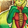
This was the poster I made for Eurofurence 17's Pawpet Show this year.
The title of the show was "The Year of the Rat" (related to the Asian con theme).
The picture was done digitally (Photoshop), but I tried to give it a
traditional Aquarell (water color) look, with canvas structure.
The Chinese text means "Year of the Rat" and was kindly translated by Reeve. :)
The title of the show was "The Year of the Rat" (related to the Asian con theme).
The picture was done digitally (Photoshop), but I tried to give it a
traditional Aquarell (water color) look, with canvas structure.
The Chinese text means "Year of the Rat" and was kindly translated by Reeve. :)
Category Artwork (Digital) / General Furry Art
Species Eastern Dragon
Size 598 x 844px
File Size 148.9 kB
Listed in Folders


i could make an obvious statement about the lack of the rat, but something tells me that you're probably aware, seeing that you did the picture (unless there is a small one hidden in the picture i didn't spot yet). it's a nice picture. my only issue with the texturing is that the very digital style of the text disrupts the effect - that said, it fits the picture itself rather well. i like the buildings and the warmth of the sun rise/set,

Very nice, though a little constructive criticism here, if thats welcome..
"noise texturing" is abit tricky to get right (as far as i perceive it).
On natural mediums the angle of the canvas never turns out being bang on 100% pixel perfect vertical orientation; nor does the pattern have absolute identical consistency, the threads weave around abit & distort in the path they follow a little. This can be acheived by taking the texture layer, applying a little bit of thoughtful distortion effect to mimic the slight inconsistencys in the thread weave & if desired, very slightly vary saturation of the effect in large areas to mimic the effect of light falling differently in different places & the paint quantity smoothing off the texture more where more has been applied.
Also overall i would feel that the effect needs dialling back a little in its saturation, it feels 2x too strong to me and destracts from the tone of the picture a little.


A wonderfull poster and the PPS this year was really nice
I enjoyed it a lot
And for all these that ask why is there a Dragon on the poster watch why
http://www.youtube.com/watch?v=qP8S.....layer_embedded
I enjoyed it a lot
And for all these that ask why is there a Dragon on the poster watch why
http://www.youtube.com/watch?v=qP8S.....layer_embedded


Damn... I waited to comment till now... I think the pic is amazing...
But just finished watching the entire thing (on youtube obviously)... took 2 sittings over two days to watch it lawl...
Fucking epic show. No joke. ^_^
Nice to see that you were part of it be doing the cover art :3
But just finished watching the entire thing (on youtube obviously)... took 2 sittings over two days to watch it lawl...
Fucking epic show. No joke. ^_^
Nice to see that you were part of it be doing the cover art :3


Comments