 FA+
FA+


")
")


EDIT:  balorkin was so kind to inform me that the ADDITION layer setting is called LUMINOSITY in conventional SAI versions (I have a really old an cracked one) you may go thank them
Woah I have been sitting half the night and half the day on this to get it together 6_9
# yes I'm using FA's dark style, it's superior in every way.
Since FA shrinks everything down, here's an external link to the fullview:
http://dl.dropbox.com/u/17145787/sh.....20tutorial.jpg
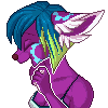
Character in the image is Mawi, and belongs to Skulldog
The finished picture can be seen here: http://www.furaffinity.net/view/6569454/
# if you can think of anything else I do where you'd like to have a tutorial on, please suggest! Chances are I might make one for it!
 balorkin was so kind to inform me that the ADDITION layer setting is called LUMINOSITY in conventional SAI versions (I have a really old an cracked one) you may go thank them
Woah I have been sitting half the night and half the day on this to get it together 6_9
# yes I'm using FA's dark style, it's superior in every way.
Since FA shrinks everything down, here's an external link to the fullview:
http://dl.dropbox.com/u/17145787/sh.....20tutorial.jpg
Character in the image is Mawi, and belongs to
 Skulldog
The finished picture can be seen here: http://www.furaffinity.net/view/6569454/
# if you can think of anything else I do where you'd like to have a tutorial on, please suggest! Chances are I might make one for it!
Category Artwork (Digital) / Tutorials
Species Unspecified / Any
Size 1000 x 4827px
File Size 1.6 MB


I'm glad you like it!
Basically it's just another image (pattern of flowers) I loaded and put behind the character.
Here's a really great tutorial about aplying texture made by Shhinerai:
http://shinerai.deviantart.com/gall.....xture#/d268ieq
I hope it helps!
Basically it's just another image (pattern of flowers) I loaded and put behind the character.
Here's a really great tutorial about aplying texture made by Shhinerai:
http://shinerai.deviantart.com/gall.....xture#/d268ieq
I hope it helps!


I...
I wouldn't rely on this >XD
It's not a good way to shade a picture, but it's fun and quick!
I still want to learn how to paint by selecting colors from a palette rather than abusing layers and gradient maps in order to get something good looking
I'll be getting there :)
I wouldn't rely on this >XD
It's not a good way to shade a picture, but it's fun and quick!
I still want to learn how to paint by selecting colors from a palette rather than abusing layers and gradient maps in order to get something good looking
I'll be getting there :)


Only using standart brushes for laying down the flats in PS.
I never really color in PS, but if I do, I use a broad spectrum of brushes I downloaded from other people, like so:
http://concept-on-mac.deviantart.com/art/ALL-MY-BRUSHES-124754901?q=favby%3Alindblut%2F44739622&qo=0
I never really color in PS, but if I do, I use a broad spectrum of brushes I downloaded from other people, like so:
http://concept-on-mac.deviantart.com/art/ALL-MY-BRUSHES-124754901?q=favby%3Alindblut%2F44739622&qo=0

hmm?
Well here is the "quicker" way I do it, I do different coloring methods depending on the picture"
http://www.synchrastudios.com/galle.....geViewsIndex=1
http://www.synchrastudios.com/galle.....geViewsIndex=1
http://www.synchrastudios.com/galle.....geViewsIndex=1
http://www.synchrastudios.com/galle.....geViewsIndex=1
I like how you spiced up the colors and you seem to use photoshop more efficiently. XD Like how you did the layer mask, my way takes a couple more steps. :P Stuff like that!
guh FA broke two of my links.
2) http://www.synchrastudios.com/galle.....geViewsIndex=1
4) http://www.synchrastudios.com/galle.....geViewsIndex=1
2) http://www.synchrastudios.com/galle.....geViewsIndex=1
4) http://www.synchrastudios.com/galle.....geViewsIndex=1


Hmm, I think it's not, at least not in PS if I remember correctly, and I always was able to select "addition" as a layer setting in Sai.
The setting however should make things lighter when working on it with your flat colors underneath, so as long as it acts like an addition layer, you should be fine!
The setting however should make things lighter when working on it with your flat colors underneath, so as long as it acts like an addition layer, you should be fine!


I love this tutorial and I'm trying it out right now.
It took me a while to understand about the "gradient map" portion, though, since I use gradient maps quite often. In your tutorial, you are actually using "Curves", which when I tried it gave a much better effect.
But thank you, thank you for this tutorial! =D
It took me a while to understand about the "gradient map" portion, though, since I use gradient maps quite often. In your tutorial, you are actually using "Curves", which when I tried it gave a much better effect.
But thank you, thank you for this tutorial! =D
I'm glad to hear that and you're very welcome!
And sheesh really? I had no idea! I'm using german photoshop where they're called Gradiationskurven (gradient curves) - for some reason I thought their english equivalent was called gradient maps though! I'll correct that soon, thank you!
And sheesh really? I had no idea! I'm using german photoshop where they're called Gradiationskurven (gradient curves) - for some reason I thought their english equivalent was called gradient maps though! I'll correct that soon, thank you!


Thanks for this awesome tutorial! I think I'm gonna give this shading style a try - I feel like my current shading style is a bit rough, and I have a hard time getting a decent gradient going. I already do my flats in "multiply" mode anyway - this method seems to be a whole lot easier. I tinkered around with "Difference" mode after reading this tutorial, and found that you can get some good shadows with it, too.


I never really pick black because it's impossible to shade - since it IS a shade, just like white!
Alternatively I pick a dark desaturated brown, blue or green for black. It really depends on the colors of the rest of the picture. And usually I just shade with a blue-ish grey, but nearly any toned grey goes well, my suggestion would be to experiment and see what works best for you!
Alternatively I pick a dark desaturated brown, blue or green for black. It really depends on the colors of the rest of the picture. And usually I just shade with a blue-ish grey, but nearly any toned grey goes well, my suggestion would be to experiment and see what works best for you!

sigh...im trying to do this form of coloring style,normally im just lineart flat and shade...
but id like to try sketches like this on the tutorial...i got sai,im just getting to see if i can get the hang of this tutorial,its nicebut im might be
making a few issues,ill figure it out soon
but id like to try sketches like this on the tutorial...i got sai,im just getting to see if i can get the hang of this tutorial,its nicebut im might be
making a few issues,ill figure it out soon


;.;......do you know how much I love you right now? I was just thinking last night just how I could color like that and then you show how to do that clipping mask thing between the layers T^T you have just saved me like hours of pain of erasing T.T thank you~~~ I love the rest of your tutorial also, I think I'm going to give some of these a try on my next coloring (which is tonight xD)

'Negative Multiply' should work just as well!
I think the addition layer blends the colors a little differently, but overall they are more or less the same (brightening up the colors underneath)
I don't really know what kind of version I'm using, but multiple people have come forward to report that they lack that layer setting.
I think the addition layer blends the colors a little differently, but overall they are more or less the same (brightening up the colors underneath)
I don't really know what kind of version I'm using, but multiple people have come forward to report that they lack that layer setting.


This is a most brilliant tutorial. Thank you so much for making this!
Unfortunately I, too, am missing the 'Addition' Layer setting... I also don't have 'Negative Multiply'.
But, the internet told me, that 'Addition' is wether a term from Gimp or older or cracked SAI versions - so the official Version that I have uses 'Luminosity' there. So I hope this helps anybody who is fiddling with this... it sure gave me a headache to find out which one I needed. ^^


Very very useful tutorial! To get this straight, when you add the highlights, you turn off the multiply base and pick the base color, then make it brighter? And for each color, a new Add layer? (Sorry if it sounds confusing ;; )
I just wished SAI worked for mac, though. Since FireAlpaca is the only art-program that works with my tablet's sensibility, Sai wont work with it, hence I only use FA. But hey! I dont doubt it'll be practically the same, so thank you for this tutorial! <3
I just wished SAI worked for mac, though. Since FireAlpaca is the only art-program that works with my tablet's sensibility, Sai wont work with it, hence I only use FA. But hey! I dont doubt it'll be practically the same, so thank you for this tutorial! <3
Yeah, you can also colorpick with the multiply layer on, the difference is that with the layer turned off the color you pick will be brighter, and thus the highlights/shading will be more contrasted (or 'shinier').
You can even hand-pick colors and see what works for you! Tone-in-tone can be boring and dead looking, which is why I like to spice it up with gradients at the end.
You can also use one layer for all highlights, but I personally find it more convenient to seperate colors sometimes so they don't mush into one another.
I have no experience with FireAlpaca, but I know that Gimp is supposely the Photoshop alternative for those who can't afford the latter. Otherwise I guess most art programs these days have layers and layer settings, so you should be fine!
Hope that answered your questions!


Comments