 FA+
FA+
183
Views
Views
4
Favorites
Favorites
Category
Artwork (Digital) / Fantasy
Species Western Dragon
Size 1201 x 908
File Size 132.6 kB
Report this content
More from Aquilla-Whingate


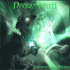
This again is an image that uses both photo and real effects in it and drawn more hand drawn content.
Sky and Landscape Photos Snowpocalypse different Photo and Sky Caption Summer as well. However the trees are all hand drawn and so are the mountains used Photoshop built in pattern texture and overlay, plus colors to make the mountains.
Total time 8 days at 33 hrs work time,
Gift for friend.
Dragon scales from Here!
Mistletoe Stock from Here!
Larger image for download Here!
The sun's rays glisten,
Warming the earth.
As the love of friends.
Warms the soul.
Category Artwork (Digital) / Fantasy
Species Western Dragon
Size 1201 x 908px
File Size 132.6 kB

If you really want to improve at art, the first thing I'd suggest is to get away from things like airbrushes, stock textures or patterns, and such things, and just learn the basics of painting from reference.
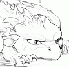
The round paintbrush will get you far at first with art, truly, as will traditional medium art. So far as the issues with this picture, it's nice to see the effort with the lighting, but the largest problem here is the different elements and things in the picture not being in perspective and proportion from once another. The sense of depth from dragons to trees to more trees to mountains is very shaky, not helped at all by the strange-looking photograph element in the snow, and it's really hard to judge how distant objects are from each other. This is a sense mostly just learned over time and from looking at things in photographs and real life, so obviously as always, looking at reference to glacial and mountain scenes involving trees and trying to copy references and elements of references will always be a boon, if you aren't already doing that.
Rather than label out every element of this picture that should be changed, I'd offer advice for art in general: to improve with art long term, get away from sampling in photos and textures at first and learn to paint things just by recreating from references. In general, try to get away from airbrushes, the inked lines around objects (things in real life never have an artificial pitchblack outline), and so on...that's the way forward with art at this point, because to be a better artist at some point you'll have to not rely on pasting in things but knowing the mechanics of drawing enough to draw clouds, snow, etc, yourself. Also, no more airbrushing! Tis an easy mistake and one I made as a beginner artist until I mended my ways. Anyhow these are my thoughts; rather than changing specific elements of the picture, I would suggest rethinking your drawing style entirely, pulling out some references for simple objects, painting them with simple paintbrushes and working your way up from there!
Now this is more of the kind of critique I needed from someone any way to be afraid to say what the flaws are and for that I thank you sir.
Now I do as you say "piece together" a lot of the image to make it come out like the way I did here, I also do that because I have to draw on pieces of paper scan clean up and then can cut out each of the sections from the background together into certain layers; also because I do not have an art tablet, that is no excuse I know. I do think that perhaps I should have drawn more of a mist or bowing snow area between the distances from the dragons to the trees to the mountains, not quite how to achieve that effect though. The air brush glow and drop shadow areas on the dragons and the first set of trees on the distance besides the ones in front; were done on I copied the black lines layer, (the ones not naturally found in nature) and added later styles, and a brush of 1% opacity here and there fir touch ups mostly, same way with the mountains light and shadows as well. I am still trying to find a way that makes mountains look real by just painting them in as well, have not found a way that suits my liking as of yet. I also to a semester of Photoshop and Illustrator in college but a lot of what has gotten me even this far was self taught and a youtube tutorial every now and then, again I know no excuse. Body references I got Landscape not as much but what is built into an image of another person's work, and I again thank you for your thoughts, I will see that I can try doing moving froward.
Now I do as you say "piece together" a lot of the image to make it come out like the way I did here, I also do that because I have to draw on pieces of paper scan clean up and then can cut out each of the sections from the background together into certain layers; also because I do not have an art tablet, that is no excuse I know. I do think that perhaps I should have drawn more of a mist or bowing snow area between the distances from the dragons to the trees to the mountains, not quite how to achieve that effect though. The air brush glow and drop shadow areas on the dragons and the first set of trees on the distance besides the ones in front; were done on I copied the black lines layer, (the ones not naturally found in nature) and added later styles, and a brush of 1% opacity here and there fir touch ups mostly, same way with the mountains light and shadows as well. I am still trying to find a way that makes mountains look real by just painting them in as well, have not found a way that suits my liking as of yet. I also to a semester of Photoshop and Illustrator in college but a lot of what has gotten me even this far was self taught and a youtube tutorial every now and then, again I know no excuse. Body references I got Landscape not as much but what is built into an image of another person's work, and I again thank you for your thoughts, I will see that I can try doing moving froward.
Comments