 FA+
FA+
411
Views
Views
5
Favorites
Favorites
Category
Artwork (Digital) / Fantasy
Species Alien (Other)
Size 500 x 500
File Size 472 kB
Report this content
More from taklayyankovic


Not really a walkthrough but sort of a step-by-step thing. Sort of. I suck at saving multiple progress shots, so I thought I'd try to explain the layers of my painting, at least? I tried to use as few layers as possible.
I'm not really good at this stuff lol, so believe me when I say I'm not trying to sound like I know what I'm talking about. 9_6
I use Photoshop CS and for this I used all default hard round brushes, except to sketch with, but that's not really important - I usually sketch with hard round brushes, and this is just barely altered to be more slanted and less round.
1. The sketch. Pretty self-explanatory. The background colour (which is also a separate layer, thankfully) was originally a lot lighter than this, which you'll see later, but having a warm grey for something like this is less intimidating and whitewashing than pure white. 100% opacity (O), 100% fill (F). It's okay for this to be messy.
2. Undercoat(?). Not really sure what else to call this, but I wanted to be a bit more, um, colourful. So I picked a darker warm red as a sort of guide for the darkest parts of Orange. I used a large airbrush, I don't remember how big it was and it's not really important as long as it's as few strokes as possible so that you can still see the sketch underneath. 50%O 50%F, probably.
3. WIP. An example of the light grey I was using as the BG before I darkened it. I wouldn't suggest starting something like this on a light canvas. I can't really explain how to pick colours, especially since I barely understand colour myself, but try to use your undercoat as a starting point for laying down the "actual" colours. Start with the darkest colours first. Be sure to check back with your sketch if something starts to look lopsided. I didn't do that, and it shows. I continued with the 19px hard round brush at 50%O 60%F, sizes varying from 50-60px for the base colours and 20-30px for the more furry details, and 10px for the smallest ones. Once you get your colours down, it's mostly about eyedropping your colours. Try not to make new ones unless you absolutely have to.
4. The finished colours. It should be noted that I also had an extra layer between the colour layer and the undercoat that was the same colour as the BG, I used that to cover up the extra spray of the undercoat and help shape the overall form I'm going to cover.
5. On a new layer, I've sharpened up some of the edges of the painting in the same way I "cleaned" the undercoat. This wasn't really necessary, I guess.
6. Another new layer, set to Overlay. The layer itself is set to 70%O. Using a mid-saturated fully bright yellow and a 200px soft round brush set to 20%O 20%F, I used this to highlight my edges, add a mild glow, and bring more warmth to the image.
7. Using the darkest purple on the image, on a new layer set to Multiply at 50%O, using the same brush, I added shadows. Be a better man than I and keep your light source in mind!
And that's more or less how I did this. One of these days, maybe I'll learn how to do this right.
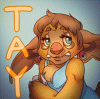
Finished image: http://www.furaffinity.net/view/7189381
I'm not really good at this stuff lol, so believe me when I say I'm not trying to sound like I know what I'm talking about. 9_6
I use Photoshop CS and for this I used all default hard round brushes, except to sketch with, but that's not really important - I usually sketch with hard round brushes, and this is just barely altered to be more slanted and less round.
1. The sketch. Pretty self-explanatory. The background colour (which is also a separate layer, thankfully) was originally a lot lighter than this, which you'll see later, but having a warm grey for something like this is less intimidating and whitewashing than pure white. 100% opacity (O), 100% fill (F). It's okay for this to be messy.
2. Undercoat(?). Not really sure what else to call this, but I wanted to be a bit more, um, colourful. So I picked a darker warm red as a sort of guide for the darkest parts of Orange. I used a large airbrush, I don't remember how big it was and it's not really important as long as it's as few strokes as possible so that you can still see the sketch underneath. 50%O 50%F, probably.
3. WIP. An example of the light grey I was using as the BG before I darkened it. I wouldn't suggest starting something like this on a light canvas. I can't really explain how to pick colours, especially since I barely understand colour myself, but try to use your undercoat as a starting point for laying down the "actual" colours. Start with the darkest colours first. Be sure to check back with your sketch if something starts to look lopsided. I didn't do that, and it shows. I continued with the 19px hard round brush at 50%O 60%F, sizes varying from 50-60px for the base colours and 20-30px for the more furry details, and 10px for the smallest ones. Once you get your colours down, it's mostly about eyedropping your colours. Try not to make new ones unless you absolutely have to.
4. The finished colours. It should be noted that I also had an extra layer between the colour layer and the undercoat that was the same colour as the BG, I used that to cover up the extra spray of the undercoat and help shape the overall form I'm going to cover.
5. On a new layer, I've sharpened up some of the edges of the painting in the same way I "cleaned" the undercoat. This wasn't really necessary, I guess.
6. Another new layer, set to Overlay. The layer itself is set to 70%O. Using a mid-saturated fully bright yellow and a 200px soft round brush set to 20%O 20%F, I used this to highlight my edges, add a mild glow, and bring more warmth to the image.
7. Using the darkest purple on the image, on a new layer set to Multiply at 50%O, using the same brush, I added shadows. Be a better man than I and keep your light source in mind!
And that's more or less how I did this. One of these days, maybe I'll learn how to do this right.
Finished image: http://www.furaffinity.net/view/7189381
Category Artwork (Digital) / Fantasy
Species Alien (Other)
Size 500 x 500px
File Size 472 kB
Comments