 FA+
FA+
250
Views
Views
17
Favorites
Favorites
Category
Artwork (Digital) / Fantasy
Species Western Dragon
Size 768 x 1024
File Size 413.7 kB
Report this content
More from EndlessHunter


Part of a trade with Sirrve on deviantart.
art © me
character © SiRrve
Background found here and belongs to its rightful owner.
art © me
character © SiRrve
Background found here and belongs to its rightful owner.
Category Artwork (Digital) / Fantasy
Species Western Dragon
Size 768 x 1024px
File Size 413.7 kB

Here's my critique -
Your shading is so soft and light as to be pretty much negligible. For starting to learn to shade and light things, I suggest starting off with working on shading and lighting by studying geometric objects and simple things from life. And hey, I've known professional artists who still default to practicing lighting spheres and simple objects in their spare practice time. Working on lighting from things like this can be very useful: http://www.learntoart.com/wp-conten.....ght-source.jpg
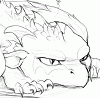
For anatomy, the biggest thing is that the head looks quite unrealistically large compared to the neck and shoulders. I'd suggest looking at references from other artists in general to work on getting things in proportion - other than the more glaring problem of the size of the head that's the main thing to do to improve, just study and try to copy what artists do. There's nothing wrong with directly copying other artist's work by eye for practice pictures for improvement's sake, as private practice pictures at least.
The shading and lighting and coloring are all very simple - very light airbrushing-style shading and coloring, and it's not something that critique can really address directly, because if you want to move beyond that the first steps really are to sit down with photographs and things from real life and working on really observing the way colors work and lighting on objects. So I can't offer too much advice other than just practice from life right now! But practicepractice is always good.
Anyhow that's my fairly uneducated opinion! Hope you find it somewhat helpful ^^
Your shading is so soft and light as to be pretty much negligible. For starting to learn to shade and light things, I suggest starting off with working on shading and lighting by studying geometric objects and simple things from life. And hey, I've known professional artists who still default to practicing lighting spheres and simple objects in their spare practice time. Working on lighting from things like this can be very useful: http://www.learntoart.com/wp-conten.....ght-source.jpg
For anatomy, the biggest thing is that the head looks quite unrealistically large compared to the neck and shoulders. I'd suggest looking at references from other artists in general to work on getting things in proportion - other than the more glaring problem of the size of the head that's the main thing to do to improve, just study and try to copy what artists do. There's nothing wrong with directly copying other artist's work by eye for practice pictures for improvement's sake, as private practice pictures at least.
The shading and lighting and coloring are all very simple - very light airbrushing-style shading and coloring, and it's not something that critique can really address directly, because if you want to move beyond that the first steps really are to sit down with photographs and things from real life and working on really observing the way colors work and lighting on objects. So I can't offer too much advice other than just practice from life right now! But practicepractice is always good.
Anyhow that's my fairly uneducated opinion! Hope you find it somewhat helpful ^^

Comments