 FA+
FA+
13015
Views
Views
494
Favorites
Favorites
Category
Artwork (Traditional) / Muscle
Species Vulpine (Other)
Size 984 x 1400
File Size 2.14 MB
Report this content
★
More from djdarkfox

")


Listed in Folders


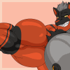
♥ Andre at the Coron Beach ♥
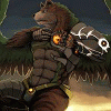
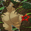
And here he is again, Andre the sexy red fox from the philipines with the ripped muscles. >w<
It's Elly's foxy character I just love to draw <3
He's having a nice time at the Coron Beach, with the beautiful cliffs, romantic springs and secret lakes hidden inbetween high rocks and a huge number of exotic plants and trees.
I used a photo as a reference for the beach and I think I caught it quite nicely ^w^
The pose is based onto a pic where I drew andre in the kinda same pose where he's a background character.
I just thought since she loves sexy abs, that a real full-body pic of her Andre would cheer her up a lot, and I hope it does. =3
Well, here you are my dear kitty-sis, your beefy sexy Andre drawn by me for you ^w^
I hope you all like it too <3
Art © to me, djdarkfox ^w^
character is © to newberrychucks <3
It's Elly's foxy character I just love to draw <3
He's having a nice time at the Coron Beach, with the beautiful cliffs, romantic springs and secret lakes hidden inbetween high rocks and a huge number of exotic plants and trees.
I used a photo as a reference for the beach and I think I caught it quite nicely ^w^
The pose is based onto a pic where I drew andre in the kinda same pose where he's a background character.
I just thought since she loves sexy abs, that a real full-body pic of her Andre would cheer her up a lot, and I hope it does. =3
Well, here you are my dear kitty-sis, your beefy sexy Andre drawn by me for you ^w^
I hope you all like it too <3
Art © to me,
 djdarkfox ^w^
character is © to
 newberrychucks <3
Category Artwork (Traditional) / Muscle
Species Vulpine (Other)
Size 984 x 1400px
File Size 2.14 MB
Listed in Folders

. I can just keep staring at it all day. n///n
Oh my oh my, dear bro... you really packed this picture with things I love. >w<... good weather, the beach, my Andre, and his gorgeous rippling body.
And of course, you put him in my favorite pose~... which shows my favorite muscle, them bulging shredded abs. >////<... and he surely seems like he's showing off for the viewers here... just finished pulling off his shirt. <3
The striated pecs, those powerful legs, and of course those ripped arms. specially the one showing a thick, veiny bicep.
And the beach! Coron! :giggle:... oh my, you did it beautifully too. Heehee, and the pawprint towel is cute <3 (not as cute as his face, though. it's charmingly handsome. >///< )
You really did an outstanding job with this, dear bro. I appreciate it very much... thank you. u//////////u
You're such a wonderful, loving dear brother. :heart: :heart: :heart:... even specially putting my name in one corner <3...
I love you so very much, dear Toby. I really do.

I am so glad I could cheer you p with your dear Andre appearing onto the Coron Beach, a beach that is just as dreamy as that sexy red fox right there X3
I must say I am very proud of this piece here and how it turned out, but the happiest I am with the broad smile and twinkling eyes I caused to appear onto your ute face, that's the best payment an artist like me can receive from a dear friend, that's all worth the markers I use to create all these artworks
Andre is such a hunk, no wonder he ikes DJ, I am glad those two hunky foxes found each other back in that forest, if you remember back that one pic you did ^w^
And DJ really enjoy being with Andre too, they are the perfect workout-buddies, especially after the workouts when they compare themselves by feeling up each other's results
Again, thank you so much for your words, I feel so very flattered by your words, it makes me so happy to hear that from you, I love you really much too my dear kitty sister, I hope one day either I can come to visite you for some nice holidays or you come to Germany for a visite


^w^ ohh myyy thats a big strong buff hot fox you drew there wow those muscles are so amazing with the veins throbbing above those hard tight strong muscles. Those biceps flexed tight and large along with those large steel slabs forming his two pectorals, and his abs, hard taught and tight with definition each tight ripple of the abs full with definition with the veins snaking up the bottom set. Another pure DJ Darkfox masterpiece right here. X3


"We are golden... no, that's just me!" ^__^ That's what Andre could say, hehehe.
Dammit, really WELL done, my friend.
I mean, this golden touch... this is as intense as never before - and it's really fitting. Meaning, it doesn't look "unnatural" or "disturbing".
Ok, I'm still not feeling very well... I've got a bad cold and my eyes are sore and my nose is running. *sniff* BUT I will take the time for my usual "eleborate" comments here.
Positive Aspects
There are at least four important aspects, which hit my eyes and caught my attention. I'd like to point them out in the usual detailed way.
1.) Andre's face: The eyes are so beautiful and looking directly at the viewer! He immediately caught my attention and Andre has a very pretty, sympathic facial expression. He looks alive and really friendly!
2.) The body anatomy: Don't have to say much here... you always do a great job here. But this time, the character is not only posing or flexing... he's doing something very normal (taking off a shirt) and still looks great (and sexy). ^^" Well done!
3.) The background: What REALLY caught my attention are the leaves on the right side of the artwork!! I love trees and leaves and you've drawn them so natural and realistic. Really great!! BUT that's not it: the leaves only look that great, because the background (rocky cliff with bushes) has NO LINE ART AT ALL!!!!!!!!!!!!
This way, you've managed to create a certain "distance" in perspective and colouring. It's something I've always wanted to try out and what I've done a few times... with more or less sucess. ^^"
It's darn difficult, to use markers only to create a "perspectival distance" and you've done pretty well here. Sure, it could be done better (read below), but hey... this is already very professional as it is.
And what's even cooler: YOU HAVE used your line art in different strenghts!!! Yes, Andre's body... the rocks of the beach and the leaves on the right side... it's all made of different lines! This - combined with the colouring - works pretty well!
4.) Little details: I love how you've taken care of the blanket, the bottle, the beach and all the small goodies, which make this artwork BELIEVABLE!! Very well done. Also, everything is in proportion and the perspectival laws are correct.
5.) Andre's colouring: You've managed to combine a golden touch, your usual grey-ish colours (for the chest) and added a brown palette for his feet and lower arms. ALL COLOUR TONES are "earth" tones, natural colours and your combination of these colours (including the shading!!!) looks just amazing!
6.) Last but not least - the speedo: Ok... I won't deny that I've also looked at THIS particular part. ^^"" But that's alright.
Still, I figure you've done something NEW here... it's not as "busting out" as usual. I don't mean the size of his "package"... naaaah. I wanted to say... darn, how can I express my thoughts... the speedo looks more natural, BECAUSE it's closer to the body. It looks more tight! It points out the shape in a way better way than ever done before!
Sometimes, a speedo (or underpant) can look like as if... somebody put a socket inside. In some cases (not in your gallery!) I've seen a speedo drawn like a diaper!!!!!!!!!!!
But right HERE, you've managed to design it very believable and I really like that cloth! IT IS more stretchy and just BETTER than everything you've done before.
Negative Aspects
"Negative" is such a bad word... I mean "Something you should take care for next time". This is help and advise! ^^
1.) If I look at the large rock in the right side of the artwork, I think the shading of that surface should've been stronger. The upper part of the rock shows pretty good contrasts, while the large, lower part is rather bright. The light source in this picture is a bright, undisturbed sunshine... and most of your shading is accurate and fitting. It's just that single rock on the right side. But no big deal!
2.) As I've mentioned above, the background (lacking line art) is really great! It gives us a great feeling of "distance". Anyway, compared to the composition and the details of the front, the background looks a bit "naive" and "too simple". Sorry, don't know another word for it. I also admit, that I (!!) would NOT know how to do it better!!! ^^" It's really hard to do a soft background with markers, I'm sure of it. The left part of the far distance background looks excellent... but the cliff with trees and bushes could be done better (or better shaded) next time.
This is it.
FINAL STATEMENT:
An excellent artwork of Andre at the beach. Full of life, light and details and believable motion and feeling! The few small flaws in the background cannot spoil the entire picture, at all!
(Noch etwas in eigener Sache: Ich schätze mal, gestern haben wir uns abends verpasst, auch wenn ich ne gute Stunde auf MSN war. Vielleicht wird's heute was? Gegen 18:00 bin ich dann da. Tut mir leid, dass es nicht länger geht, aber ich muss mich echt schonen, wenn ich die nächste Woche schaffen will. Blöde Sache. Aber man sieht sich und... immerhin kannst du dich an diesem Kommentar erfreuen, das ist ja auch was. Viele Grüße! )


Comments