 FA+
FA+
8344
Views
Views
446
Favorites
Favorites
Category
Artwork (Traditional) / Muscle
Species Vulpine (Other)
Size 1057 x 1500
File Size 1.07 MB
Report this content
★
More from djdarkfox


Listed in Folders


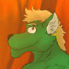
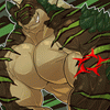
Teasing Snowflakes (fin)
...I worked like 3 months on this pic, always on and off like with all my other artworks, my job's sometimes killin' my drawing moods, or sometimes I draw a bit in the breaks between working XP
Anyways, here's another pic, finally finished, worked on it together with the previous pic of Rufus you've seen recently ;p
It's a pic for dailightfox of his fursona Dai, he's a slight color variant of an european red fox, just more brown than red ^^
The background was quite time taking but I guess I did well on it too, I did that BG when it was very snowy and got in a somewhat wintr-like mood, but winter's thankfully gone already (I hope... no one knows if it will cme back again for a last smack of snow XP)
Anyways, hope ya'll like it, all done traditionally, just as the category it is in says, because I dont work digitally often, I have rarely any computers with me, prefer sitting silently somewhere outside in the sun to draw with my markers and drawing pad ^^"
art is © to djdarkfox, me
character is © to dailightfox
Anyways, here's another pic, finally finished, worked on it together with the previous pic of Rufus you've seen recently ;p
It's a pic for
 dailightfox of his fursona Dai, he's a slight color variant of an european red fox, just more brown than red ^^
The background was quite time taking but I guess I did well on it too, I did that BG when it was very snowy and got in a somewhat wintr-like mood, but winter's thankfully gone already (I hope... no one knows if it will cme back again for a last smack of snow XP)
Anyways, hope ya'll like it, all done traditionally, just as the category it is in says, because I dont work digitally often, I have rarely any computers with me, prefer sitting silently somewhere outside in the sun to draw with my markers and drawing pad ^^"
art is © to
 djdarkfox, me
character is © to
dailightfox
Category Artwork (Traditional) / Muscle
Species Vulpine (Other)
Size 1057 x 1500px
File Size 1.07 MB
Listed in Folders


Murr, das hast du sehr fein gemalt, Fuchsi!!!
Ich mag vorallem diese neue Methode das Fell mit weißem Buntstift zu schrafieren, sieht echt Hammer aus!
*dich mal sau feste Knuddel*
Echt schön mal wieder ein Schnee-Hintergrund von dir zusehen.
Erinnert mich dolle an unseren Tag in Altenberg.
Ich weiss echt nicht was ich dazu sagen soll.... wirklich außer Danke!Danke!Danke!Danke!Danke!Danke! X3 *macht seinen Dai-tanz*
Ich werde dich dolle Knuddeln wenn ich wieder da bin im April X3
Vielleicht sieht der Dai nächsten Winter auch real so aus ;3


Oh, man, this is really nice. The hint of the curve of his glutes visible in his jeans is a subtle touch, along with the more visible shapes of his thighs stretching them out, plus I like how no matter what in all your pictures, even as warmly as he's dressed.. there's still the waistband of a speedo showing from underneath.
Nice to see some guys stay ripped and cut even in the cold winter months!
Nice to see some guys stay ripped and cut even in the cold winter months!


I can not just give you top marks on this one. Your shadows on the pants are really bad. Ways to improve:
1. Make the edges sharper. it is a clear winter day shadows are very crisp and well formed
22. Increase the intensity of certain shadows. Like on the door under the donning, right beneath the shirt
1. Make the edges sharper. it is a clear winter day shadows are very crisp and well formed
22. Increase the intensity of certain shadows. Like on the door under the donning, right beneath the shirt
Well, I gladly thank you for a critique like this, but you aren't right in most of your words. First thing, Jeans dont reflect light as shiny as fur or other materials, because their surface is very "light eating", also there is lots of snow around, which reflects the light back at various points to an object, so an object can seem less shadowy with so many "light sources" around.
And the door is completely under a shadow, if you'd see from which angle the sun shines down to the ground, you'd see where the edge between light and shadow is, so I cant make hard shadows on there, and again, because of all the snow around, the light reflects back to many objects, so that a shadow seems brighter than it would be without the snow.
And the door is completely under a shadow, if you'd see from which angle the sun shines down to the ground, you'd see where the edge between light and shadow is, so I cant make hard shadows on there, and again, because of all the snow around, the light reflects back to many objects, so that a shadow seems brighter than it would be without the snow.


YAY, it is done!!!
Long comment ahead:
CHARACTER:
When I first saw this picture, I said to myself: "Ow, this really looks different than the LINE ART version!" And it's not only because of the the colouring. No, the final colours and shadings really changed the looks in many ways! First, DAI looked like all your "average fox anthros"... but now he's personalized and unique!! ^^
His reddish hair, the cute black marking on his snout/muzzle aaaaand his soft reddish-brown fur really works well together.
I like him!
There is a difficult choice, though. I suppose, it wasn't easy for you to give him a real BLACK shirt/pullover... because his hands are BLACK, too!!!!!!!
That can be very, very frustrating. In this digital scan version, it looks very similar: hands and pullover... almost merging into each other. But I'm sure, that's NOT the fact on the original verison. And you've done some highlighting on the fur, after all.
It also seems to me, that you've paid most attention to the face and the abs!
Having a very huge appreciation for well-build abs myself.... *snickers* I surely love that part of the body the most!!!! ^^"
Yes, the belly surely looks amazing and that's why DAI is presenting it to us.
In some previous comment we could read about "improper" or "less strong" shading. Well, I'd agree that some shadings COULD (!) be harder and some COULD be softer... but in the end, most people don't know how to work with COPICS... and most people really don't understand that "real" media (like copics) don't function like a digital tool! You cannot just put a colour spot or splat anywhere and create a perfect line or part... with a perfect colour intensity.
That's my opinion: people should really try out the traditional media and see for themselves!! ^^
I guess, most shadings are ok. And the most important shadings are all correct: I'm talking about the "Wurfschatten"... eh, the shading cast on a body part or on the ground. AND since we can see that the main light source might be somewhere upper right, it's all working just fine.
I like the shading cast by the character's left arm!
Ow, and... DAI seems to be the one NOT wearing red underwear, right??? *snickers*
BACKGROUND:
You didn't disappoint me, when it came to finishing the background. Living in a "winter-wonderland" myself, I do appreciate your effort in creating this snowy landscape and it WORKS and looks believable. Once more, you've created a good "depth", by lowering the line art and strenght of the colours in the far distance. I'm sure this can even be improved by using "almost empty" markers... *grins* Or at least even thinner, less bright markers. But it looks really great so far! ^_^
The foreground is my favourite! The nice house, the soft snow everywhere... the pines... it's a pretty environment.
Just one thing I should've told you in the sketch version: the little pile/pole on the right side is really TOO small in my opinion. There's no way a fence or anything similar would be connected to this logically... but like I said, I didn't see it earlier. ^^"
And it's not a big deal, either.
RESULT:
Well, DAI loves it and that's really all you need to care about!!! ^____^
But you've drawn a very unusual, cold background this time. We're always used to beaches and warm (or warmer) places, so this here was a challange and I really wanted to point it out!! Well done!
Furthermore, DAI does not (!) look like any other of your characters/drawings. When I'm drawing reptilians, most guys look all like REPTILE and that's another challange.
It is really SURE, that DAI does not look like DJ... or RUFUS... or ANDRE. But they're all of a similar species and yet you managed to give them all their own, unique flair.
And that counts a lot, too.
Ja, es ist eben nicht unbedingt so sehr einfach, alleine chon wegen der im vergleich zum Photoshop stark begrenzten Menge an Farbauswahl dieser doch recht teuren Stifte ^^"
Und wenn man es so sieht, der Schnee wirft ja in dem Sinne auch sehr viel Licht zurück, von der Sonne UND vom blauen Himmel, und wenn du es schonmal beobachtet hast, Schnee im Schatten unter blauen Himmel hat die gleiche Farbe wie der Himmel selbst, und auch nahezu die selbe Helligkeit, deswegen ists unsinn in den Schnee so superdunkle schatten zu setzen, da müsste der ja umgeben von Bäumen oder Gebäuden sein damit der schnee wenig genug "blaues Licht" abbekommt ^^"
Und das mit dem Pfahl, der ist eben so klein, ist alles so geplant, soll eben einfach nur aussehen ohne eine wirkliche Funktion zu haben XP


Comments