 FA+
FA+
4470
Views
Views
137
Favorites
Favorites
Category
All / Tutorials
Species Pokemon
Size 800 x 3860
File Size 724.8 kB
Report this content
More from Dodoki


Listed in Folders


Introduction to the art of choosing and adjusting colors. This piece addresses some personal qualms of mine, as well as informs the artist on what sorts of things to be aware of in their work.
Briefer than the last one, written as concepts, not steps. Again, this tutorial is exclusively for your flat colors, not shading.
Example art by c-trigger, characters belong to their owners, and are used under the educational stipulation of Fair Use.
Enjoy!
Briefer than the last one, written as concepts, not steps. Again, this tutorial is exclusively for your flat colors, not shading.
Example art by
 c-trigger, characters belong to their owners, and are used under the educational stipulation of Fair Use.
Enjoy!
Category All / Tutorials
Species Pokemon
Size 800 x 3860px
File Size 724.8 kB
Listed in Folders


this is very well done. I had professors that used to yell about not using black. (though, if you reeeallly need high contrast somewhere, using it is inevitable sometimes)
That, along with the overuse of suuuuper highly saturated colors, is one of this biggest beginner mistakes I see on FA.
That, along with the overuse of suuuuper highly saturated colors, is one of this biggest beginner mistakes I see on FA.
Or that anything that can be described as yellow is automatically colored as highest-saturation lemon yellow...
Yeah, it's pretty bad sometimes, but at the same time, some artists I've seen can actually use those full-sat colors and make them work, but they understand how to make such risky moves, unlike the people who are like "ALL BLUE SHOULD BE ROYAL BLUE BECAUSE THAT'S THE PRETTIEST."
Yeah, it's pretty bad sometimes, but at the same time, some artists I've seen can actually use those full-sat colors and make them work, but they understand how to make such risky moves, unlike the people who are like "ALL BLUE SHOULD BE ROYAL BLUE BECAUSE THAT'S THE PRETTIEST."


Well, see, what gaining a stronger sense of color actually does, is changes the very way your eyes see color. My eyes actually perceive hues, colors, and composition much differently than long ago, and they're still changing.
It's not that the first one is a complete unsalvageable atrocity, it's more that there are significant opportunities to improve on the piece, and that those ways can be found when you search for them. Sometimes the changes you make won't please -every- crowd, but if they're ultimately easier on the eyes, then you're doing your audience a favor.
It's not that the first one is a complete unsalvageable atrocity, it's more that there are significant opportunities to improve on the piece, and that those ways can be found when you search for them. Sometimes the changes you make won't please -every- crowd, but if they're ultimately easier on the eyes, then you're doing your audience a favor.


The first one uses literal grays that have no hue or saturation to them, meaning that the charizard has coloring that is impossible. This then clashes with the character on the right who is oversaturated, and wherewith the brown on his leathers clashes by being too dark by comparison.
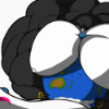
The second one may be washed out, but the goal was for the mood to be congruent. They match in terms of feel. Additionally it's important to remember that neither image is shaded. Fore the purposes of the tutorial, I didn't show how, for example, the first one can't be effectively shaded and highlighted due to over/undersaturation. There's a lot to explain, I'm afraid!
The second one may be washed out, but the goal was for the mood to be congruent. They match in terms of feel. Additionally it's important to remember that neither image is shaded. Fore the purposes of the tutorial, I didn't show how, for example, the first one can't be effectively shaded and highlighted due to over/undersaturation. There's a lot to explain, I'm afraid!
Welp, this is the end result of using the less saturated colors from three years ago. It would seem as if I'm not effectively communicating the point, though. Color theory is about cohesion and congruency. The charizard on the left is literally complete grayscale next to an oversaturated character. I'm not telling you what to like, I'm telling you that from a functional viewpoint, the top one clashes, and the colors can prove segmenting. As to shading the first, I did not say it was impossible, rather that it would not yield a strong effect. You're more than welcome to prove me wrong, though. The colors of the first were literally me just taking the flat color layer of the second one and moving the hue/saturation sliders around haphazardly while trying to retain some similarity to what the requested colors were.
I use bright colours in most of my art. Being a children's illustrator I get asked to. Stuff like this http://www.furaffinity.net/view/13836423/ or this http://www.furaffinity.net/view/14067533/
I'm not trying to say I'm right and your wrong or vice versa. More in the fact I don't understand how and why the brighter colours are harder to use or be functional.
The finished pic is very nice and I understand what you mean but the colours seem muted to me and it makes the pic overall seem dull and dark. I am always willing to try and improve and learn. If there was someplace you could suggest that I learn more on this, I would be willing to check it out and try it.
To be clear, I'm not saying that brighter colors are harder to use to be functional, but that clashing and incongruency occur more in the first than the second. The demonstration is not about the characters or content, but the color, strictly the color. You say that the finished pic seems "Overall" dull and dark. That's the point, that "Overall" it creates a consistent mood. In my experience, brighter colors have a higher propensity for clashing, as slight differences can be the difference between a good and a poor fit. If you look at my more current pieces, which are much more saturated than my earlier ones, you'll see that I managed to work my way into them. I'm sorry if I'm failing to communicate my actual points. Please keep in mind that this was made years ago and that the demonstration at the top was merely a demonstration.
Okay. I'm sorry. I was taking it as you were trying to get the same feel and emotion out of the second pic as there was in the first but using colour theory and thus it was a better picture because of that. I didn't know you were trying for a darker subdued feel to the pic instead.
I was just confused on that. I'm sorry if I wasted your time or made you annoyed at me somehow. I just thought you could point me in the right direction to understanding what you were going for. This was never actually covered in art school. I keep trying to learn new things in my art as my BA only took me so far. Thanks for at least explaining it to me. Sorry if I bothered you. ^,..,^
I was just confused on that. I'm sorry if I wasted your time or made you annoyed at me somehow. I just thought you could point me in the right direction to understanding what you were going for. This was never actually covered in art school. I keep trying to learn new things in my art as my BA only took me so far. Thanks for at least explaining it to me. Sorry if I bothered you. ^,..,^
Comments