 FA+
FA+
2875
Views
Views
182
Favorites
Favorites
Category
All / General Furry Art
Species Vulpine (Other)
Size 496 x 620
File Size 240.3 kB
Report this content
★
More from LittleNapoleon


Listed in Folders


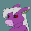
Everybody Wants to Rule the World
"I prefer landscapes. A tree doesn't complain that I haven't done it justice." --Winston Churchill
I've been wanting to try my hand at a piece of classic portraiture featuring my little mascot guy for a while now, but I just hadn't felt confident enough in my artistic skill to pull it off until recently. It's still no Rembrandt, but hey, it's a fair shade better than last year's attempt!
Hey, I just noticed this is my hundredth submission! How fitting ^^
Stylistically inspired by how grind3r and
  hollowbastion have drawn LN: now with 25% more gravitas! It's probably how the little guy sees himself when he looks in the mirror :P
Little Napoleon & Art © Me
Dark moody portraits © Caravaggio and the Dutch
I've been wanting to try my hand at a piece of classic portraiture featuring my little mascot guy for a while now, but I just hadn't felt confident enough in my artistic skill to pull it off until recently. It's still no Rembrandt, but hey, it's a fair shade better than last year's attempt!
Hey, I just noticed this is my hundredth submission! How fitting ^^
Stylistically inspired by how
 grind3r and
  hollowbastion have drawn LN: now with 25% more gravitas! It's probably how the little guy sees himself when he looks in the mirror :P
Little Napoleon & Art © Me
Dark moody portraits © Caravaggio and the Dutch
Category All / General Furry Art
Species Vulpine (Other)
Size 496 x 620px
File Size 240.3 kB


Yeah. See I'd like it if the "dinner" part could be done at home rather than 3 day out of 5 being at work due to often working 12pm to 9pm...
Since though I have morning off on those days, it also means that since "off time" is before work, so is "work preparations" going at the same time than said off time.
Add house chores and yeah :|
And that's when I'm not working a 9am to 6pm shift and whaddya know, surprise, the 5pm to 9pm guy isn't there. Guess who has to pick back up being the only employee left in the workplace since anybody else's shifts ended at 5pm at the latest while there's this one guy that is me was still going to be there until 6pm anyway?
Such as what happened today...

The pattern on the silk is an overlaid old wallpaper pattern from this website: http://lostandtaken.com/ Lotsa great textures there! There is also a canvas texture overlaid on top of the whole image which helps make the fabric look rough.
And the metallic sheen can be achieved the same way manga-style artists do hair shine. There are lots of different techniques out there to get that effect (plenty of tutorials available on DeviantArt); the way I've been doing it lately is painting a stroke of highlight color on a new layer set to color dodge/luminosity, then erasing with a smudge tool from the edges toward the middle until they meet near the center to form that bright wavy line :3
And the metallic sheen can be achieved the same way manga-style artists do hair shine. There are lots of different techniques out there to get that effect (plenty of tutorials available on DeviantArt); the way I've been doing it lately is painting a stroke of highlight color on a new layer set to color dodge/luminosity, then erasing with a smudge tool from the edges toward the middle until they meet near the center to form that bright wavy line :3


Ack! I've been caught XD
Like I say in the caption, this concept has been on the backburner for ages. But while doing the illustration for "Shadows," it gradually dawned on me that I was accumulating enough practice digitally painting to try to pull this idea off! Getting Corn's head right from the underside on "Bandits" was causing a headache (precious few reference photos of deer chins from beneath on the net, as it turns out XP), so one day just as an experiment I sketched out the pose and lighting. One thing led to another and before I knew it I had this! And it wouldn't have been possible without your story ^^
Apologies for the diversion, though - I'm back on all things Corn now, promise!

oh don't be silly... we both have life and other things that take time.
A very important lesson to be learned from this - and I have known this for a long time from the work I do - if something is not going right, or you find yourself hitting a brick wall, step away from it and go have a coffee. When you get back you will be surprised how easily it all fits together.
Mark Twain would do this. Back then there were no computers or type writers or anything - what you had were a large amount of 'pigeon holes' above your desk for organization and storage. He said, (paraphrased) 'a story writes itself, and when it loses steam (every machine was steam run back then) you pigeon hole it and let it rest. When it's built up the steam again you continue with it.'
V.


WOW!! O__O
How did you do this?
The textures are practically tangible (I LOVE the helm and the background), and needless to say, the technique and color palette are absolutely fantastic! If you ever make a tutorial, I'm going to study it faithfully :D
Meanwhile... brb, practicing textures :3
How did you do this?
The textures are practically tangible (I LOVE the helm and the background), and needless to say, the technique and color palette are absolutely fantastic! If you ever make a tutorial, I'm going to study it faithfully :D
Meanwhile... brb, practicing textures :3
Hah, no se - suerte? XD Habia mucho ensayo y error! Escribire en ingles si otras personas quieren leer la respuesta.
I started with a reference that had the same feel as the picture I had in mind (actually I ran across that painting first and it in large part inspired this). Next came sketching and preparing the figure for coloring. But before I actually started digitally painting, I selected some textures to give it a gritty feel.
At the very bottom, the base layer is a picture of cement. Next is a photo of an old door I took in some alleyway out in the boondocks of Turkey :3 I set that to 'overlay' and masked it to only partially show through. Above that are some shadows and the figure itself. Finally at the very top is a texture of canvas set to 'multiply' to darken everything and help create the feel of an actual painting.
As for the helmet itself, most of the texture comes from the dirty, blotchy canvas texture I used. The reflection though was done by painting a streak of bright color and then smudging it inward (either the Marker tool in SAI or the Smudge tool in Photoshop would work) to create a thin wavy line.
Hope that helps! Textures are a ton of fun :3 Good luck and happy overlaying!


Holy crud... TEXTURES! You outdid yourself with this with the fabric and texture detail my friend.
I gotta say, the first thing that grabs my attention is the helmet, that is got to be the best eye grabber whole picture. You gave it it a a FANTASTIC look of worked-in wear; where it's glistens of scratched gold at the fore most light reflection, but quickly gradients onto a dullness that seems to be tarnish from work, ware, and warfare. One thing is for sure, you hit the roman look dead on (or at least I think it's roman style, I suck at geology and what not); heck, the hair detail on your helmet looks great. The only thing I would say is that the front visor seems a bit off in its shading. The contrast shading on the visor seems to be weaker than the rest of the metal on the helmet. Not the highlights, no, the highlights match up through out the helmet, it just the visor shading that seems like separate from the rest.
But after getting just a few seconds of looking, I've come to really like your fabric work than your helmet; the helmet is the first thing that sticks out, but to me, the clothing fabric is what holds my attention better after I get over the helmet. Your characters attire is so realistic; the folds, shading, highlights, textures, details, and even the change of lighting from warm to cool light hues (warm on his right and cool on his left). The folds are spot on in the aspects of placement, they all seem to fit and form to his body correctly and the range of wrinkle depths is very well articulated; I can easily tell which folds and wrinkles are shallow and deep. The badge, undershirt, and the rest of the details and accessories fit well too. They hold the same tones and shades as the clothing, so they all seem to fit and attached to the clothing and not like it was just pasted into the picture. Of the whole picture, I would say that the clothing is the most superb in detail... in my opinion that is.
I like his expression as well, the mild frown is an obvious expression of seriousness and the darkened eye sockets helps give his seriousness a penetrating ability. I would have liked to see a little bit more of fur detail, the smoothness takes away from his canine looks; but as we all know here on FA, to talk about fur detail and actually drawing it are two completely different things, it's something that is very hard to do and thus I'm not going to get hung on it knowing how hard it can be to do. Not much to say about his expression though, it seems like you were straight and to the point with his expression (or at least that's what I got from it) and straight forward is what I'm getting from it... good stuff.
I can't ignore the background though, you seemed to have put a great amount of effort, or at least layers into it. Being a photographer, I see texturizing like this done all the time and it's become a bit less impressive now-a-days... but this isn't a photo. The background and overall textures is like the cherry to this whole sundae... a very dark sundae. None the less though, I'm glad you used the textures and the door; it adds a very abstract and surreal effect that entertains the eyes; and what makes it so is that there aren't so many illustrations out there that use this technique, much less furry artworks. Saying that, it adds a fine uniqueness less seen that gives us something to marvel about.
And now for a bit of abstract thinking; even though this is a portrait illustration, you do have some nice features here and I'll be bringing up a few things that I previously said in your dinosaur picture. For example, your use of lines! I have to say, the background door adds a a lot of power to this picture. It adds those straight vertical lines that represent strength, and not only that, but it compliments the character (i.e. the vertical posture, helmet hair, etc.), all of which then just adds to the "authority" to the picture, which of course, is what your character is *the all mighty Napoleon*. The tilt of his head adds uneasiness though, to show a sense of unsure feeling, which is great. On top of that, your dark shading, dull blots and textures of layers adds to that unsettlment which ultimately feels like not only is he powerful (vertical lines), but he has a darker side that is potentially unstable and unpredictable, or he it can be representative of a brutal history tat he has endured,; all of this makes him look like a force not to be reckoned with. What's nice though, is that you didn't overload with layers, textures, and background details. It all adds an interesting view, but doesn't distract form your powerful character... that gets a lot of respect from me.
So there ya go, another eye full of critiquing *chuckles*, you and your work just seem to bring it out of me. you should be VERY proud of yourself with this, even though there are a few flaws, the over all picture is mind blowing *boom*. If I had the money, I would seriously commission you, or at least buy a print from you; but alas, I am just a poor college kid and thus limited from doing so. Anyway, I really lve this picture, keep up the good work. And heads' up, I got another one coming your way here shortly :p.
What's so funny though was when I clicked on this pictures, a song started playing on soundcloud that made him feel so powerful... the song fits the picture well, take a listen for yourself.
http://soundcloud.com/jeff-fiorenti.....ocks-guitarist
*brushes off reading glasses and squints* Goodness, if thoughtful critique were an Olympic sport, you'd be on the team for sure this year!
If I remember correctly the original spark for this piece was seeing Rembrandt's Man With the Golden Helmet in a gallery in Berlin last year. Given the more serious take on LN Grind3r and Hollowbastion took on the character, something along those lines seemed like it would be a good fit for Rembrandt's style. Then while researching the painting I came across another picture of his and decided to try to build a composition based off of it. So much as I'd love to take credit for a lot of the compositional elements you mentioned - the arch, the pose, the color tones, even the helmet shine - really they are owed to Mr. van Rijn's groundbreaking artistry ^^;
My goal with this one was mainly to see if I could figure out digital techniques to imitate Dutch style, and as always it was an exercise in improvisation. I'm really glad to hear you think the textures and the lighting turned out well! They were a booger to render at such dark levels, and I was worried people whose monitors were calibrated differently might just see a black rectangle XD Anyway, Rembrandt's still the master, but this project definitely helped teach a few handy tricks!
Oh - believe it or not, that background actually is a photo! I found that door in a back alleyway in some old village in Turkey back in 2008. With some soft masking and opacity tweaks, though, it does kinda integrate right in, doesn't it? Pure luck ^^
Thanks again for your comments - they are eye opening and most encouraging!
(Haha, he wishes he were as cool as that song'd make him out to be! Clint Eastwood's got this little guy beat any day :P Great song!)


Comments