 FA+
FA+
5394
Views
Views
584
Favorites
Favorites
Category
All / All
Species Unspecified / Any
Size 625 x 621
File Size 97.6 kB
Report this content
More from ssirrus


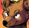
This is the more recent version of http://www.furaffinity.net/view/6595511/
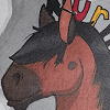
I am having a hard time because I tend to feel like I over-complicate images (color schemes mostly) by trying to make them more dynamic or interesting. I wanted a stronger sense of light/shadow for this thing, but I can't help but get the feeling like I lost some quality of the original.
What do you all think? How should I proceed? Should I go back to the first wip stage?
Thx for input!
Category All / All
Species Unspecified / Any
Size 625 x 621px
File Size 97.6 kB


I guess it depends on what sort of feel you're going for. The first is definitely more graphic, versus this more painterly one. You have lessened the impact of the original line quality, but also added to it with the new colors. I think the only downside is that you've lost the emphasis on the lip piercing that you had originally. I really enjoy this version; it appeals to my aesthetics. But I would keep both of them in your gallery because I feel like there's a story to be told between the two images - the buildup of it is incredibly interesting to me.


YES!
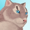
Looks so close to completion. Here's a shot in the dark, without any guarantee of being a good idea:
What do you think of laying down colour lines on a new layer, liquifying it to follow the form of the neck and torso, and then blurring/redrawing it? It could be a subtle way to insert that last 5% without bogging it down.


You're coloring in the sketch in a fun and interesting way, so far. It looks good, how you are going at it, I love seeing the patterns and designs you use as you blend colors and declare form.
If you are going for something with actual lighting, I'd suggest trying to be more deliberate with where the light is touching. I dunno if you wanted to go for something with dynamic lighting, but using sharp-edged shadows as well as soft would help declare that better.
Either way, though, this looks really pretty, your sense of color is so amazing <3


I like the original. I think there may be too much color- he kinda looks like an oil slick. That's not to mean that I don't like this version of course, but the variety of colors makes it a little hard to focus. I like where you're going with the lighting though. I think if you were to keep with this version, you should maybe reserve the greens (like on his neck) for reflected light.
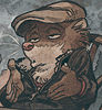
I really like the luminosity of the labret swirly and ear weights and definitely think you should keep them the way they are because they really drive home the idea of bright warm light
I really like the luminosity of the labret swirly and ear weights and definitely think you should keep them the way they are because they really drive home the idea of bright warm light

I don't think color is the issue here, but maybe composition? you have a very dense character squished into a very "small" space. I think extending the canvas in some direction (up, left, or right - I would choose right, personally!) and continuing with the vague yellowy background might help. Even if your final version doesn't stay that way, the exercise might help you get fresh eyes on it.


I think that any wacky color scheme can work well, provided there's a clear visual hierarchy and a framework of strong value relationships underneath it. The tetradic yellow-orange-teal-purple guy you've got going on here is a workable, interesting palette, but I do think that the visual hierarchy and value structure have maybe spun a little out of control. As a result, I think the previous version was probably more successful as it stands now, but there are some fairly easy fixes that will allow you to get back the solid structure of the previous version while still keeping the work, detail, and color interest of the new one.
In the original version, you have basically three values going on: the midtone of the background and neck, the lighter value on the muzzle, ear, and eye highlight, and the darker value along the cheek and top of the head. Looking at the piece in black and white can help you see your values clearly. Just as a tip, I always keep a saturation adjustment layer at the top of my layer stack that I can toggle on and off to view the piece I'm working on in black and white so I can check my values on the fly, which I find super helpful.
In the new version, you have what I would call four major values: near-white in the background, earring, lower lip, and eye; a ~50% grey in the highlights along the neck and lower cheek/jaw; an ~80% grey for the base of the neck (and really most of the flesh, under the highlights); and a near-black around the eye and the top of the head.
So just looking at your value structures, the old version had mostly mid-tones, with highlights and shadows added as necessary to shape the form, and to call attention to the details you want the viewer to focus on -- the eye, first and foremost, with the brightest highlight in the piece, then to a lesser extent the striped pattern on the muzzle. That's a very clear hierarchy of detail. In the new version, you've kind of lost your midtones and pushed everything into shadow or highlight, and there are a lot more areas of high contrast. The earring, which before was of nearly identical value to the neck behind it (51% and 52% black, respectively), is now an area of extreme contrast (5% on 85% black). The stripes on the cheek are high contrast, the highlights down the neck are high contrast, the entire complex contour of the noodly hair against the background is extremely high contrast -- there's a ton of attention-grabby contrast going on. As a result, the figure's eye grabs less attention by comparison.
Next, take a look at hue. One of the really successful things you do in the earlier version that allows you to conserve values is to represent value change with hue. There are only about seven values available to painters that are clearly distinguishable from one another -- white, very light grey, medium light grey, grey, medium dark grey, very dark grey, and black. That's all you get. Many (most) of the master paintings I've seen limit that to 3~5. The rest of the portrayal of darks and lights is happening in hue. Look at the earring in the old version of the piece. It pops clearly, despite being nearly identical to the neck in value. That's because of the transition in hue and saturation -- varying the hue from orange to red made for a clear boundary without needing to use contrasting values. The lower lip and eye are another great example. By picking a much less saturated orange, you get a big contrast: it seems much lighter) with only a subtle lightening of the actual value.
As a result, you're left with a really simple, clear value structure in that first version that still has strong boundaries and popping details. The details you want to pop the most are using hue and value shifts. The details that are lower down on the visual hierarchy are just using subtle hue shifts.
In the newer version, you take the overly contrasty value structure and layer more high-contrast hue shifts on top to push it into even more extreme territory. The saturated gold hue of the cheek lines against the complementary purple make that left edge suuuper contrasty. As a result, the underlying form of the cheek is lost, and we're left not really sure what we're looking at. Like I said at the beginning, I think you could probably keep 80% of the hue information you have on there now and still be successful if you got the value structure in order, but keep an eye out for cases like that cheek, where the hue relationships are exacerbating problems in the value relationships.
So, where to go from here. I would recommend starting by pushing the values back toward the middle (or all toward the lighter or darker end -- the point is to get less contrast among them). You can toss a couple of flat color layers on top of your stack using various blending modes like soft light or lighten/darken to accomplish that. Next, decide on a visual hierarchy. Write out a list of the order in which you want people to notice each detail. Do you want the silhouette to pop first, as if the figure were strongly back-lit? If so, reduce the contrast throughout the face, but keep the high contrast along the edges of the figure you have here. Do you want the eye to pop first? Make sure it has the lightest highlight and the most value contrast within the piece. Go down your list from most to least important detail, and make sure that each item has less contrast than the one above it (starting with value and hue shifts, then just using hue shifts). Once you're done with that, you should have a focused, controlled, sense-making painting that keeps all of the interest of this new version, but pulls all of the voices here into a single, harmonious chorus <3
Looking at it now, it's kind of a wall of text... But for all the tl;dr of it, I think the advice in there is pretty simple -- you could just read the last paragraph and get 99% of it <3
But yeah, keep playing with it! I'd super recommend saving a small, flat copy and loosely painting over that to make a few quick thumbnails. Use those as quick experiments to see what direction you want to take it from here! Seeing it at a small size is also really helpful in making sure your visual hierarchy scans well. An instructor once told me that every successful poster would also work as a postage stamp and vice versa -- give it a try!
But yeah, keep playing with it! I'd super recommend saving a small, flat copy and loosely painting over that to make a few quick thumbnails. Use those as quick experiments to see what direction you want to take it from here! Seeing it at a small size is also really helpful in making sure your visual hierarchy scans well. An instructor once told me that every successful poster would also work as a postage stamp and vice versa -- give it a try!


Comments